When people notice a brand, they often remember how it feels before they read a single word. Fonts play a huge role in shaping that first impression. The typefaces you choose convey personality, professionalism, and intention, quietly guiding how your audience perceives your brand.
As 2026 approaches, typography is evolving to meet the needs of modern branding. Designers and businesses are focusing on clarity, adaptability, and consistency across every channel, from websites and social media to printed materials. Trends like variable fonts, bold display styles, and nostalgic revivals are helping brands stand out while maintaining a clean and approachable aesthetic.
This article explores the typography trends that will define 2026 and offers guidance on selecting fonts that elevate your brand identity across digital platforms and physical products.
Variable fonts continue to rise in popularity due to their dynamic performance and efficiency. Unlike traditional font files, a single variable font can include multiple weights and styles, giving designers the freedom to create varied looks without increasing load times (Google Fonts, 2025). This flexibility improves website performance, allows seamless responsiveness across different devices, and gives creative freedom to adjust thickness, slant, or width within a single font family (Shaw, 2024).
Platforms like Google Fonts offer an expanding collection of variable fonts suitable for websites, social media graphics, product packaging, and printed brand materials. For brands, this means typography can be applied consistently across both digital and physical touchpoints, including stickers and business cards, without sacrificing quality or design integrity.
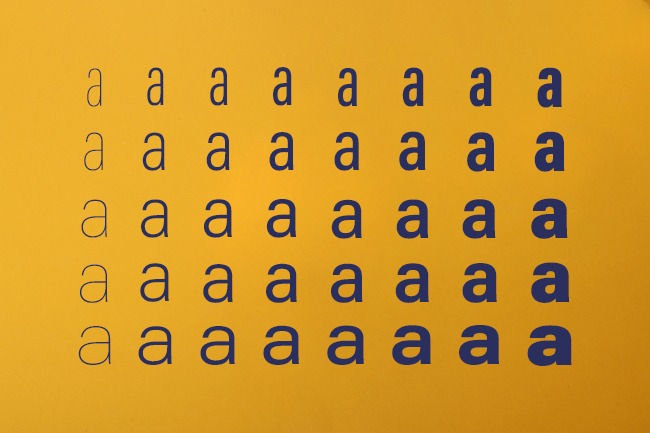
Classic typography styles are making a comeback, refreshed for contemporary branding. Designers are blending the nostalgic charm of 1970s-inspired serifs and early digital geometric sans-serifs with modern spacing, clean lines, and updated color palettes (Creative Bloq, 2025). When used thoughtfully, retro-inspired typography can add personality to logos, headlines, or hero sections while maintaining a modern look.
For printed materials, such as stickers or business cards, these retro styles can create a tactile, memorable impression. Using vintage fonts in combination with minimalistic layouts and contemporary colors allows brands to evoke nostalgia while remaining current, particularly for lifestyle brands, creative studios, and small businesses seeking a distinctive visual voice.

Minimalist sans-serif fonts remain a cornerstone of modern branding. Their simplicity ensures readability while conveying confidence and professionalism. Geometric sans-serifs, in particular, provide a neutral yet distinct appearance suitable for tech, wellness, finance, and creative industries (Adobe, 2025). Using different font weights and spacing allows designers to create hierarchy and structure without relying on color alone, and pairing a geometric sans-serif with a warm, humanist font creates balance and versatility.
Bold display fonts, on the other hand, are essential for catching attention in crowded digital spaces, particularly on social media or advertising campaigns (Typographica, 2025). Limiting their use to headlines or hero sections ensures impact without overwhelming the reader, and pairing them with clean body fonts maintains readability. Display fonts also work beautifully on physical materials, including event badges, promotional stickers, and business cards, reinforcing a brand’s personality and making it memorable.
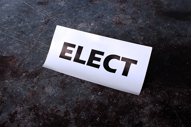
As sustainability and accessibility become increasingly important in branding, typography plays a key role. Eco-conscious typefaces help reduce ink usage in print, while accessibility-focused fonts improve legibility for a wider audience (Ecofont, 2023; W3C, 2024).
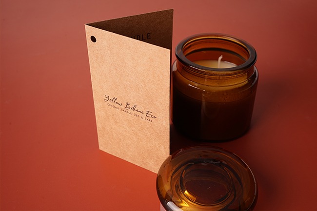
Designers can prioritize readability by selecting fonts optimized for digital interfaces and ensuring contrast ratios meet accessibility standards. Using lighter font weights and eco-friendly options for printed materials, including brochures, business cards, and labels, demonstrates a brand’s commitment to ethical, inclusive design practices that resonate with conscious consumers.
With design trends evolving rapidly, selecting the right typeface requires a strategic approach:
A strong typographic system elevates brand recognition and ensures your visual identity remains cohesive across all customer touchpoints, whether viewed online or held in hand.
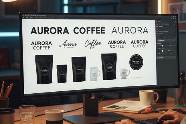
Consider a mid-sized creative brand updating its identity for 2026. They switch to a variable sans-serif for body text to improve digital readability, introduce a bold display font for headlines, and incorporate a subtle retro-inspired serif in their logo for a timeless yet contemporary feel. Applying these choices consistently across websites, social media, printed materials, and event merchandise creates a cohesive and memorable brand identity.
Strategic typography like this can transform a brand’s presence both online and offline, ensuring every touchpoint feels connected.
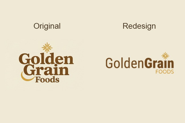
Typography doesn’t just affect how your website or social media looks. The fonts you choose also appear on tangible items, including custom stickers for packaging and business cards. Using fonts consistently across these items helps your brand feel cohesive and professional.
Branded stickers can make packaging stand out, while a well-designed business card leaves a strong first impression. Extending your typography into physical products ensures your brand identity is complete, consistent, and memorable for every audience interaction.
Typography in 2026 strikes a careful balance between creativity, clarity, and accessibility. From flexible variable fonts and nostalgic retro revivals to clean sans-serifs, expressive display styles, and sustainable, accessible typefaces, these trends are redefining how brands communicate visually. When applied thoughtfully across both digital and printed materials, including items like custom stickers and business cards, typography helps create a cohesive, professional identity that leaves a lasting impression on audiences.
By considering how typefaces appear not only on screens but also in tangible formats, brands can ensure their visual language remains consistent and memorable. Thoughtful application of fonts across all touchpoints strengthens recognition and reinforces the personality behind a brand. Typography is more than design; it is a tool for creating a lasting impression wherever a brand is experienced.
Text Effects & Style Resources
