Choosing the right color for your brand can feel overwhelming. It’s not just about picking what looks good — it’s about selecting a tone that evokes the right emotion, speaks to your audience, and aligns with your brand’s personality. For many founders and creatives, this feels like a psychological maze.
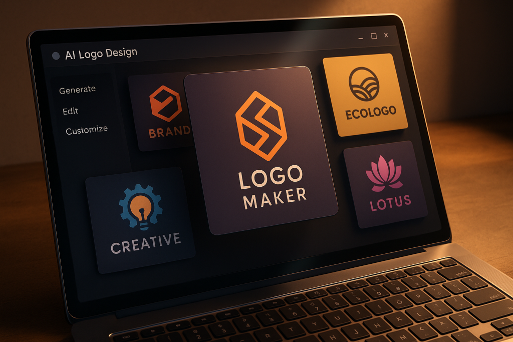
And yet, color is one of the most powerful tools in branding. It can shape customer trust, suggest quality, and even influence buying decisions. That’s why understanding how AI tools approach color psychology is essential — especially if you want your logo to do more than just “look nice.”
In this article, we’ll explore how smart design platforms use color psychology to influence branding choices. You’ll learn:
Let’s dive in…
Color recommendations aren’t random. When you begin working with an AI logo tool, you’re usually asked to describe your brand. Words like “bold,” “reliable,” “elegant,” or “fun” help the algorithm match color psychology to branding goals.
For instance, if you select “calm” and “professional,” the AI is likely to suggest muted blues, soft grays, or pastel tones — shades historically linked to stability and peace.
Actionable tip: Before you start designing, write down three personality traits for your brand. Use them as input — they’ll shape your color direction from the first click.
Remember that the AI is only as good as the signals you provide. Be intentional.
AI tools are trained on branding principles that align colors with emotional triggers. Red often suggests energy or urgency. Blue implies trust. Green nods to growth and balance. These associations are grounded in both psychology and decades of marketing data.
Look at PayPal and Facebook — both rely heavily on blue for authority and reliability. Meanwhile, Coca-Cola’s red generates excitement and passion.
Actionable tip: Identify what you want customers to feel when they see your logo. Match that emotion to a primary color group.
Pro Tip: Keep your visual identity consistent across all channels. If your color says “trust,” your messaging and tone should reinforce that feeling.
Modern AI design platforms don’t just pick a color — they build an entire color system. That includes primary tones, complementary accents, and neutral backgrounds. These palettes are rooted in principles like contrast ratio, harmony, and mood consistency.
Say your logo’s base is a cool green. The AI might suggest soft beige for backgrounds and deep navy for accents — creating a sense of calm professionalism.
Actionable tip: Stick to a 2–3 color palette for your branding kit. Avoid using every suggested color, especially if you want a clean, modern look.
Sounds simple? It is — and it makes your brand feel more intentional.
Many AI logo makers scan thousands of logos across industries to understand common patterns. For example, tech brands often lean into blue for trust, while health brands favor greens and purples for care and innovation.
But here’s the trick: AI also highlights opportunities for differentiation. If your competitors all use blue, it may suggest teal or charcoal as ways to stay in the same mood while standing out.
Actionable tip: Let the AI suggest industry-aligned colors — but don’t follow the crowd blindly. Slight shifts in hue or saturation can help you feel fresh while staying familiar.
Examples of Creative Logo Approaches: Spotify’s energetic green breaks out from the typical media red-blue space. Dropbox mixes neutral blue with sharp black for clarity and confidence. Airbnb’s coral tone brings emotional warmth to tech.
Beyond emotion, color also affects usability. High contrast improves readability. Accessible palettes ensure your logo looks good to everyone, including those with visual impairments. AI tools factor this in automatically — something novice designers often overlook.
A yellow logo on white? Beautiful in theory, unreadable in practice. AI will likely nudge you toward deeper contrast or darker backgrounds.
Actionable tip: Test your final palette for accessibility. Use online tools to check contrast ratios for text and icons.
Don’t be afraid to adjust. A small change in shade can make a big difference in perception and usability.
One of the best features of AI logo tools is instant mockup previews. You can see how a red logomark looks on a business card, or how a gold wordmark appears on mobile screens. These previews help you gauge how your chosen colors perform in the real world.
For luxury brands, AI might suggest gold on black — and show how it shines on packaging. For startups, it could demonstrate how bright tones grab attention on digital platforms.
Actionable tip: Don’t skip the previews. Use them to stress-test your colors in multiple contexts — web, print, social.
This real-time feedback sharpens your eye. It’s not guesswork — it’s guided experimentation.
Even with smart suggestions, great branding comes from personal nuance. AI doesn’t lock you in — it encourages adjustments. You can fine-tune saturation, swap tones, or even override the base palette entirely.
Let’s say the AI suggests navy blue — but your brand has a quirky edge. You can nudge it into indigo or electric blue to match your voice more closely.
Actionable tip: Use the AI-generated palette as a base, then experiment. Try shifting just one color 10–15% warmer or cooler. It often adds the unique twist your brand needs.
Turbologo, for example, gives you editable files that make this kind of refinement easy after export.
Ultimately, color isn’t about trends. It’s about storytelling. When your palette aligns with your message — whether that’s luxury, eco-consciousness, or innovation — everything clicks. AI helps you get there faster, but you still need a clear narrative behind your choices.
Think of how Apple uses white to convey clarity. Or how National Geographic’s yellow border reflects exploration and energy. Color isn’t decoration — it’s a story device.
Actionable tip: Write a one-line sentence explaining your brand’s color choice. If it makes sense emotionally and visually, you’re on the right track.
This is branding at its best: intentional, simple, and unforgettable.
Color shapes how your brand is seen — and remembered. Thanks to AI, you don’t need a degree in psychology to use it wisely. Today’s AI logo platforms are designed to help you choose palettes that resonate, align with industry signals, and adapt across formats — all while staying true to your identity.
The secret is using these tools with intention. Combine smart suggestions with human judgment, and you’ll land on a color story that feels strategic, consistent, and emotionally compelling.
Because at the end of the day, good branding is all about how you make people feel. Start with color — and tell your story well.
