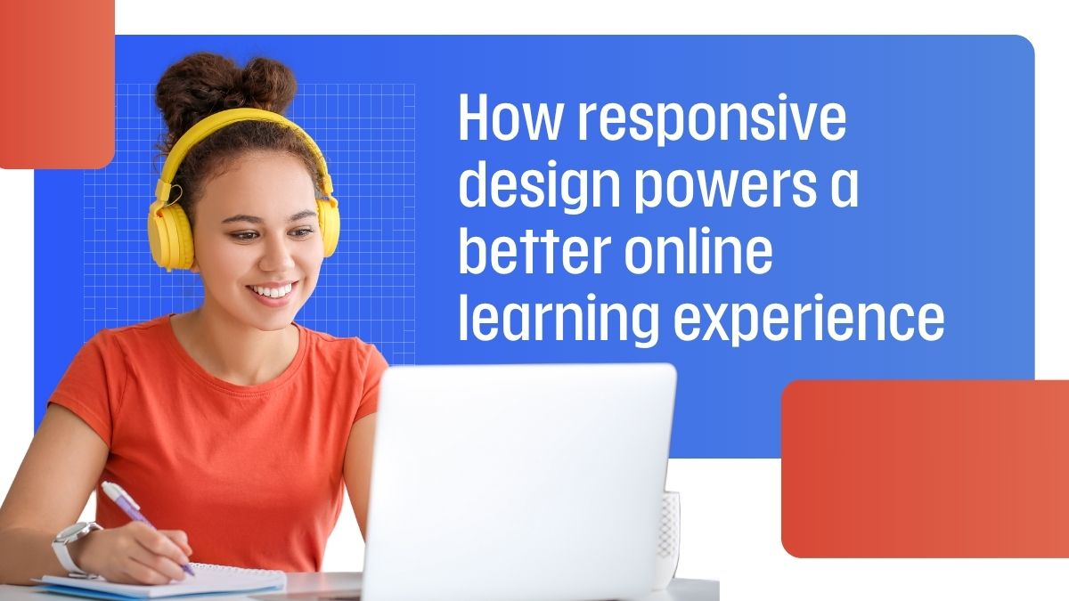
Responsive design powers a better online learning experience because students rarely complete digital courses from one perfect desktop setup anymore. They start a lesson on a laptop, review instructions on a phone, return later from a tablet, and expect the course to remember where they stopped without making the interface harder to use. For online education platforms, this is no longer a design preference. It is part of how people actually learn.
The strongest online learning products do not ask users to adapt their schedule, device, and attention span to the platform. They make the platform adapt to the learner’s environment. A clean layout, readable text, tappable controls, saved progress, fast loading, and clear next steps can decide whether someone finishes a course or abandons it halfway through.
Online learning is different from ordinary browsing because the user is trying to complete a task that may take several sessions. A person reading one article can tolerate a little friction. A person taking a course cannot. If the menu is hard to open on mobile, if the quiz button is too small, if progress is unclear, or if a video block breaks the page layout, the learning process starts feeling heavier than the subject itself.
This matters for schools, training providers, certification platforms, and professional education products. Students may be busy adults, parents, shift workers, drivers, employees, or business owners. They may not have a quiet desk available every time they need to study. A responsive course respects that reality by making each step usable across screens.
Driver education is a useful example because many learners are not taking the course for entertainment. They may need it for licensing, defensive driving, ticket-related requirements, continuing education, or personal confidence on the road. The platform has to guide them clearly from enrollment to lesson completion without adding confusion.
A visitor comparing the NextDoorDriving platform from a phone, tablet, or laptop needs the same basic experience on every screen: clear course information, readable lesson pages, simple navigation, visible progress, and a completion flow that explains what happens next. If the layout works only on desktop; the course loses part of its value for people who study during small breaks in the day.
This is the design lesson for any online learning platform. Responsive UX is not only about making content fit the screen. It is about protecting the learner’s path through the course. The student should always know where they are, what they have finished, what remains, and which action comes next.
| Learning moment | What responsive design should support | What happens when it fails |
| Course discovery | Clear pricing, topic, timing, and eligibility details | Users leave before enrollment because the offer feels unclear |
| Lesson reading | Comfortable text size and spacing on mobile | Students skim poorly or miss instructions |
| Quizzes or checks | Tappable answers and visible feedback | Mistakes happen because controls are cramped |
| Progress tracking | Saved status across devices | Learners repeat sections or lose confidence |
| Completion steps | Clear certificate or next-step guidance | Support requests increase after the course ends |
Completion is often treated as a content problem, but layout can be just as influential. A course may have accurate lessons and still perform poorly if the interface makes progress feel uncertain. Students need a calm sequence: start here, continue here, answer this, review this, finish here. Responsive design gives that sequence shape across devices.
This is especially important for courses that people complete in several sessions. A learner may begin during lunch, continue after work, and finish on the weekend. The platform should not punish that pattern. Navigation should remain familiar, progress should be easy to find, and the next lesson should not be hidden behind menus that behave differently on every screen size.
A learning platform does not need decorative complexity to feel modern. It needs practical clarity. The best design choices are often the ones users barely notice, because they remove small obstacles before those obstacles become frustrating.
Before publishing or redesigning an online course, product and design teams should check whether the experience works in ordinary learner conditions:
People judge digital education by more than the lesson content. They also judge whether the platform feels stable, readable, and respectful of their time. If a course page loads awkwardly, if the checkout step feels confusing, or if mobile navigation changes too much between screens, the user may start questioning the product before reaching the actual material.
Trust matters even more when the course is tied to a practical outcome. A learner completing driver education, workplace training, certification prep, or compliance education wants to know that their progress is recorded and their completion will be handled correctly. Responsive design supports that trust by making the platform feel consistent from start to finish.
A better learning experience starts with fewer interruptions
Responsive design works best when it removes interruptions from the learning process. Students should not have to zoom in to read a paragraph, rotate a phone to answer a question, rewatch a section because the page refreshed badly, or contact support because the final step was unclear. These problems feel small in testing, but they become tiring during a full course.
For online education providers, the practical goal is to make learning feel continuous. A student should move from enrollment to lesson, from lesson to quiz, and from quiz to completion with as little friction as possible. That does not mean the course should feel rushed. It means the interface should stay out of the way while the content does its work.
Responsive design helps online learning platforms serve people in the conditions they actually live in: mixed devices, interrupted schedules, short study windows, and different comfort levels with technology. When the design supports those realities, the course becomes easier to finish, easier to trust, and easier to recommend.