Challenge coin design templates and ideas a practical guide to laying out your coin challenge coin design templates and ideas a practical guide to laying out your coin

A challenge coin looks simple, but designing one is a real constraint problem. You are working on a tiny canvas, usually round and about an inch and three quarters across, with a front and a back and very little room to waste. Whatever you put on it has to read clearly at that size, survive being struck into metal, and still feel like it means something. That is harder than it sounds, and it is why most good coin designs start from the same underlying structure rather than a blank circle. This is a practical guide to that structure, the template most coins follow, and the ideas you can build on top of it.
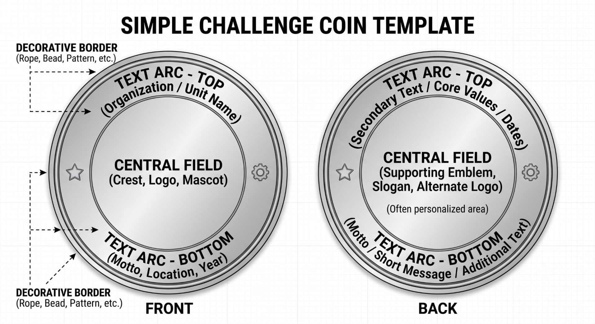
Diagram of a two sided challenge coin template labeled front and back showing decorative borders central fields for crestlogo and motto and surrounding text areas for organization name text arcs and additional info Image

The anatomy of a coin design, your working template

Almost every challenge coin, whatever its purpose, is built from the same handful of zones. Learn them and you have a template you can reuse for any coin you design. Think of these as slots to fill rather than a blank space to invent from scratch.

  • The central field. The heart of the design: the crest, logo, mascot, or central image. Everything else supports it, so decide this first and give it room.
  • The border. The ring around the edge, often a rope, a bead pattern, or a decorative band, that frames the design and gives the coin a finished edge.
  • The text arcs. Text curved along the top and bottom inside the border, usually the organization or unit name across the top and a motto, location, or year along the bottom.
  • The front and back. A coin has two faces. A common and effective split is a bold identity on the front, the crest and name, with supporting content on the back, the motto, values, a secondary image, or space for a name and date.

Before you design anything, map your content to these zones. That single step, deciding what belongs in each slot, is what separates a clean coin from a cluttered one. Most weak coin designs are not badly drawn, they are simply trying to fit too much into too little space.

Design ideas by purpose

The template stays the same. What fills it changes with what the coin is for, so pick your purpose first and let it guide how formal, how illustrative, and how text-heavy the design should be.

  • Unit and organizational coins. Crest or insignia centered, the group name arced across the top, a motto along the bottom, often a fixed color palette. Heraldry-driven and formal.
  • Commemorative and event coins. A date or event name featured, an image tied to the occasion, and often a more illustrative central field than an everyday logo would use.
  • Corporate and brand coins. The logo as the central emblem, brand colors carried through, a tagline in the bottom arc. Cleaner and more graphic, closer to the branding work you already do.
  • Personal and gift coins. The most creative freedom: a portrait, a meaningful symbol, a private joke, with the back left open for a name or a short message.

Designing within the constraints

This is where coin design departs from designing for screen or paper, and where most first attempts go wrong. The medium has rules, and working with them rather than against them is the whole craft.

  • Legibility at size. Detail that looks crisp on your monitor can vanish at under two inches. Keep lines bold, set text large enough to read comfortably, and cut fine detail that will muddy once the coin is struck.
  • Color and enamel. Color on most coins comes from enamel filled into recessed metal areas, separated by raised metal lines. In practice that means every color needs a metal border around it. Two colors cannot simply touch, there has to be a line between them. Design with that in mind and your artwork translates cleanly into metal instead of fighting the process.
  • Enamel versus relief. Flat, color-filled artwork suits enamel. Sculpted, dimensional artwork suits 3D relief, where the metal itself is contoured. These are different design approaches, so choose early rather than halfway through.
  • Text and breathing room. Give the arcs space. Crowding text around the border is the single most common mistake. If the words do not fit comfortably, the answer is almost always to simplify, not to shrink.

From template to finished coin

A coin design is not finished on screen. It is finished in metal, and the two are not quite the same thing. Once your layout is set, the design goes into production, usually with a proof stage first, a digital rendering that shows how the metal, plating, and enamel will actually look before anything is struck. That stage is worth taking seriously, because the constraints above are much easier to navigate alongside someone who works in the medium every day. Many designers take the layout as far as they can, then hand the final production to a custom challenge coin manufacturer who can flag what will and will not hold up in metal, and refine the design together before the dies are cut. The template gets you a strong design. The collaboration gets you a coin that matches it.

Start from the template, not the blank circle

The circle is intimidating precisely because it is empty. The template is not. Map your content to the zones, choose your purpose, respect the limits of size and enamel, and sketch a few rough layouts before you commit to one. A challenge coin is a small object, but a well-laid-out one carries a surprising amount of meaning in very little space. Get the structure right, and the rest of the design follows naturally.

Design Tools & Resources


Pinterest