It is information presented in graphic form, supported by data and text, with the objective of helping the reader get insight into the topic being presented. Infographics are also known as “data visualization” or its shortened form “data viz” or “information design.”
An infographic seeks to present complex information simply, clearly, in a visually appealing and engaging way. It draws the reader into the information, engages him in a conversation and urges action. It presents a meaningful, coherent and relevant story with accurate facts, figures, graphs, graphics, pictures and content to support it.
“By visualizing information, we turn it into a landscape that you can explore with your eyes, a sort of information map. And when you’re lost in information, an information map is kind of useful.” (David McCandless)
Some infographics use a visual metaphor. Some visualize data in colorful ways, using tag clouds, word clouds, bar charts, graphs, maps, and illustrations. A good example of a visual metaphor is this attractive infographic on The State of Open Source Adoption, which shows that 98% of enterprise businesses use open source platforms. Note the visualization (open source platforms as a racehorse versus proprietary platforms as a donkey), the attractive colors, and the data, clearly and simply presented.

Businesses, social interest groups, the government, the media, educators, students and individuals can use infographics powerfully to inform, educate, reach out to key audiences, engage, generate interest and response, create a buzz, receive feedback, build a community of thought-leaders and like-minded people.
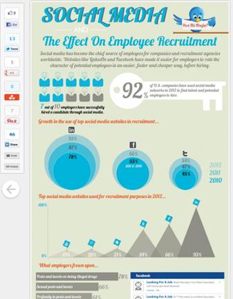
This infographic explores the effect of social media on employee recruitment.
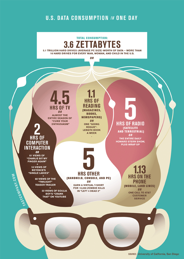
US data consumption in ONE DAY (a stupendous total consumption of 3.6 zettabytes) is cleverly visualized by FastCompany.com in this infographic below.
Infographics
