In this article we wil see how great brochures are born:
Every year, millions of dollars are spent on producing brochures that often end up in the trash without a second glance.That’s why it’s so important to zero in on the purpose of the brochure. What is your brochure going to accomplish?Will it inform, educate, persuade or sell?What is the message it should convey to achieve its purpose?
Great brochure designs begin with good concepts.And good brochure concepts are rooted in the simple questions “Who are you talking to?” and “What are you saying?”
Define your target audience and study their lifestyles and interests to develop your message. You need to understand your product or service and the benefits it offers. Then craft your copy and design your brochure to convey your message most effectively.
The following are a few basic points you should consider while designing a
What would grab their attention?You’ve got to communicate with your audience within seven seconds or less, or you’ve lost them.Only when you’ve arrested their attention will they flip the pages to read more.
Naturally, a brochure targeted to medical professionals to provide information on a new medication will have a whole different look and feel from one that is aimed at young mothers to sell kiddy clothes.
Use visual and verbal metaphors and cues that communicate with your target customer.Use their frame of reference (factors that shape their thinking and define whether an object or situation is familiar or strange), while revealing your product.This will largely influence how your product is perceived by your target reader.
VERTEX
Here are a few examples of good brochure designs to inspire your creative thinking.


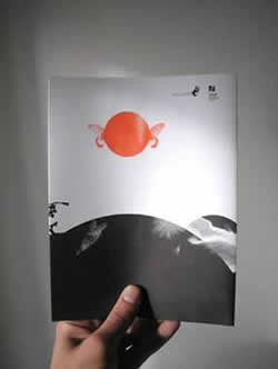
The Vertex brochure pack is for a specialized sports store that sells mountaineering equipment specially designed to ensure the safety and lives of those who derive their highs from climbing to dizzying heights on the rocks.
Targeted to men and women separately, in order to sell the individual products better, the two multi-fold brochures are excellent examples of “putting yourself in your target audience’s shoes” while thinking design.Vivid “product-in-action” photography is combined with “reason-why” content to grab attention and sell, sell, sell. The headline “Make you feel real” uses arresting, unusual typography (see the “Man” brochure) which echoes the heights of exhilaration you reach while mountaineering. In the “Woman” brochure, the rope guides the reader’s eye movementand adds continuity to the design.
Each brochure folds out into impressive 8-page spreads that superbly display the formidable challenge of the mountains, along with the thrills and risks of the rock-climbers.The photos portray Vertex shoes and equipment in action, in places where precision is the highest priority.On the reverse side of the brochures, the products are depicted in close-up and the selling points of style, quality and reliability are highlighted to persuade the target audience to buy.
The brochure covers show exciting photographs of a man and a woman in typical climbing positions on challenging heights. The design makes visually arresting and relevant use of bright orange rock-climbing hand-holds, turning them into a design element.
Both the brochures go into a vibrant orange and black folder-cum-display-pack and the focus is on the shoes as the man and woman on the brochure covers seem to leap out at you!The “must-open” folder cover shows a tight close-up of a hand as if gripping a mountain ledge.
What are the interests of your audience?What kind of look would they respond to?
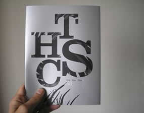
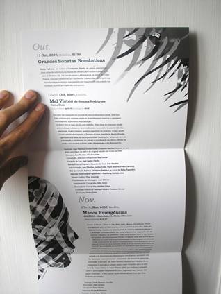
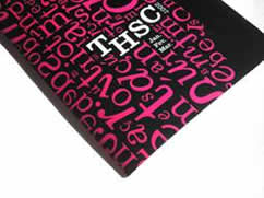
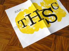
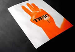
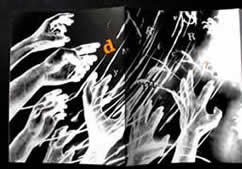
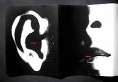
Take a look at these programs/brochures made for a cultural institute: THSC.
  |  |
 |  |  |
 |  |  |
 |  |  |
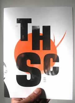 |  |  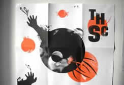 |
Note the distinctive art styles for cover design with emphasis on the logo, and effective use of color with two-color contrasts. The design portrays the five senses of sight, hearing, smell, taste and touch with a modern, free-flowing feel, to appeal to a culture-loving audience. Some of the illustrations are used again along with the text.The brochures open out to become programs and posters.
 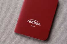  |  An employee orientation handbook designed as a passport – that’s the Redbox stamp of personality!Redbox has turned a boring internal document with information about its various departments, into an easy-to-carry-and-keep passport that promises an exciting tour of the organization. The passport guides the employees through the different departments of the company and includes a set of rubber stamps, one for each of the 15 departments.The rubber stamps indicate the completion of a section during employee orientation.The passport carries positive associations with travel, the excitement and new experiences it holds.The physical act of rubber-stamping the handbook when the employee completes orientation with one department, makes the “passport” experience unique and authentic. An employee orientation handbook designed as a passport – that’s the Redbox stamp of personality!Redbox has turned a boring internal document with information about its various departments, into an easy-to-carry-and-keep passport that promises an exciting tour of the organization. The passport guides the employees through the different departments of the company and includes a set of rubber stamps, one for each of the 15 departments.The rubber stamps indicate the completion of a section during employee orientation.The passport carries positive associations with travel, the excitement and new experiences it holds.The physical act of rubber-stamping the handbook when the employee completes orientation with one department, makes the “passport” experience unique and authentic. |

This brochure for Tessuto Fashion creates an air of mystery with its “barred” cover.
Splash it around or control its usage, depending on your product and your target audience.
Let’s look at two contrasting design styles here.
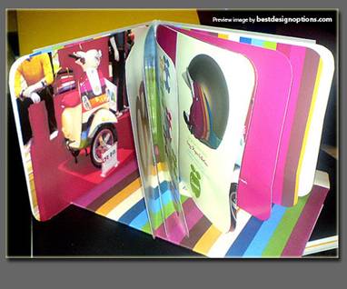
1. The brochure above sells two-wheelers to a youthful audience, using bright, vibrant colors to emphasize their trendiness. The colors are chosen to catch the young person’s eye.
2. The brochure below also uses color judiciously and is designed to reach a more sophisticated audience. Note the use of grey and white to contrast with the color of the artist’s works.
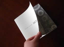
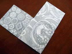
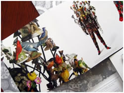
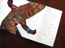
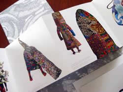
 | Heavyweight Alterskins A creative art exhibition by Nick Cave This brochure was designed for the Fosdick-Nelson Gallery and Nick Cave, a contemporary textile and performance artist.It is created to appeal to the art aficionado, and consists of three brochure/direct mail pieces enclosed within a cross-shaped folder, celebrating the artist’s creations and performances. Sober grey contrasts with brilliant color, as the folder opens up to reveal elaborate beading and patterns from Nick Cave’s pieces, shown in a neutral grey on the inside of the folder to contrast with the vividness of the artist’s textile work, while drawing attention to the intricacy of it. |
 |  | |
 |  |  |
 |

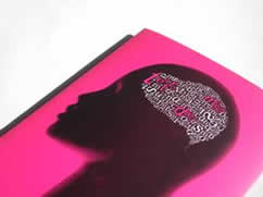
Run your eye over the brochure on the left, which uses typography in different colors to evoke certain feelings and emotions. How do the words make you feel?Do the colors contribute to the feeling?
Warm colors like red, orange and yellow lie in the red area of the color spectrum and depending on their intensity, can evoke feelings of warmth and comfort or anger (“seeing red”) and hostility.Reds and yellows are stimulating colors.
Cool colors like blue, purple and green lie on the blue side of the spectrum and can make you feel calm and peaceful (which is why blue or green are often used in hospitals)but can also stir up feelings of sadness (“feeling blue”) or indifference.
Different sections of content can be color-coded to brighten up your brochure, highlight important points and make it stand out from standard staid, predictable and boring brochures. This works especially well in the case of corporate and design guidelines and instruction booklets, like the brochures below.

Remember that dark colors have more weight than lighter colors.
Some colors are weightier than others.Red is heavy, yellow is light.
Warm colors tend to expand and so are perceived to be heavier than cooler colors.
Keep these facts in mind while designing your brochure.
Use heavier colors with restraint, in smaller patches of color, to direct eye movement, flag an element, or create focal points within pages. Heavier colors will appear to be larger than their actual size.Use lighter colors as backgrounds or as visual relief for darker ones.

This brochure cover is printed with pantone metallic colors on special embossed wood textured paper.You can almost run your finger over the wood grains, like you would stroke a tree!The inside of the brochure carries beautiful photographs and uses blurbs with captions to make a point for “skimmers”, as well as draw attention to the facing pages carry detailed text for more serious readers.


Ozlab Fun Factory, a Disney-style entertainment park serves up fun that’s good enough to eat, as per this promotional brochure that has big bites taken out of the sides of it.

Take a ride on the wild side with this dynamic brochure for American Adventure. Its die-cut cover shows a group of whitewater rafting enthusiasts all set for an action-packed adventure on the rapids.

Nutcracker – The brochure for the San Francisco Ballet’s Nutcracker performance features pop-up cutouts of familiar Christmas characters and images in a colorful background. The brochure folds into a five-pointed star shape and the star motif is used on the color-coded section folds.