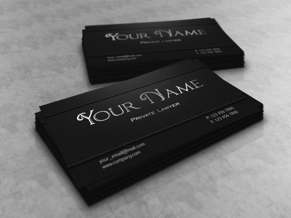
Business cards are a tool for representing a professional’s or company’s portfolio. Using a mockup will go a long way in terms of visualizing the broad range of business card presentation styles for one to look at. Here are some reasons why business cards matter a lot and why mockups can help enhance these benefits.
There are a variety of factors that impact the type of business card one prefers. These include things like:
For these reasons, different biz card mockup softwares may be more suitable for some professionals than others. Here are some exciting programs for some companies to take advantage of.
| CorelDRAW | Known for strong vector graphic capabilities and advanced layout tools; great for detailed and scalable designs |
| Sketch | Lightweight, user-friendly, vector-based design tool primarily used for UI/UX design; |
| Affinity Photo | Professional-grade photo editing and raster graphics software; cost-effective, since it can be purchased for a one-time fee unlike a software like Photoshop |
| Yellow Images | Yellowimages.com’s strength rests in the impactful realism of its mockups as well as endless flashy ways of displaying and storing the actual cards, leaving no need to stay complacent with generic designs. Its mockups can subsequently be edited in a program like Affinity Photo. |
The first thing to do is search for a style that suits your taste and projects your professional attitude. When it comes to business cards, the essence of it all is to make a powerful, lasting impression. Mockups allow you to clearly see how the presentation will look before you go and mass produce it. Here is how the process works on Yellowimages.com.
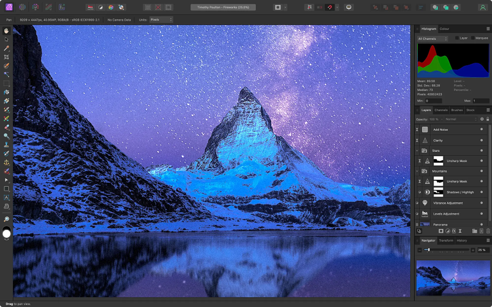
This is a very powerful program, which is a staunch competitor to Photoshop. One important difference is that you only have to pay for Affinity Photo one time and the program is yours – no subscription required. Here are the steps for editing your mockup in Photoshop.
Go to file > Open and choose the PSD, NPG, or JPEG business card mockup file that you’d like to modify
Check the dimensions to ensure that the document has the proper business card size, which is typically 3.5 x 2 inches with a bleed area usually of 0.125 inches around the edges.
If necessary, go to View > Show Rulers to double-check the bleed guides.
Otherwise, to manually check the bleed area, select Bleed Area in the Resize Document settings or use the guides.
Open the Layers Panel by choosing View > Studio > Layers. This will allow you to see all of the mockup elements.
View the layers with placeholder text or images. These are commonly labeled “Your Logo,” Your Name”, or “Your Contact Info”.
To ensure that you don’t accidentally modify background elements (such as shadows or established texture), you can lock them by clicking the lock icon in the Layers Panel.
This is where you get to style the text, the font, the spacing, the alignment, and the color in a fashion that communicates your company’s identity. Make sure everything is legible and it fits.
If you wish to add new text, press on the Text Tool and click anywhere to insert a text block featuring whatever information you want to add at that location, such as contact details or your job title.
If you’d like to edit any background or design elements, choose the layers and fill in colors using the Color Picker or Fill options in the color palette to match your brand colors
If you wish, you can add shadows, gradients, bevel/emboss, outer glow, or other special effects. First, select the layer you wish to modify and then go to the Effects Panel and choose which effect you’d like to add.
Use the alignment tools in the toolbar or the Arrange menu to ensure your text and images are properly aligned and spaced apart.
Check for consistency and balance in the margins, padding, and overall layout.

There is a right way and a wrong way to produce a biz card mockup, under normal circumstances at least. Here are the aspects that matter the most.
Winning designs: One that gives the impression of having been meticulously crafted. Every element is perfectly designed and balanced out with no visual distractions. The font is clearly legible and the hierarchy of information is clear.
Losing designs: Cluttered and chaotic with misaligned text or images and awkward spaces.
Winning design: adheres to the established color palette, fonts, and general artistic style used in the company’s logos, advertising materials, and media. This helps consistently convey the company’s identity and adds a sense of harmony throughout its design.
Losing design: ugly or inconsistent color schemes and fonts.
Winning design: High-quality images. This is huge when it comes to attracting eyeballs and projecting an air of legitimacy.
Losing design: pixelated or stretched images, low-resolution logos, or blurry graphics. Clip art and generic stock photos also enhance skepticism.
Winning design: the purpose of the business card is clearly communicated in a way that resonates in a specific way with the target audience. The values and personality of the brand are reflected.
Losing design: disconnected from its intended purpose or audience, such as a law firm using overly bright colors.
