Learn how to create amazing shadow effects in CSS using the Box Shadow Property.

This tutorial will teach you how to create inner and outer shadows and will give you sample code for different kind of shadows you can create using CSS. You will also learn how to make a text box with a shadow effect.

These effects can be made using the Css Box Shadow Property. There are two types of shadow effect that are possible using Css Box Shadow Property. Look at the images above.
The first one has Css Shadow Property applied on the outer side of the div element.
The Second one has Css Shadow Property applied to it on the inside of div element.
This Property works for IE9, Opera, Firefox and Webkit browsers like Safari, Chrome.
IE9 and Opera use simillar code to display the shadow while for Firefox and Webkit Browsers, a prefix needs to be added before the code.
Lets have a look at the code:
To create Outer Shadow:
box-shadow:X-Offset Y-Offset Blur Blur-Offset Color;
Ex: box-shadow: 0px 0px 20px 10px #00CED1;
To create Inner Shadow:
box-shadow:Inset X-Offset Y-Offset Blur Blur-Offset Color;
Ex: box-shadow:inset 0px 0px 20px 10px #00CED1;
The only difference between the two codes is the keyword inset. If you put it in the code you’ll get an Inner Shadow. The rest of the code is same.
Inset : To create an inner shadow.
(do not write this keyword to create outer shadow. )
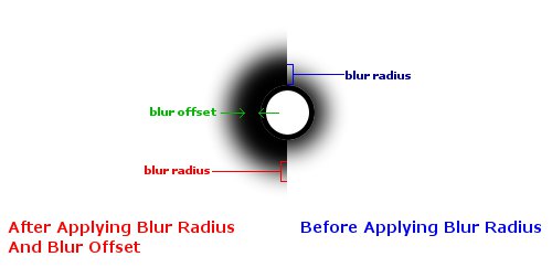
X-Offset : Shifts the shadow horizontally along the X-axis.
Y-Offset : Shifts the shadow vertically along the Y-axis.
Blur : Blur Radius for Radial Bluring effect on the shadow.
(0 is min value with no blur effect.)
Blur-Offset :(optional) Offsets the Blur Radially.
Color : Here Color name or Hex Color Code or RGBA color values can be declared.
Lets start by declaring width and height for the <div id=example
> and then the Shadow Property. To apply shadow effect to this <div> </div> element we’ll have to give it an id. Give it an id=example
.
To display Shadow in Firefox a prefix -moz-
needs to be added before the code. And for Webkit Browsers -webkit-
needs to be added before the code.Example:
For IE and Opera – box-shadow: 10px 20px 30px 30px #00CED1;
For Mozilla Firefox -moz-box-shadow: 10px 20px 30px 30px #00CED1;
For Webkit Browsers -webkit-box-shadow: 10px 20px 30px 30px #00CED1;
You should put all the three code types so that the shadow is visible on all browsers.
<head>

<style type=text/css>

#example{width:250px;
height:80px;
box-shadow:0px 0px 20px 0px #000;
-moz-box-shadow:0px 0px 20px 0px #000;
-webkit-box-shadow:0px 0px 20px 0px #000;
}

</style>

</head>Now you only have to paste this empty <div> </div> inside your <body></body> tags.
<body>
<div id=example>

</div>
</body> Here are some examples how you can manipulate the Outer shadow just by changing the Offset and Blur radius values.

#example0{box-shadow:0px 0px 20px 0px #000;
-moz-box-shadow:0px 0px 20px 0px #000;
-webkit-box-shadow:0px 0px 20px 0px #000;
 }
#example1{box-shadow:0px 0px 20px 10px #000;
-moz-box-shadow:0px 0px 20px 10px #000;
-webkit-box-shadow:0px 0px 20px 10px #000;
 }
#example2{box-shadow:20px 0px 20px 10px #000;
-moz-box-shadow:20px 0px 20px 10px #000;
-webkit-box-shadow:20px 0px 20px 10px #000;
 }
#example3{box-shadow:20px 20px 20px 10px #000;
-moz-box-shadow:20px 20px 20px 10px #000;
-webkit-box-shadow:20px 20px 20px 10px #000;
 }
#example4{box-shadow:inset 0px 0px 20px 0px #000;
-moz-box-shadow:inset 0px 0px 20px 0px #000;
-webkit-box-shadow:inset 0px 0px 20px 0px #000;
 }
#example5{box-shadow:0px 0px 10px 5px #000;
-moz-box-shadow:0px 0px 10px 5px #000;
-webkit-box-shadow:0px 0px 10px 5px #000;
 }
#example6{box-shadow:inset 5px 0px 5px 5px #222;
-moz-box-shadow:inset 5px 0px 5px 5px #222;
-webkit-box-shadow:inset 5px 0px 5px 5px #222;

 }

#example7{box-shadow:inset 5px 5px 5px 5px #222;
-moz-box-shadow:inset 5px 5px 5px 5px #222;
-webkit-box-shadow:inset 5px 5px 5px 5px #222;


} Because of compatibility issues with some of the browsers will use <div id=textbox
> to display this textarea.

Now let’s see how we have made this effect:
We’ll have to use the inner shadow here, with Blur Radius of about 80 px and Blur Offset set at 40px. Then we’ll put some text inside the <div id=textbox
> . This textbox has a fixed width and height. I’ve added another Css property overflow which keeps the text inside the <div id=textbox
> .
<head>

<style type=text/css>

#textbox{border:3px solid #000;;
width:540px;
height:300px;
color:#000;
background:#aaa;
overflow:scroll;
overflow-x:hidden;
margin:auto;
box-shadow:inset 0px 0px 80px 40px #000;
-moz-box-shadow:inset 0px 0px 80px 40px #000;
-webkit-box-shadow:inset 0px 0px 80px 40px #000;
}

</style>

</head>Line 4 › #textbox{
→ This is the Id of to the div that we are going to use as textarea.
Line 5 › border:3px solid #000;;
→ Here 3px is the width of the border. Solid is the type of border. #000 is Hex code for Black Color.
Line 6 › width:540px; Line 7 › height:300px;
→ Tospecify Width and height for this <div id=textbox
> tag.
Line 8 › color:#000;
→ This color property changes the font color for the text inside <div id=textbox
> tag.
Line 9 › background:#aaa;
→ Again this is the Hex Color Code which makes the background slightly greyish for
<div id=textbox
>.
Important Line 10 › overflow:scroll;
→ This is the Css Property that makes this <div id=textbox
> behave like a textarea.
Important Line 11 › overflow-x:hidden;
→ Another Extension for Css Overflow Property. It hides the horizontal scroller which was generated on line 10.
Line 12 › margin:auto;
→ Margin auto positions the <div id=textbox
> in the center. (The value auto works only when width is also defined.)
Important
Line 13 › box-shadow:inset 0px 0px 80px 40px #000;
Line 14 › -moz-box-shadow: inset 0px 0px 80px 40px #000;
Line 15 › -webkit-box-shadow: inset 0px 0px 80px 40px #000;
→ Box-shadow property for all the browsers.
Now you need add about 150 words or about 1000 characters inside <div id=textbox
> to make this textbox scrollable.
<body>
<div id=textbox>

This is made using CSS Box-Shadow Property.
This is made using CSS Box-Shadow Property.
This is made using CSS Box-Shadow Property.
This is made using CSS Box-Shadow Property.
This is made using CSS Box-Shadow Property.
This is made using CSS Box-Shadow Property.
This is made using CSS Box-Shadow Property.
This is made using CSS Box-Shadow Property.
This is made using CSS Box-Shadow Property.
This is made using CSS Box-Shadow Property.
This is made using CSS Box-Shadow Property.
This is made using CSS Box-Shadow Property.
This is made using CSS Box-Shadow Property.

</div>

</body> 


