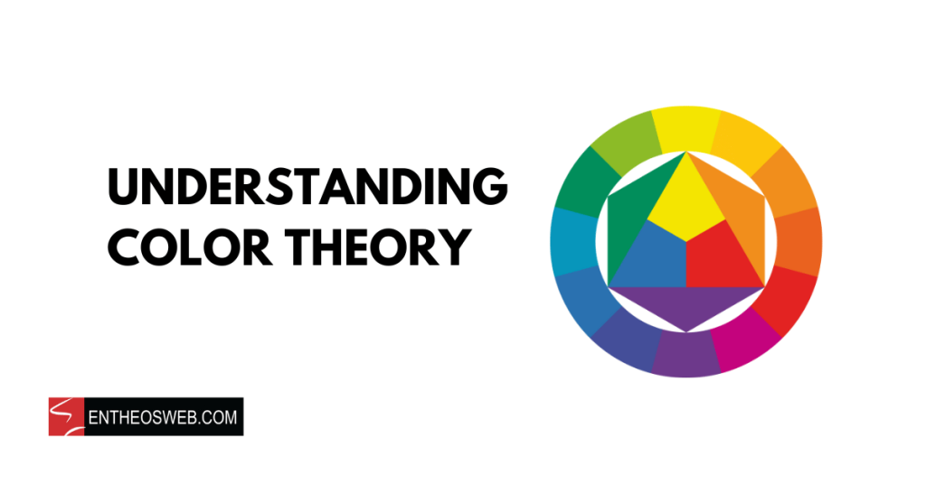
Color theory is a set of guidelines and principles that explain how colors interact with each other. It helps artists and designers understand the relationships between colors and how to create visually pleasing combinations. By studying color theory, you can effectively use color to evoke emotions, create harmony, and communicate messages in various visual mediums.
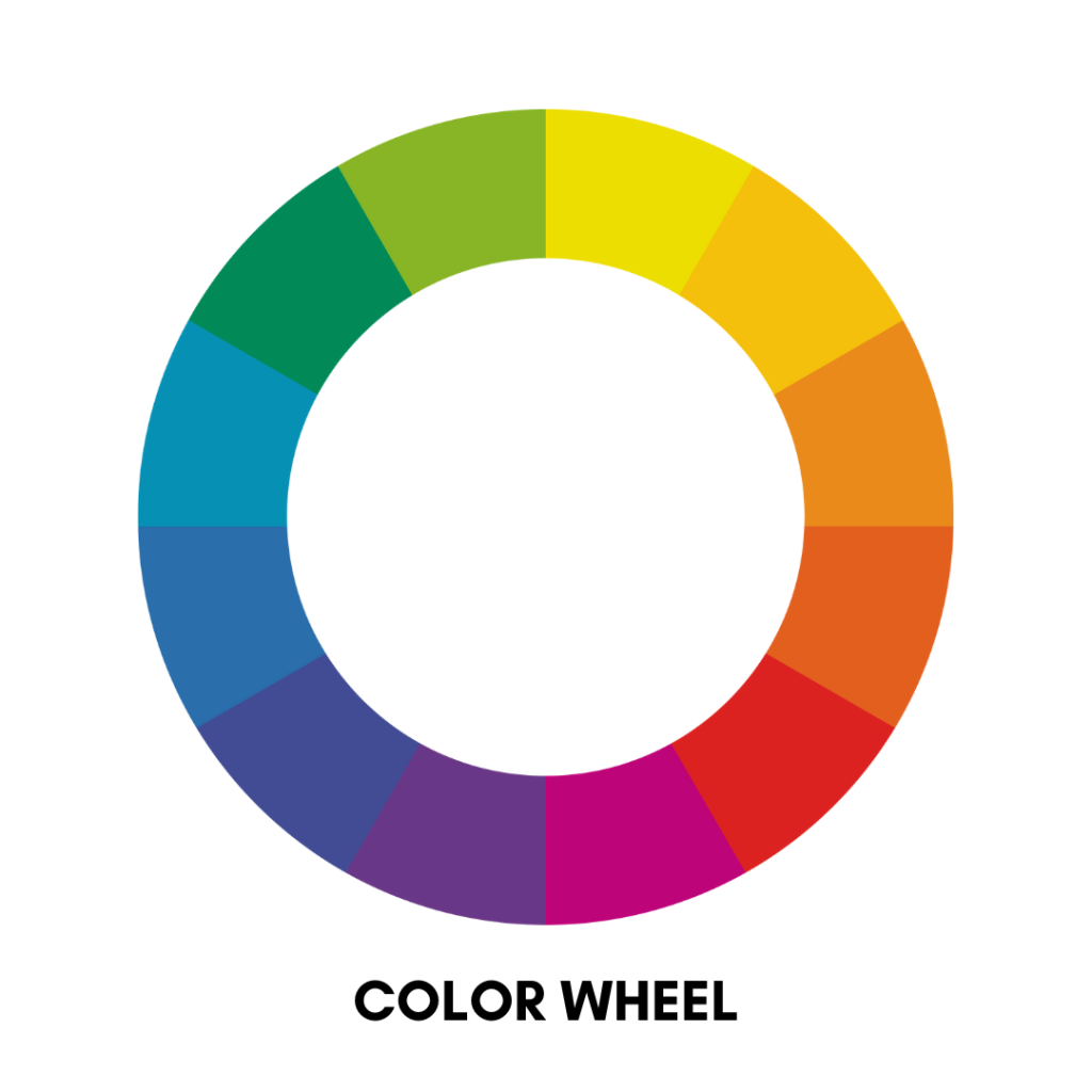
Imagine a circle filled with different colors. That’s the color wheel. It’s like a rainbow in a circle, showing all the colors of the spectrum. The color wheel is divided into primary colors, secondary colors, and tertiary colors.


These are the building blocks of all other colors. They are red, blue, and yellow.

When you mix two primary colors together, you get secondary colors. They are green (mixing blue and yellow), orange (mixing red and yellow), and purple (mixing red and blue).


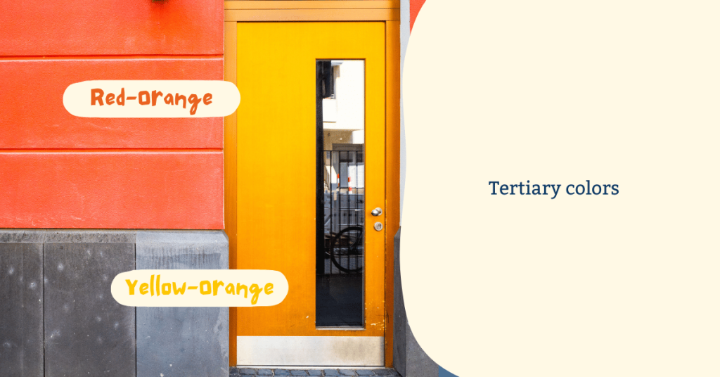
These are created by mixing a primary color with a secondary color. Examples include red-orange, yellow-orange, yellow-green, and blue-purple.
Color harmony is about how colors interact with each other and how they make us feel. Color harmony involves using color combinations that are visually appealing and attractive. This process involves selecting colors that complement and boost each other. There are several color harmony techniques, but here are a few:
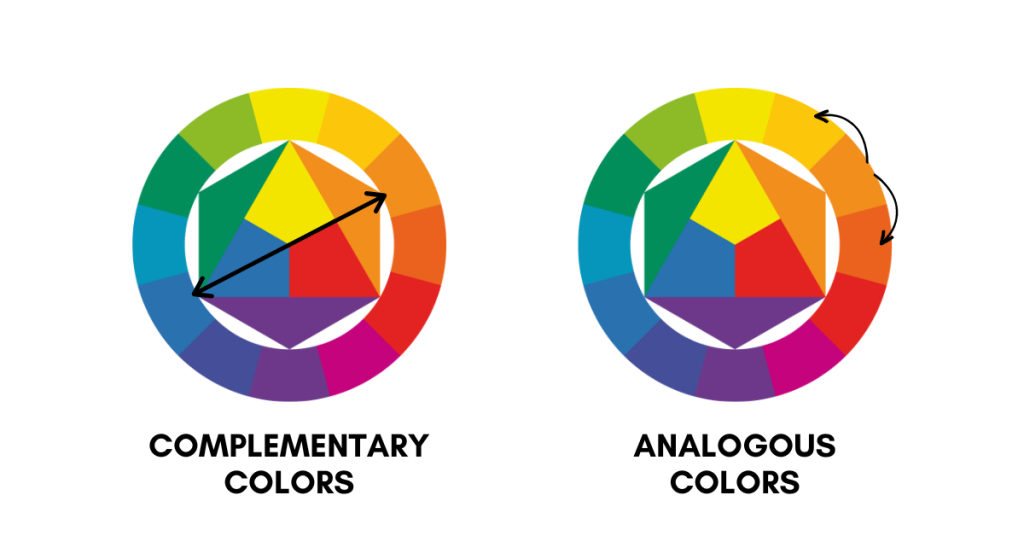
These are colors that are opposite each other on the color wheel, like red and green or blue and orange. They create a strong contrast and make each other stand out.
These are colors that are next to each other on the color wheel, like blue, green, and yellow. They create a sense of harmony and are pleasing to the eye.
Example of web design using analogous colors:

These are three colors that are evenly spaced around the color wheel, like red, yellow, and blue. They create a vibrant and balanced look.
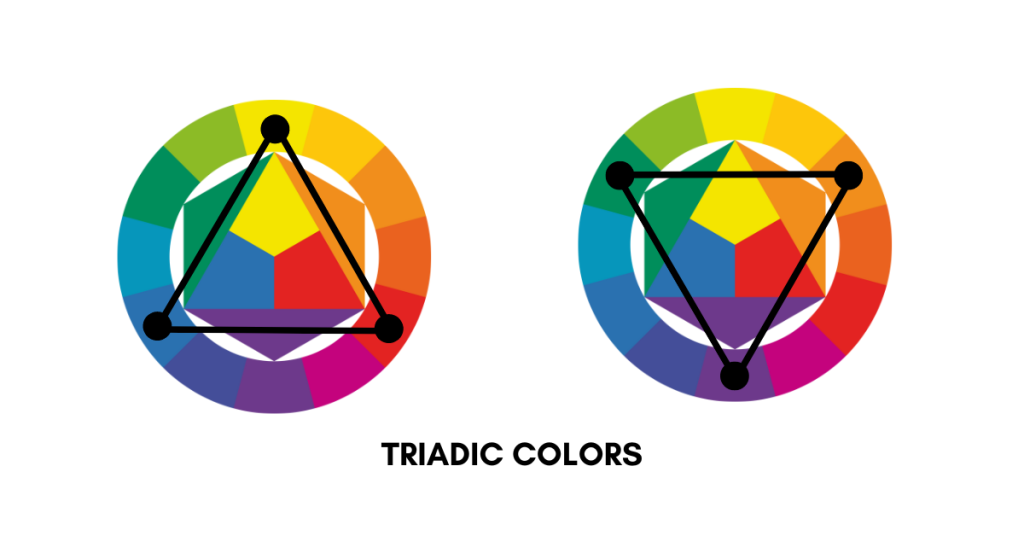
Example of web design using triadic colors:


Colors can also be grouped into warm and cool categories based on the feelings they evoke.
These are colors like red, orange, and yellow. They remind us of things like sunlight, fire, and warmth. Warm colors can make a space feel cozy and inviting.
Example of web design using primarily warm colors:

These are colors like blue, green, and purple. They remind us of things like water, sky, and coolness. Cool colors can make a space feel calm and relaxing.
Example of web design using primarily cool colors:


There are various components of color.
Hue refers to the pure spectrum colors commonly identified by the color names, such as red, violet, or green. It is essentially the basic color itself, without any addition of white or black to alter it.
Value, in terms of color, indicates the lightness or darkness of a color, essentially determining how much light a color reflects. It’s a measure of how much white or black is mixed in with the color, where adding white produces a tint and adding black produces a shade.
Saturation describes the intensity or purity of a color, indicating the degree to which the hue is diluted with white or black. High saturation means the color is vivid and intense, while low saturation results in a more muted, grayish tone.

Colors can also affect our emotions and perceptions. For example:
Often associated with passion and energy, but it can also signify danger or anger.

Example of web design primarily using red:

Evokes feelings of calmness and serenity, but it can also represent sadness or coldness.

Example of web design primarily using blue:

Symbolizes happiness and optimism, but too much yellow can be overwhelming or chaotic.

Example of web design primarily using yellow:


Color Design Resources:


