Muted pastels are finding an important place in website design, giving the site visitor a welcoming look in contrast to bold, bright and neon colors that can diminish the impact of site content.
Muted pastels create a number of positive effects. Soft pastels including “there-but-not-there” greys, form beautiful near-neutral or neutral backgrounds that enhance photography, illustration and art, making your product the hero of the webpage.
Muted pastels can evoke a number of different responses, emotions and moods in your audience, while presenting a backdrop where your product and message takes centerstage.
These are some of the effects of muted pastels in web design:
Imaginative. Creative. Whimsical.
Pastels are light and airy, leading one into the realm of imagination. Websites for creative studios, start-up companies, photographers,
artists, writers, illustrators, and all kinds of creative, innovative and inventive people make use of pastel designs to showcase their work
effectively.
Sarah – Premium WordPress Theme

Frostofolio | Personal Website Fully Responsive
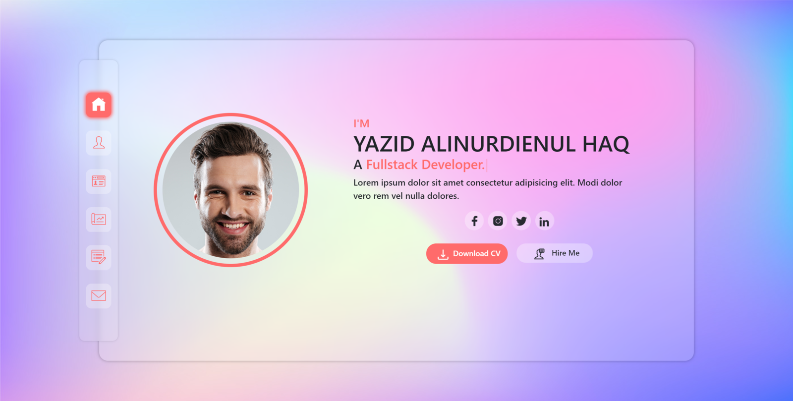
Sophisticated. Dreamy. Romantic.
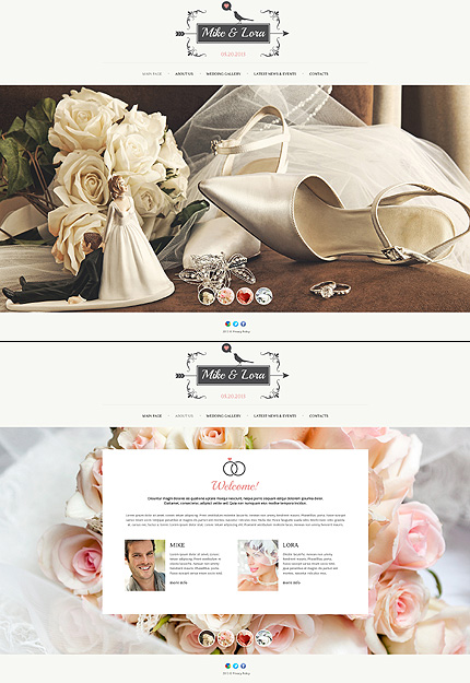
Softer colors evoke a soft, emotional feel, which is why they are so popular in romantic and wedding websites. Pastel shades lend an elegant appearance to the presentation of clothes and jewellery, a romantic feel to wedding support services and restaurants.
While some pastel shades like pink and lavender have a feminine look and are favorites for women’s products and services, pastel websites in browns, greens, blues and warm earth tones work well for men’s products and services too.
Calm. Soothing. Tranquil.
Pastels in cool blues and greens as well as warm mid-tones like orange, yellow and brown have a calming effect, which makes
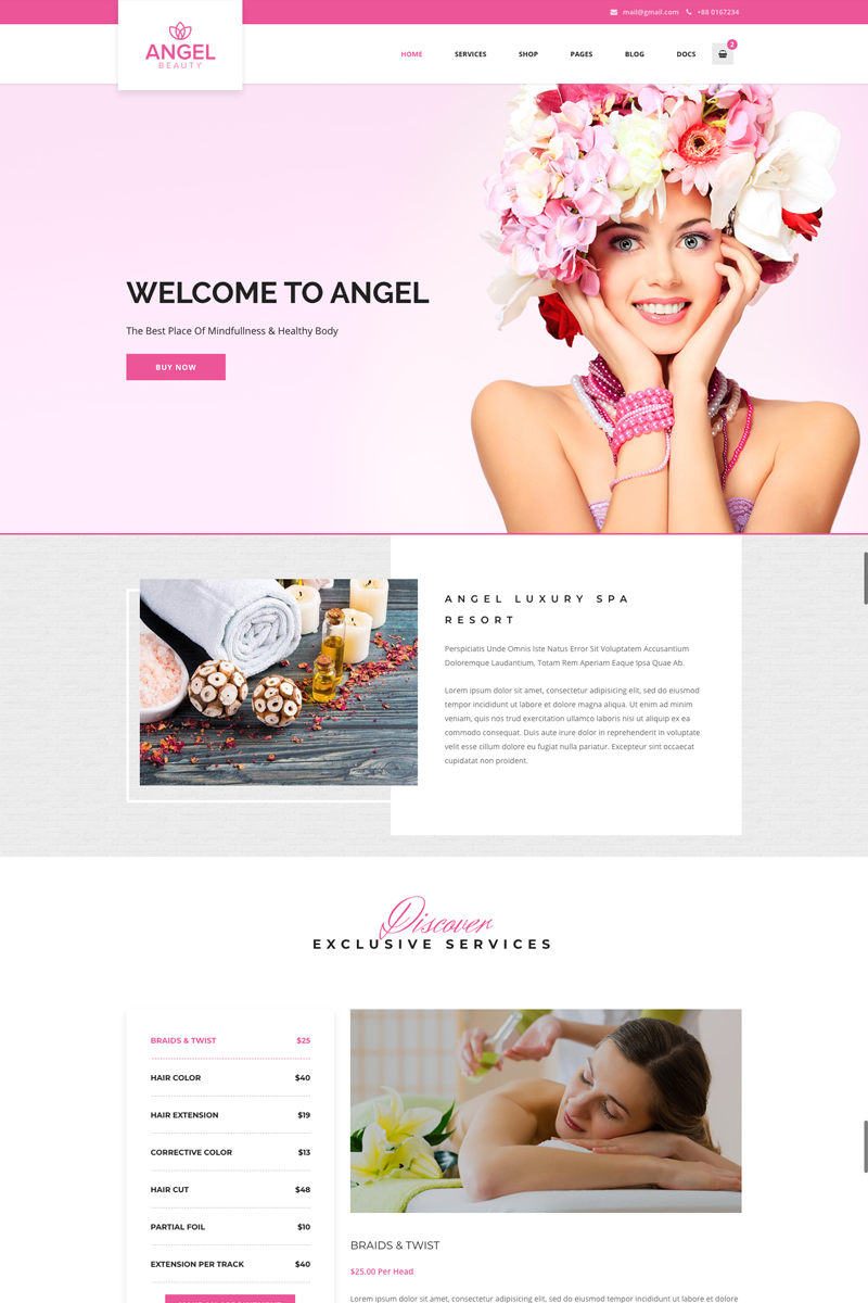
them popular in websites promoting the nurturing services such as health care, babysitting and family support services, spas and beauty parlours.
Angel – Beauty Salon Store WooCommerce WordPress Elementor Theme
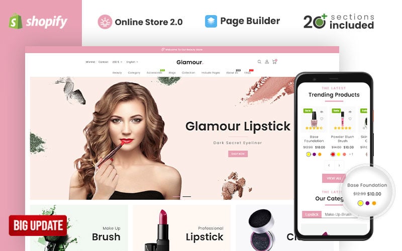
Glamour Cosmetics Store Shopify Theme
Summer Juices & Shakes – PrestaShop Responsive Theme

JazzBeat – Music Shopify Theme
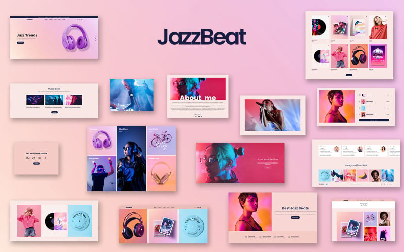
Light-hearted. Childlike. Playful.
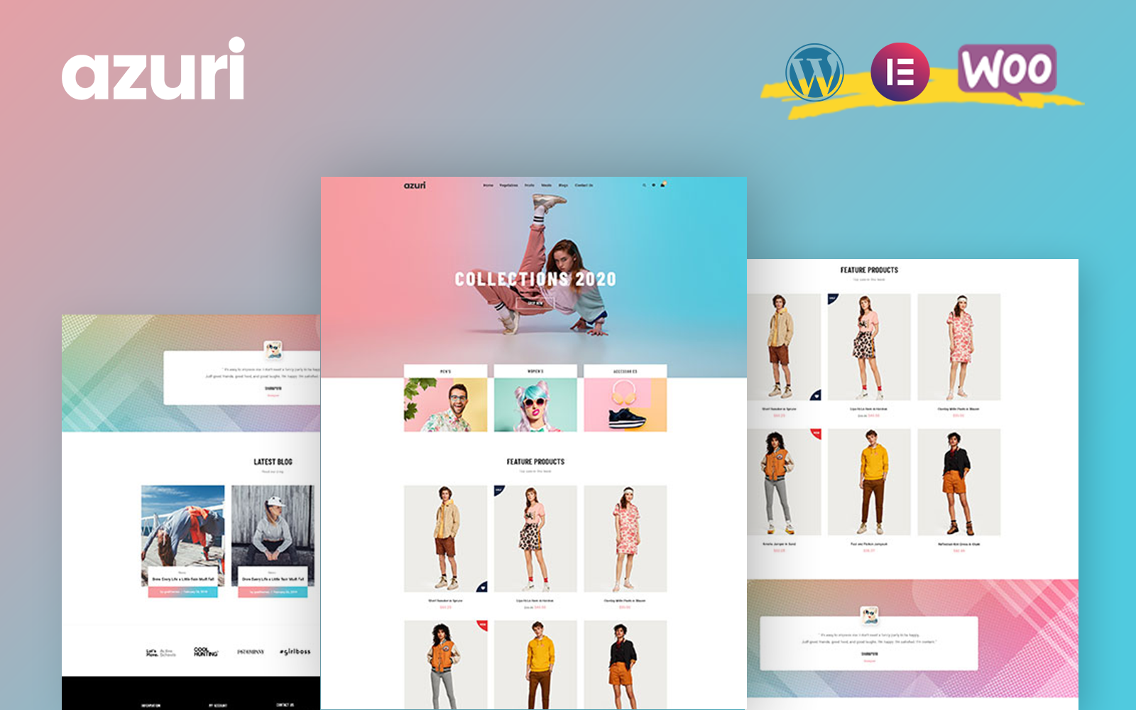
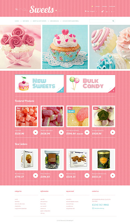
Pastels have a playful feel and work well in bakery and confectionery sites, or in websites for children’s products or play schools.
Azuri – WooCommerce WordPress Theme
Soft pastels used inillustrations provide a distinctive look. Even day-to-day services like plumbing can be presented in a way that provides a reassuring appearance and captures the spirit of fun, using vector-style illustrations in pastel shades.
Infographics need to present a lot of content and pastel shades make them attractive without diverting attention from the main points to be conveyed. Pastels in infographics diminish visual noise on the web, and convey information in a friendly way without overwhelming the site visitor.
How best to use pastel shades on the web?
Pastel colors blend well into the prevailing popular website design trends of flat design, bold text, minimalism and clean layouts, illustration, parallax scrolling, handwritten text and retro design, as you will see from the examples below.
Flat design, bold text
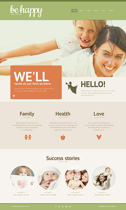
Family Guide Responsive WordPress Theme
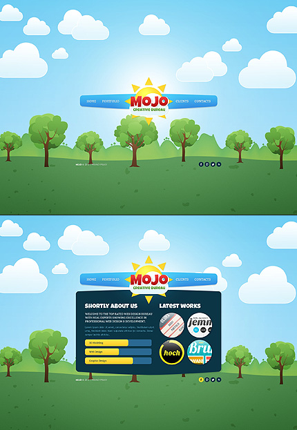
Parallax Scrolling and Illustration
Creative Studio Flash & XML Website Template

Illustrated Single Page Website Design With Parallax Scrolling
Retro Style Design, Pastel or Handwritten Fonts
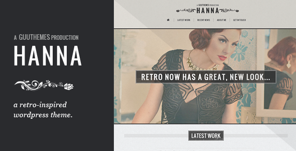
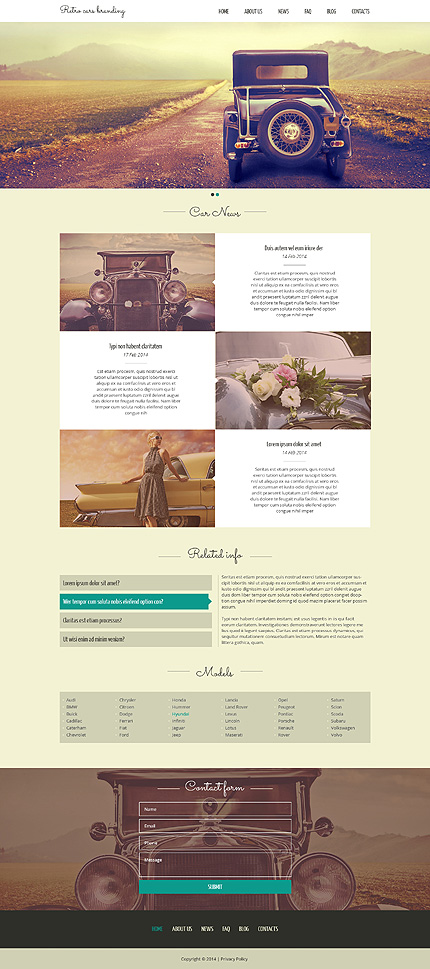
Faded colors represent the passage of time and evoke nostalgia, which is why pastels are a natural choice in retro-style designs with hand-written or pastel fonts and delicate, old-world visual embellishments.
Wedding Album Retro JS Animated Template with Gallery
Hanna – Responsive Retro WordPress Theme
Colorized Photographs and Minimalism
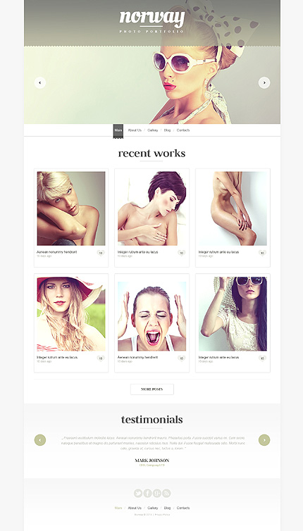
Colorized photography is another design trend where pastels are a hot favorite. Photographs are tinted with warmly subdued hues to create pastel effects using Photoshop and other image editing software, so you can carry your website color palette from graphics and background right through into the photography for maximum effect.
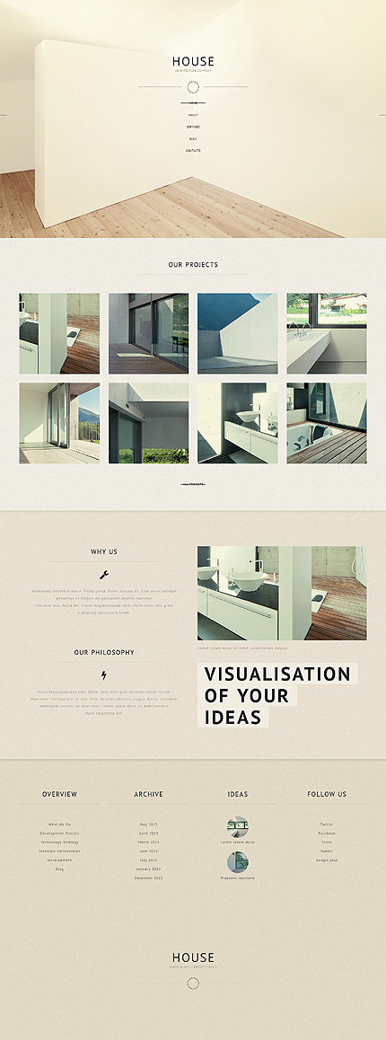
Pastel colors also ride on the prevailing trend towards minimalism, that cuts away unnecessary clutter and focuses attention on the message and content.
Norway Portfolio Responsive WordPress Theme
House Architecture Responsive WordPress Template
Retro Cars Responsive Website Template
Wedding Minimalist Template with Photo Album and Blog

Although faded colors are in vogue especially for retro style web design, soft colors need not have a dull and washed-out look. Muted shades in a whole range of complementary,contrasting or monochromatic color palettes create a pleasing appearance, define brand personality
and promote all kinds of products and services on the web.
Are you just a bit tired of the bold, in-your-face, sometimes harsh and jarring colors that bombard you on the web? They tend to compete
with many other web elements in the already cluttered webosphere and create a “too busy” look. Subtle pastels provide a welcome change,
a ”breather” in this noisy atmosphere, help your product stand out and create a distinctive look while evoking positive emotions.
Try them out for your next web project!
Color Design Resources:
