Forbes says “Blue and purple are the new black” You can expect many tech products in the market to be blue and purple as these are the trending colors this year.

But hey, purple isn’t even a real color, right? Let’s look into that statement.
“In common English usage, purple is a range of hues of color occurring between red and blue. In color theory, purple colors are any colors on the line of purples on the CIE chromaticity diagram (or colors that can be derived from colors on the line of purples), i.e., any color between red and violet, not including either red or violet themselves.
The first recorded use of purple as a color name in English was in 975.”
Source: Wikipedia
Shades of purple
Since red is a warm color and blue is a cool color, the shades of purple derived from combining the two are called red-purple, purple, and blue-purple. Red-purples are warm shades of purple, purple is neutral, and blue purples are cool shades of purple. Source
How is purple different from violet?
Violet is a ‘’real ‘’color that exists on the electromagnetic spectrum. It is visible at one end of the spectrum when sunlight is split using a prism. Purple on the other hand is a perceived color that is a mixture of red and blue, the result of the human eyes and brain working together. The color purple doesn’t really ‘’exist’’ as there is no wavelength of light we produce called purple. Read more from this great answer on Quora by Bowen Li
Associations with purple
Purple is associated with royalty, wealth, nobility, sophistication, romance and luxury and is used in used in heraldry and logos. Exotic, spiritual, creative, imaginative, dignified are other associations. Since purple is a color you rarely see in nature, stronger shades of purple tend have an artificial feel to them, depending on how they are used in the design. Purple has more of a feminine than a masculine association. It is used in a variety of health, spirituality, fashion, beauty and lingerie product websites because purple calms and soothes more than any other color.
The 12-color wheel is a quick way to understand analogous and complementary colors. Colors close together on the color wheel are analogous colors, colors opposite each other on the color wheel are complementary colors. And what is a split-complementary combination, you may ask? That is when you use a color along with colors adjacent or analogous to its complementary colors. These colors make an effective statement without making too strong or jarring a contrast as a complementary color would.

12-color wheel. Source: Wikimedia Commons
As purple is a mix of red and blue, you’ll find shades of red, and pink too on purple and blue websites. Purple can get overpowering at times, so pair it with white or black.Textures, accents, geometrics, color gradients or solid color can all be used to enhance the appeal of the color when it is used in design.
Purple with analogous colors
Analogous colors are close together on the color wheel, look good when used together and your design is pleasant and harmonious. Purple, blue and green are analogous colors on the color wheel.
Get ideas and inspiration with this collection of purple and blue website designs.
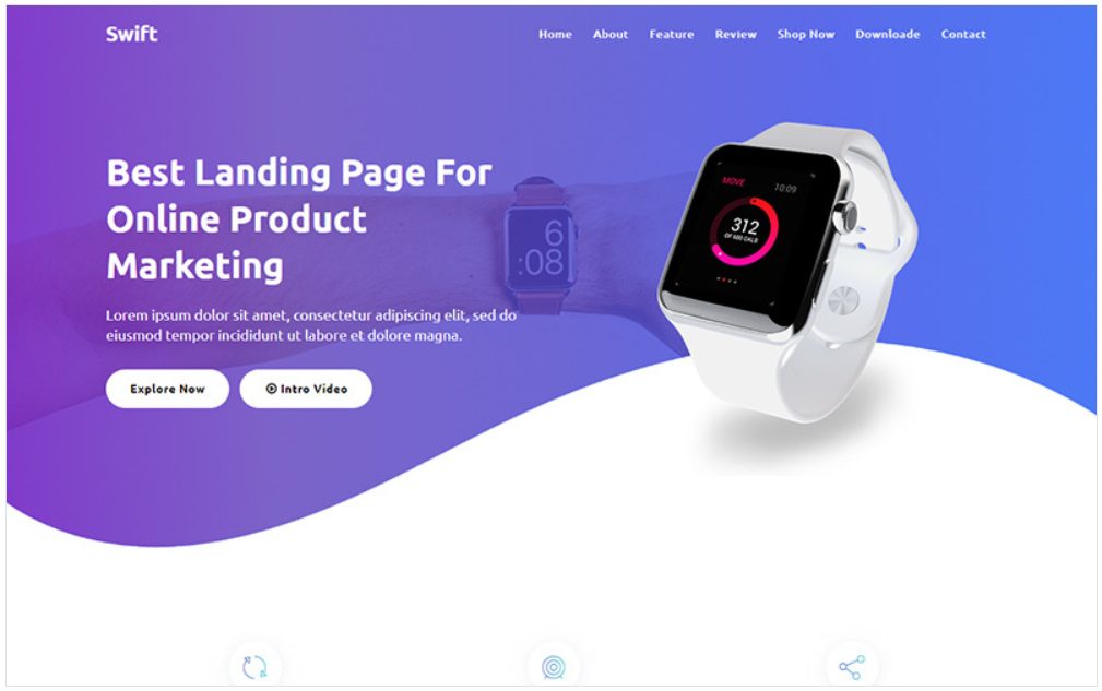
Swift – Product Landing Page Template
Eventagy – Event Agency WordPress Elementor Theme

Medicap – Medical WordPress Elementor Theme

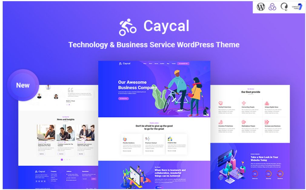
Caycal – Startup Technology & Business Service WordPress Theme
Techsell – Corporate Responsive Website Template

Sceo – SEO and Digital Marketing Agency WordPress Theme

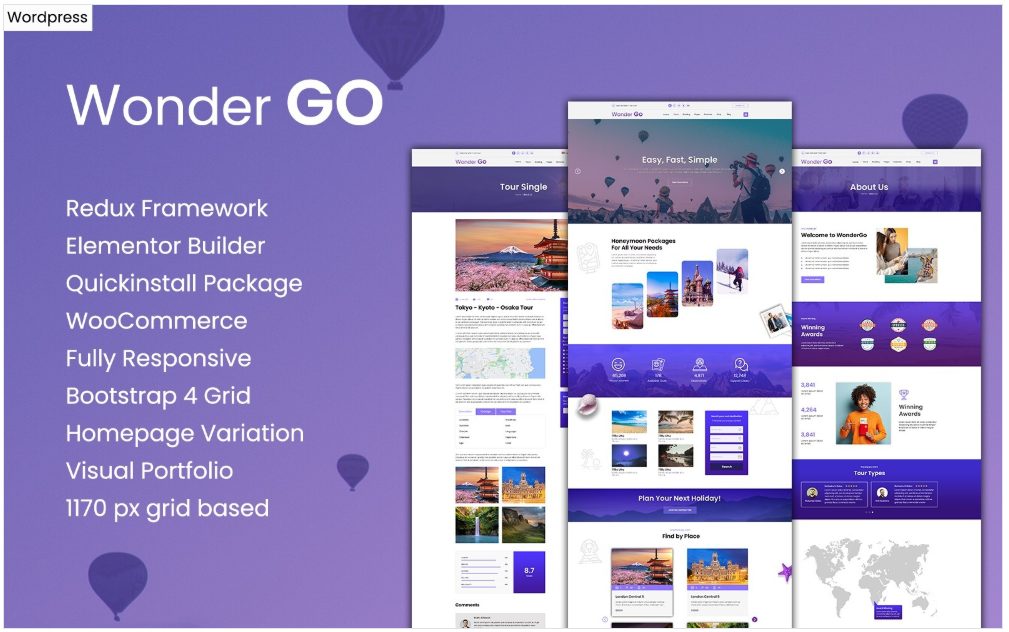
Wonder GO – Tour Booking and Travel WordPress Theme
Lavender, blue and green work together to produce a soothing effect while promoting the business capabilities of this global company. All business people want peace of mind while their businesses move like clockwork – efficiently going the extra mile to provide value. This is what this responsive website template conveys with its choice of colors and graphics. The parallax slider with hero images focuses attention on the company’s services and strengths. Content boxes in shades of color on a background of a clock, have lazy loading images that load on scroll. Blog snippets below lead into the blog. An image carousel beside the newsletter signup invites user interaction. Services are presented in a gallery viewable by category. The template has a geometric background that gives a dynamic look to the company. Shades of purple are used in the slider, content boxes, buttons and transparent panel below.
Color Design Resources:
