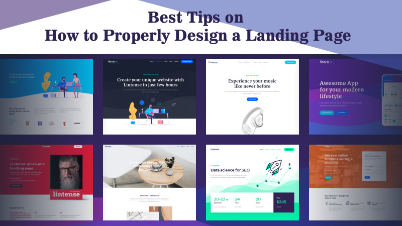
How can you make a business thrive in a day and age when all businesses aim for the same thing and every brand is looking for that competitive edge?
Apart from state-of-the-art email marketing and automation tools, you need to have more than that: Great content, fantastic visuals and, of course, insight on how to create a landing page.
A landing page is a page that people… Well, land on. They get there after they click on a link found on a post, email, ad, pretty much anything that carries a link, and are created so that they will contain as much information as needed to get a prospect to take a specific action, pointed out by a CTA.
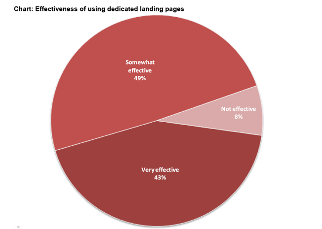
(Source)
The difference between a landing page and the website itself is that a landing page aims to do one thing alone: Convert. Nothing more, nothing less. They are simple, point to one action only and you can’t find a link to them anywhere on the website. The action is only one and it’s right there where you can see it.
But does that mean that all landing pages are successful and can convert? The answer to that would be no. So, let’s see the best tips on how to properly design a landing page.
In order for your landing page to convert, the first thing you need would be to understand your followers. This is the crowd you’ll need to convince.
Therefore, it’s imperative that you study your buyer personas (if you haven’t created those already, consider using a marketing persona maker) and try, through those, to understand what kind of solution your business can provide. This solution is what your actual followers are interested in.
Make sure that satisfying your followers’ intent is what appears to be the end goal of your landing page. This will give you more insight, concerning the kind of goals you can set for your own business. If, for example, you need to optimize your conversion rate (CRO) through sales, you’ll need to sit down with your personas and see what your ideal customer would like to buy from you. Then, design your email campaigns and the landing page itself.
Landing pages, much like email and ad campaigns, are more effective when they include thoughtful copy that’s concise, on-brand, and relevant to your audience.
Since you’ve studied your personas and you’ve already determined your goals, based on these personas, it’s time to start creating.
You’ll need to be witty, informative and simple. Don’t try to pack your landing page with information though. Just let your audience know why you need them to act the way you’re telling them to. If you need to get their email address, don’t withhold the reasons why. Rather, be clear about your unique value proposition and how downloading your content for free will make your followers’ life easier.
Oh and don’t withhold any of your information, either. If you’d wanted me to trust you, for example, I would’ve wanted to have a clear idea of how I can contact your business, should I need anything.
Of course, the simplicity rule goes way beyond the body copy. You should keep your CTAs clear, with as much information as needed and nothing more. Netflix‘s “Join free for a month” in all caps, white letters and red background is the perfect example of the point I’m trying to make.
Do you even need more words? I didn’t think so either.
Of course, your visuals will need to follow the same rule. Consistent with your brand’s tone, and definitely something that would capture your audience’s attention, visuals can be anything from landing page templates to embedded videos. Again, don’t be too “fabulous” with that one, there’s no need to confuse someone that wants to convert.
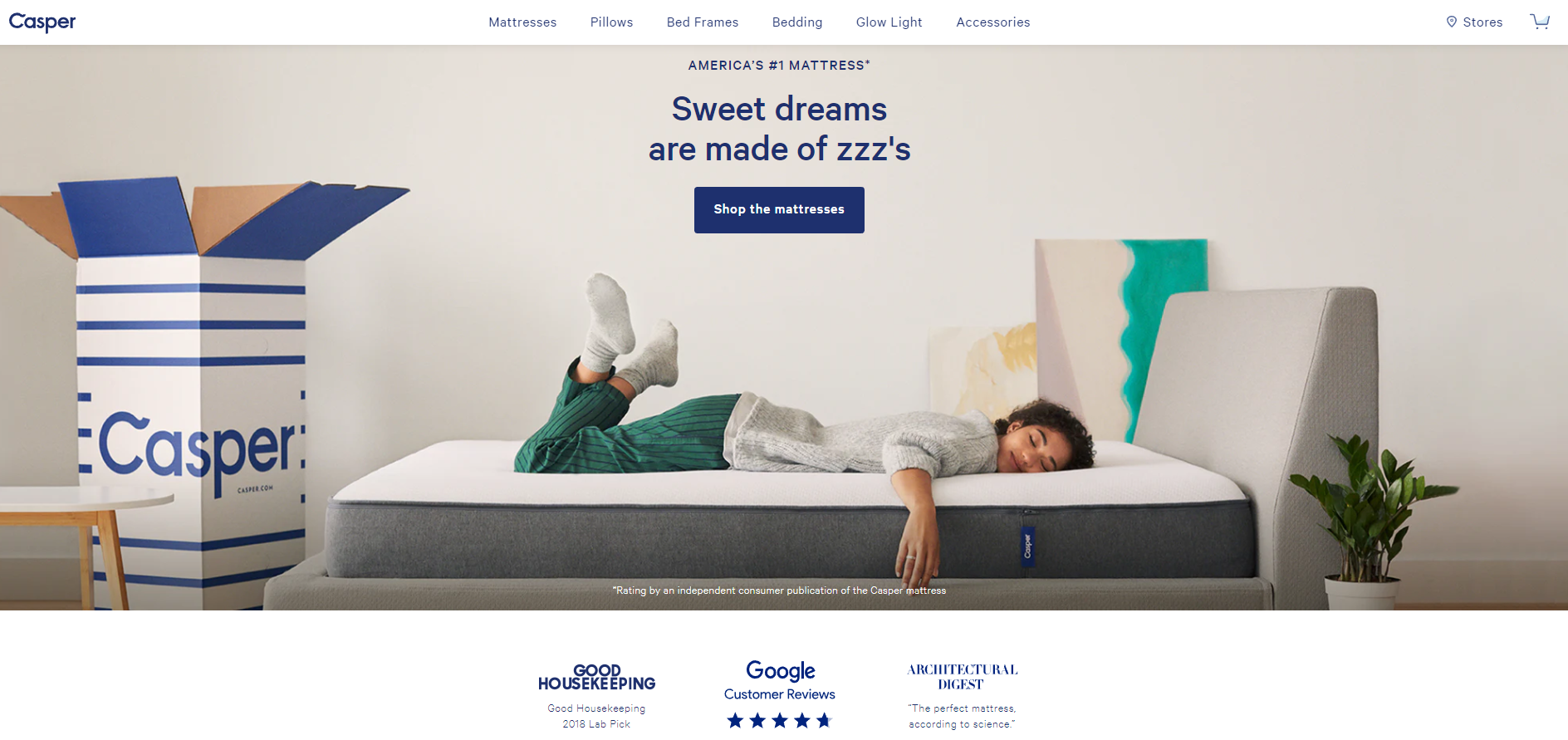
Here’s an example of the point I’m trying to make:
(Source)
This landing page answers the “Why” question (for sweet dreams), gives the much-needed and always-trusted social proof through the reviews at the bottom, the CTA is on point-as what you need to do is just shop-and the final touch is that the brand’s tone is in complete sync with the landing page, down to the colors: Blues, whites and greens that keep people calm-just like a mattress is supposed to do-and give that warm feeling of home.
Before I close this part though, I’ve got something else you should keep in mind: Keywords. Oh yes, those little buggers that can help you make something out of nothing and see your SEO endeavors actually get you everywhere, even if the only thing you know is the SEO basics.
Just try and be as specific as possible. And let me explain how and why: In the example above, we’ve got a store that sells mattresses and is based in the States. So, instead of using the keyword “mattress”, “store” and “America”, combine those three and target the long-tail keyword “mattress store in America”.
That way, people from Europe won’t get all riled up and, in the end, disappointed and you’ll only have the crowd you’re looking for, swarming your page.
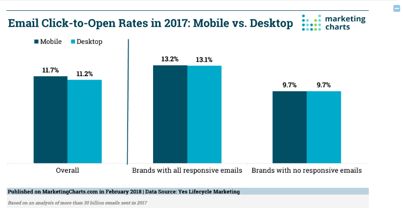
I cannot stress this enough, even though I shouldn’t really have to. So, here’s a statistic to back my claim:
(Source)
The stat above shows how many email opens happened on mobile devices for 2017. Now, imagine that you’ve got the link to the promised land-aka the landing page-in your optimized-for-mobile email.
Imagine that the prospect reaches the landing page after clicking on a social media ad. Which they saw while browsing their home pages through their apps on their mobile devices.
Can you imagine not having a landing page that would be optimized for mobile?
Followers and users are now accustomed to high speeds and perfect pages, so much so that a slow page or a non-optimized one (or both) can earn you a very high bounce rate. You can’t just leave money on the table like that!
And if you can’t believe me, maybe you should believe Google itself:

(Source)
If you want to go the extra mile and make things a little bit fancier for you, you can use a little click-to-call action to the mobile landing page.
Don’t pack that one with data, it won’t be large enough and can end up in disaster. Just use a click-to-call button and save your prospects the time and effort of looking around for a contact number.
This tip works great for landing pages that are there to promote an offer and sell.
A/B testing is what happens when you decide to create two versions of the same thing, changing one key component, and using them to see which one wins.
Much like mobile optimization, A/B testing is a no-brainer when it comes to making sure you know what works before giving it out to your followers.
So, here’s what you can do: Create a landing page and change one or two key components at a time. Change more, and you’ll find yourself at a loss, seeing as you won’t be able to verify which one of these components could’ve made a difference.
Then, sit back and gather your data. Analyze them and gather insights. After that, you’ll be all set and ready to release the final version of your landing page, which will be exactly what your people want to see.
An A/B tested page can lead to more traffic, more clicks, better higher conversion rates and, of course, a lot more sales (if that’s what you’re after), higher engagement rates and social shares.
The principle behind that is very simple: By incorporating all the right elements, you give people something worthy of their time.
Now, if that something has a responsive design and great UI to boot, you can guarantee that you’ve got yourself a winner!
I wouldn’t want to see you go before reading some things that summarize what I’ve just said and some that add a little bit more insight to the point I’m trying to make:
Indeed, there are many things to consider when designing a landing page for your website. These details shouldn’t be overlooked, as a well-designed landing page can be crucial for your business’s success. It can help in the following ways:
Because of these advantages, your landing page should be properly created to obtain more favorable outcomes. But how are you going to do that? This is where the Google Analytics landing page report comes into play. It contains all the data you need about the landing page’s performance. It plays a crucial role in the success of your web page since you can use the data from the report to improve engagements and conversions.
The landing page report gives you actionable insights into customer behavior, helping you make better decisions to improve your page’s performance. But if you’re using Analytics for the first time, you should prepare for the impending change in the platform. This change is the advent of Google Analytics 4 (GA4).
GA4 is a new tool that provides website users with accurate data reporting and new ways to understand the customer journey and how they connect with the landing page. If you’re planning to use this tool, make sure to prepare for Google Analytics 4. That way, you can successfully use the platform for data collection and reporting to boost the number of landing page visitors and revenue.
We could be going on and on about landing pages and how those things can convert like crazy, but I think these are the basics for today.
Now, what say you? Are there any other tips and tricks you use that you didn’t see in this post?
Please tell us in the comments and, as always, share the knowledge!
Here is our very popular All-In-One Landing Page Template
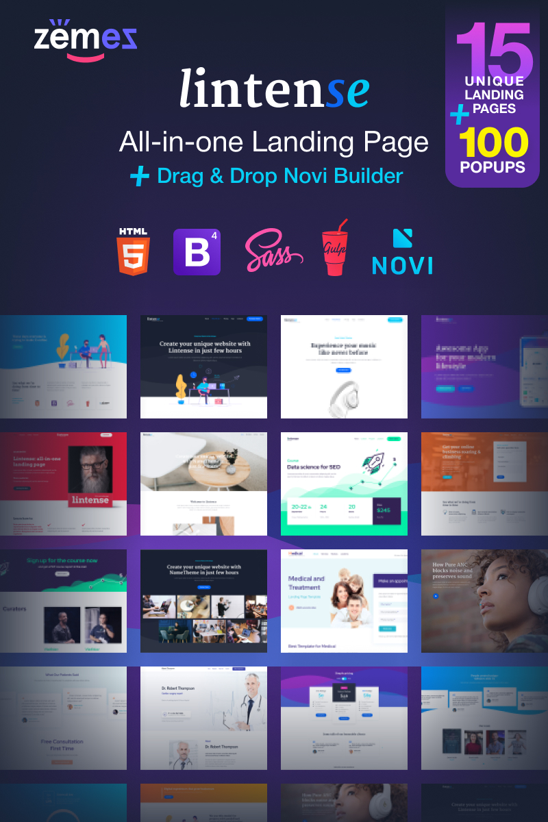
Click here for more Popular Landing Page Templates
Author Bio:
Téa is a content writer working for email marketing software company Moosend and an obsessive writer in general. In her free time, she tries to find new ways to stuff more books in her bookcase and content ideas-and cats-to play with.

