By Steve Bunker, CEO, Target Patients MD
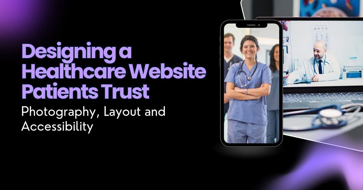
Most design work is judged on whether it looks good. Healthcare sites are judged on something harder: whether a nervous person, often on a phone and sometimes not feeling well, decides in a few seconds that this practice is one they can trust with their health. That changes the brief. Clever layouts, trendy color palettes and dramatic hero animations matter far less than clear photography, calm structure and an interface anyone can use. Here is how designers can approach a medical or dental practice site so that it earns that trust.
Stock imagery is the fastest way to make a healthcare site feel generic. Visitors have seen the same smiling model in a white coat on a dozen other sites, and they notice. Real photography of the actual doctors, the front desk team, the waiting room and the treatment rooms does more for credibility than any graphic element, because it answers the question every new patient is quietly asking: what will it be like when I walk in?
A few principles make practice photography work. Shoot in natural light where possible and keep the color grading consistent across every image, so the site feels like one place rather than a collage. Photograph people doing their jobs rather than posing, since a nurse adjusting a blood pressure cuff reads as more trustworthy than a nurse smiling at the lens. Keep backgrounds clean and uncluttered, and retouch lightly; patients want to recognize the people they will meet. For headshots, use the same backdrop, framing and lighting for every provider so the team page looks deliberate. And always get written permission before any patient appears in a photo, even in the background.
A healthcare visitor usually arrives with one of a handful of goals: find out whether the practice treats their problem, check whether it takes their insurance, see who the doctors are, or book an appointment. The layout should put each of those within one obvious step of the home page. That usually means a short, plain navigation, a prominent booking button that stays visible on mobile, and service pages organized the way patients think about their problems rather than the way the practice’s departments are organized internally.
White space does real work here. Dense pages full of competing panels make a stressed reader feel more stressed. Generous spacing, short paragraphs, clear subheadings and one primary action per screen let people find what they came for without hunting. Resist the temptation to fill every corner of the home page; a few strong sections with a clear path forward will outperform a page that tries to say everything at once.
Healthcare palettes tend to lean on blues and greens for good reason, but the bigger decision is restraint. Pick one primary color for actions such as booking buttons, a neutral base, and one accent, and use them consistently so that people learn what a button looks like. Avoid low-contrast combinations like pale gray text on white or light blue on teal; they look elegant in a mockup and become unreadable for older visitors or anyone reading on a phone in sunlight.
Typography should be just as practical. A clean sans-serif at a comfortable body size, generous line height and short line lengths make medical information easier to absorb. Use weight and size, not color alone, to show hierarchy. And keep the type system small: two typefaces at most, a handful of sizes, applied the same way on every page.
Many of the people who need healthcare most are the ones a careless design shuts out: older adults, people with low vision, people with tremors or limited dexterity, and people who rely on screen readers. The W3C’s introduction to web accessibility makes the point simply: when sites are designed and built properly, people with disabilities can use them, and many sites still contain barriers that exclude them.
For designers, that translates into concrete habits. Keep text contrast strong. Make buttons and tap targets large enough to hit easily. Write meaningful alt text for every image, describing what it shows rather than stuffing it with keywords. Never rely on color alone to convey information, label every form field clearly, and make sure the whole site can be navigated with a keyboard. Test with real assistive tools rather than assuming. The U.S. Department of Justice also publishes guidance on web accessibility and the ADA, which is a useful reference for practices that want to understand their obligations.
Most people looking for a doctor or dentist start on a phone, often when they are already worried about something. Designing the mobile layout first forces the right priorities: the phone number and booking button within easy reach, short pages that load quickly, images compressed so they do not stall on a slow connection, and forms that ask only for what is needed. A desktop layout built up from a strong mobile design almost always works; the reverse rarely does.
Trust is built from many small signals that agree with each other. The photography style matches the colors, the colors match the printed materials in the office, the provider bios follow the same format, and the tone of the writing sounds like the same practice from page to page. When those details line up, visitors relax. When they do not, something feels off even if they cannot say what. That consistency is the heart of good healthcare website design: not a single dramatic visual, but a site where every element tells the patient the same calm, reliable story about the practice behind it.
Designing for healthcare means designing for people at an anxious moment. Real photography, a layout built around patient goals, restrained color and readable type, accessibility treated as a requirement, and a mobile-first approach all point in the same direction: making it easy for someone to understand the practice, trust it and take the next step. Get those right and the site does what every healthcare website should do, which is help people get the care they need.
Steve Bunker is the CEO of Target Patients MD, a healthcare marketing agency that works exclusively with medical and dental practices. He writes about how patients find, compare and choose the care they need.