As we head deeper into, let’s take a look at the trends making the web what it is today – a vibrant, constantly changing, updating and interactive place where work gets done, ideas are exchanged, transactions take place at a rate that triggers a whole new world of web development, web applications and website design, making it easier to access information, relate with people, network and get things done.
Trend 1: Responsive web design (RWD)
Trend 2: Infinite scroll and more vertical scrolling
Trend 3: Sticky navigation/fixed headers/fixed position design elements
Trend 4: Parallax scrolling
Trend 5: HTML5 and CSS3 are here to stay
Trend 6: Flash is out for mobile website design
Trend 7: Leaner, faster, high – performance websites
Trend 8: Modular design using design process building blocks
Trend 9: Scalable web design (SWD)
Trend 10: Designing for the retina web and the mobile web
Trend 11: The beta model release – going strong
Trend 12: Thinking big – Oversized buttons, headers, background photos and text
Trend 13: Simplicity – Minimalism is better
Trend 14: Single color sites – effectively using monochromatic color palettes
Trend 15: Illustration in web design
Trend 16: Social network badge design
Trend 17: Circles in website design
Trend 18: Blurred backgrounds
Trend 19: Single Page Websites
Trend 20: Skeuomorphic design is on its way out
The boom in tablets and mobile devices and the rise in multi-screen internet usage has placed the focus squarely on responsive web design or RWD as it is called. 17% of all adult cell phone owners in the US access the Internet mostly on their cell phones. No longer is it feasible or necessary to design different layouts for every possible screen size and resolution. Responsive web design has the flexibility to handle all environments, with layouts that respond to any screen size, whether desktop or mobile. It uses the same set of code to display properly on desktop, tablet and smartphone browsers.
Based on fluid grids, liquid layouts and media queries, responsive web design ensures that the design adjusts to fit different screen sizes, going from say three-column text layouts for PCs to single-column text for mobile phones. Web designers now have to take into account the dynamic nature of the web in other presentation formats too – from large-screen web browsing in corporate boardrooms and in homes, to high performance on car dashboards, among other user interfaces.
In keeping with the new design trend, major brands like Time magazine, Mashable, Microsoft and Awwards have launched responsive websites. Time magazine presents an enormous amount of information in a reader-friendly way without hiding content on mobile devices, whereas Awwards requires a few extra clicks for mobile users to get to non-core content.
Responsive web design makes good business sense. Here’s why:
Optimized visitor experience across all devices. Users demand and expect the same user experience whichever device they use to access your site.
Single site content – no need for separate sets of content or different designs for desktop or mobile
Responsive site design encourages the visitor to call – good for your business. Simpler navigation and functionality
You will find more statistics at Statista Mobile-first design
Designers will focus on mobile-first regarding design, form, usability and functionality. They will concentrate on how a person uses or interacts with the website, using natural user interface design (fingers and gestures, not cursors).
Tablet-first design makes sense
Growth in tablet sales is projected to outstrip PC sales worldwide. Says Forrester Research, tablets will become the “preferred, primary device for millions of people around the world” by 2016, owing to their convenience and rich user experience. Social networking, internet usage, consumer buying behaviour and web browsing habits are going unstoppably mobile. This is why many designers are opting for a “tablet-first” design approach – since users access more content on tablets than they do on mobile websites. ReadWrite is a tech blog that follows a “tablet-first” design – simple, consistent and user-friendly through all devices.
Tablet-ready design
Looking beyond the iPad, publishers will continue to create native iOS apps as Android and Microsoft tablet sales will trigger the rise of “impressive, hand-built responsive HTML apps that play everywhere“. As mobile platforms evolve, designers need to watch out for Tizen, an HTML5-based mobile OS created by Samsung and Intel. Initial devices are expected in Q2 2013.
“Tizen is an open source, standards-based software platform supported by leading mobile operators, device manufacturers, and silicon suppliers for multiple device categories such as smartphones, tablets, netbooks, in-vehicle infotainment devices, and smart TVs. Tizen offers an innovative operating system, applications, and a user experience that consumers can take from device to device.”
Web designers will have to design for multi-screen usage to make web content quickly and easily consumable by a sophisticated and impatient, on-the-go audience. Responsive design forces designers to focus on the most important content first.


This trend has become popular because of sites like Pinterest and Tumblr, which allow content to be loaded continually as the visitor scrolls down the page. No longer does everything of interest have to be concentrated “above the fold” – users are now comfortable with scrolling and so content can be placed at strategic points that attract eye movement as the reader quickly scans the page.
Vertical scrolling is the preferred user mode although a few devices allow for horizontal scrolling. It’s just easier to navigate the site when you know which way to go.
Often used in single page web layouts, sticky (or fixed) headers using CSS or JQuery make it easy for the visitor to navigate anywhere in the site. In Sticky Navigation, the website menu sticks to the top or left of the page and is set firmly in place so that it does not vanish when the user scrolls down.
As your visitors scroll down the page, the nav menu scrolls along with them while remaining in the same position on the page. This makes the user’s browsing experience much faster and less frustrating. Sticky menus are quicker to navigateand users prefer them without knowing why.
The website menu is locked into place so that it does not disappear when the user scrolls down. This makes the user’s browsing experience much faster and less frustrating. Sticky navigation can be used for the footer and other design elements (like the logo or Call to Action button) as well.
Sticky navigation can also be used for other design elements like the footer, sidebar, product picture, logo or Call to Action button.
When the page size is smaller, sticky menus could restrict the space for content. One way out of this is to shrink the menu as scrolling begins or hide some parts of it, for simplicity and clarity. Smartphone users in need of more information will then click on additional links to get to the required content.
See examples of sticky page elements below.

Ryan Scherf has a beautifully designed fixed menu on a textured background with the feel of wood, to match the arrow button on the bottom left of the page, and the form with the call to action that ends the page.

In the Nizo site, the iPhone is fixed although other objects on the page move, giving the viewer a visual point of reference.

Kisko uses a Slide and Stick approach with its nav menu scrolling along with the site visitor but sticking to the top of the page once the end of the page is reached.
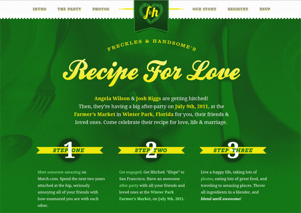
Freckles and Handsome uses the fixed header for consistency in navigation and branding in all sections of the site.
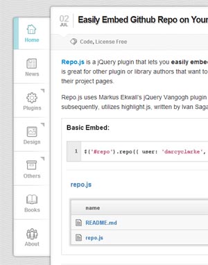
Web Appers has a sticky sidebar which stays constant when you scroll the page.

Fat Man Collective keeps the (animated) mascot and logo in a fixed position on the right fixed while content scrolls.
Parallax scrolling places 2-D objects on different layers in a web page and moves them in the same direction at different speeds to create a 3-D feel. The closest layers move the fastest. This technique which is used in games or product launches, is expected to become more popular in web design in 2013. Parallax scrolling lends interest to the somewhat standard web pages like the Home Page and About Us page, making them interesting and interactive.

The Bagagia site above shows the IPad case to great advantage. As the viewer scrolls, the case turns around and brings it close to the viewer’s eye in extreme closeup. You can almost feel the material!
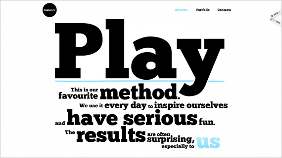
The TokioLab site reveals itself word for word while the reader scrolls.
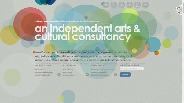
Cultural Solutions uses graphic circles, another design trend, on a soft, textured background and leads the reader through the content as she scrolls.

Egopop’s cartoon characters create a 3-dimensional, animation effect with parallax scrolling while drawing attention to the portfolio of the designer.

Soleil Noir has an engaging site that presents its beliefs and work culture in a scrolling slideshow, using bold typography, illustrations, colourful moving backgrounds and animation effects through parallax scrolling.


This logo represents HTML5, the cornerstone of the Open Web Platform that the web community and W3C (WorldWideWeb Consortium) is building for modern Web applications. HTML5 includes the fifth revision of the HTML markup language, CSS3, and a series of JavaScript APIs. These technologies work together to help you create complex applications that were once restricted to desktop platforms. You can now reach a wider audience across multiple platforms and devices using HTML5.
Advantages of HTML5
HMTL5 is a collection of features, technologies, and APIs that brings the power of the desktop and rich multimedia UX to the web—while building on the web’s innate strengths of interactivity and connectivity.
Today, the web browser is becoming the main platform for communication, business or gaming. HTML5 features are supported on modern web browsers.
HTML5 makes it possible for the web to achieve the functionality, speed, performance, and user experience of desktop applications. With HTML 5 you now can create apps and websites that are fast, secure, responsive, interactive and stunning without the huge investment of time and money traditionally associated with their development or updating.
High performance video, audio and graphics
The web is a visual medium and HTML5 offers the integration of video, audio or multimedia within your website’s code. You can present stunning video and photo galleries with faster load times.
Using HTML5 and CSS3, the audio and video effects are tagged and viewed without the use of third-party applications or plug-ins.
Here’s Apple’s showcase of HTML5 multimedia, audio, and graphics in action: https://www.apple.com/html5/showcase/video/
HTML5 offers enhanced multilingual support
Businesses run on HTML5
HTML5 offers advantages to businesses over any other IT model – in terms of simplicity, lower cost, security, flexibility and mobility.
Leading companies moving to HTML5 include Adobe, Salesforce, Citrix, Netflix, Twitter etc.
Games and apps are more engaging, interactive and stunning
HTML5 enables the creation of games that connect with users wherever they are – whether on desktop or mobile devices.
Features like high performance 2D and 3D graphics, offline asset storage, rich audio APIs, and socket-based networking let you create gripping modern games with a reach like never before.
CSS3 – Elegance and style without the coding pain
Cascading Style Sheets (CSS) offer a simple mechanism for adding style (e.g., fonts, colors, spacing) to Web documents. CSS3 is the latest standard for CSS. CSS3 with its new technologies and extensions like 2D Transformations, Transitions, 3D Transforms and WebFonts makes it possible to create rich user experiences with no coding effort. Just apply some CSS to your existing applications.
With the advent of CSS3, apps can have an elegant, expressive, and flexible design. You can create visual enhancements like rounded corners, gradients, and shadows, text transformations, animations and 3D transformations.
Simplified color and image management allows for faster loading (fewer HTTP requests) and simpler redesigns. You can directly manipulate elements with mathematical access to graphics, rotating and zooming almost anything without swapping out images.
Presentation can be achieved with just CSS3 and no JavaScript. This makes both development and maintenance easier, as developers don’t need to know both CSS and JavaScript. Control column width, banner size and other layout elements with CSS3.
Typography in your design is made easy as Google Web Fonts and TypeKit and Font Squirrel provide you with access to a large number of fonts you can use in your apps.
The following are some examples of what you can do in design, presentation and animation with CSS3:
Magazine-like layouts – wrap shapes, flow text and more with HTML and CSS3 regions
CSS 3D transforms – examples
CSS – Transitions and Transforms
CSS – Web Fonts
CSS Animations
Flexible Box model
CSS3 is completely backwards compatible, so you will not have to change existing designs. Browsers will always support CSS2.
Apple does not support Flash on iPhones, iPods and iPads as Flash is 100% proprietary, versus HTML5, CSS and JavaScript, which are open standards that Apple adopts. Flash was designed with a conventional mouse and keyboard in mind, and not for touchscreen devices. Battery consumption is far higher with Flash. Reliability, security and performance is compromised on Flash. Steve Jobs shared these and other concerns in his open letter on “Thoughts on Flash“.
Flash has made a name for itself for development of animated, rich, immersive, interactive, expressive online content, particularly for games and video.
See examples below:
Best Flash Sites based on visual artistry, integrated sound, ease of use and uniqueness
Rich experiential content created with Flash.
Disadvantages of Flash:
Adobe has discontinued development of Flash for mobile devices in favour of HTML5, as HTML5 is now universally supported on major mobile devices. However Adobe continues to focus on Flash for PCs, for advanced gaming and premium video, as well as hardware accelerated 3D graphics for console-quality gaming and premium HD video with content protection.
Today the use of Flash continues to decline as HTML5, CSS3 and JavaScript technologies evolve versus single-vendor technologies in creating cross-platform Web and mobile experiences, Designers are opting for future-ready HTML5 designs. HTML5 can create dynamic layouts without all of the bugs and lags that Flash can produce. Flash will still survive for specialist video players, banner-ads, Facebook modules, and games.
The trend is to move away from gigantic, slow-loading websites to leaner, faster, more efficient websites that perform better and provide the user a superior expeience. This can be achieved by using best practices in web development such as:
using a library of smart objects;
combining CSS stylesheets into a single style sheet to prevent multiple http requests;
using geographically dispersed content delivery networks to deliver your content efficiently to users in different locations;
optimizing CSS Sprites to make images fast-loading;
minifying JavaScript and CSS – removing unnecessary characters from code to reduce its size and improve load times … to mention just a few.
Responsive Web Design (RWD) has popularized grid-based, modular GUI design. We’ll see more structured page layouts over the coming year.
Amazon Web Services (AWS) provides infrastructure and application services in the cloud– bringing down the time, effort and cost involved in development of projects ranging from enterprise applications and big data projects to social games and mobile apps. Thanks to cloud computing infrastructure and applications, upfront capital infrastructure expenses can be replaced with low variable costs that scale with your business.
Frameworks make it easier to rapidly design websites with standards-compliant, semantic code. There are many well-established frameworks which can make a designer’s life much simpler – some are CSS Frameworks while others focus on Typography on the web.
Scalable web design or SWD is a methodology for designing websites capable of being displayed on screens with both low and high pixel densities. SWD is a collection of ideas, techniques and web standards which aims to achieve websites that are cross-browser compatible and look great in any screen resolution, operating on any platform. SWD uses SVGs (Scalable Vector Graphics) rather than rasters for images, because SVGs are capable of scaling in size without a loss in detail or sharpness.
How capable is your website for handling growth?
Adobe refers to scalability as “a web server’s ability to maintain a site’s availability, reliability, and performance as the amount of simultaneous Web traffic, or load, hitting the Web server increases.”
Scalability is the ability to serve the website without overwhelming the server even during huge surges of traffic. It helps maximize usability and user conversions.
Scalability can be achieved by:
