Web design is exciting now! Less design restrictions, more and better apps, platforms and design and communication tools make the web a happy playground of color and shape, movement, content and form.
Designers have a lot more freedom to play with – asymmetrical design, fluid shapes, inventive fonts, bright colors and broken grid layouts, high quality photography juxtaposed with illustration and web animation. Brutalism, a web design style with its disruptive designs that go back to the basics of the web, has created a different look altogether. Immersive longform content fascinates users with interactive storytelling tools. Progressive Web Apps (PWAs) both online and offline, work faster than native mobile apps, boosting conversions. “Pivot to video” affects text readership, but text is still a powerful and effective medium of communication on the web and is much cheaper to produce than video. Large companies are building brand value with content hubs.
Let’s take a look at these 12 web design trends in 2018 one by one:
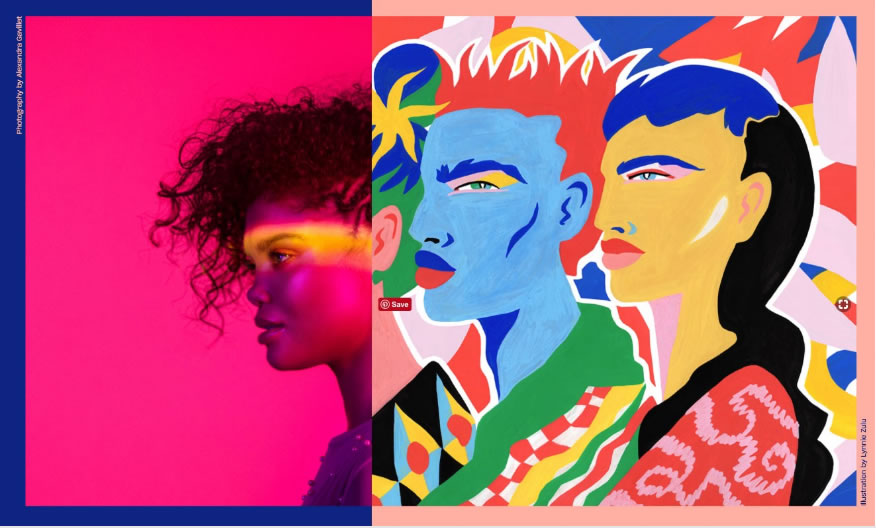
Designers choose superior quality photography over stock photography, especially for brands that communicate sophistication and glamor. However, illustration is increasingly finding preference for its flexibility and ability to communicate abstract concepts across different target audiences.
Photography and art merging as in the new Dropbox design website can combine with content to present a complex message.
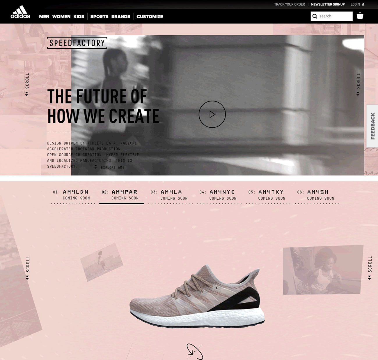
Scroll-triggered animations like the one in Adidas captivate and engage the user and help tell a story.
Variable fonts are good news for designers
A variable font is a single font file that behaves like multiple fonts. Variable fonts provide the flexibility that makes design creativity in responsive typography possible. This OpenType Font Variations technology has been jointly developed by Microsoft, Google, Apple, and Adobe.
What makes variable fonts so exciting? Smaller file size, smaller disk footprint and webfont bandwidth, faster loading and delivery of webfonts, more efficient packaging of embedded fonts and potential for design-variations. This opens up exciting prospects for responsive typography that can adapt to best present dynamic content to a reader’s device, screen orientation, or even reading distance. Older font technology uses multiple files for multiple instances of fonts, such as Regular, Italic and Bold. This slows loading time on the web. Variable fonts are the way of the future.
Serifs make a comeback
With added support for variable fonts in technology, serif fonts have made a comeback – they are favorites both among writers and designers for their class, elegance and sophistication. Some sites combine both serifs and sans serif types in their layouts.
Creative typography cutouts, bold fonts are in
Custom and oversized fonts find designers going bold with attention-grabbing headers in huge fonts against bright contrasting colors. A block of color over a still or moving image that shows through clear lettering creates a different look with typography cutouts.
The hard right-angles and sharp-edged card designs that defined web design in the past are being replaced by softer, gentler, rounded curves. We see a lot more experimentation with “broken” grid layouts where a structure does exist but the designer has the freedom to move beyond that, and break out of the box with text and image elements drifting across the screen where grid outlines would have been. Of course, this doesn’t mean that the right-angles have disappeared, just that designers are playing around with other design elements drawn from nature to soften the limits of formal grid lines.
Drawing users into your site, engaging them and then keeping them coming back for more with interactive content like games, quizzes and polls is a specialized business. You need to know your target audience and what keeps their interest alive. A lot of industry experts have sprung up who know exactly how to go about this. Interactive content can also drive sales, as seen in this video from Content Marketing Institute.
5. Immersive longform storytelling content is in
Longform pieces have come into their own on the web. Design is breaking new ground . This CNN story on global warming’s impact on Greenland and the world takes a complex, almost unreal subject and brings it close to you and your personal space. Going beyond a standard CMS, this story uses custom layouts with copy that’s served up to the viewer in easily digestible chunks, with well-written content combined with excellent 3D presentation, interactive multimedia, animation, audio and video that takes you to the place where it’s all happening.
“Interactive storytelling” is simply storytelling enhanced by digital tools, using audio, video, multimedia, infographics, charts and graphs, maps, slideshows, posters, flowcharts, comic strips, images and longform content delivered in an interactive format, in bite-sized chunks easily digestible by the user. Here are some favorite storytelling platforms and apps to add value to your piece and create social impact or inspirational stories. Personal, instructional, informational and historical stories are a good fit for your storytelling article.
Data visualization and data storytelling enables you to present data in easily digestible form, to add credibility to your piece. AR, VR, and MR (augmented reality, virtual reality and mixed reality), terms that are explained superbly in this article from Foundry, enable an overlapping of a computer-generated world with the real world, allowing the user to interact in that world.
The GE website on the Masaya volcano is a stunning example.
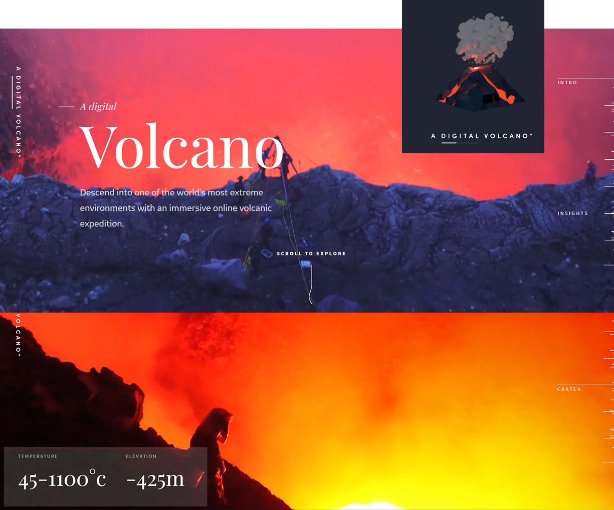
In both the CNN and GE examples, by the end of the presentation, a complex subject has been simplified, humanized and personalized. The user understands that it is not some faraway concept but something that could affect him locally and personally.
People do read longform content that’s well-written and provides value. They also like and share it, and it earns backlinks, a further benefit! Top ten Google posts are often 2,000 words long.
6. Brutalism shakes up the web design world
Brutalism is in – but what is brutalism?
Brutalism is a style of post-war architecture, a term derived not from the English word “brutal” but from the French term “béton brut”, meaning “raw concrete.” The objective of brutalism in architecture was getting back to the basics: stripping away non-essentials, replacing them with honesty in materials. It was characterized by geometrical, repeating forms; economy in costs; efficiency, simplicity; social vision and integrity of function.
Brutalism in web design has inspired experimentation with asymmetry and freeform design. It harks back to the early days of web basics – HTML and bright colors. In web design it’s rebellious and disruptive – some say downright ugly – expressed in vibrant, bold colors and minimalism. Or playing with huge fonts, nonsense text or code and blobs of color, images, illustrations or painting. While some brutalist websites present a message simply and clearly, it seems like others actually want to turn you off – like a mad artist throwing everything on his canvas regardless of how it pleases the eye of the beholder. You be the judge.
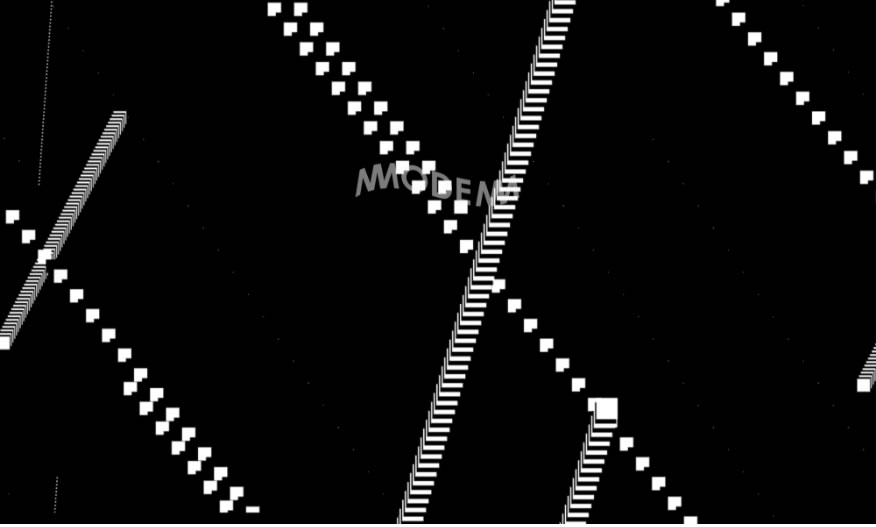 Mmodemm Frankfurt
This website with its asymmetrical geometrical patterns has a 3D feel … but wait till you click on the link! You want it to stop blinking and flashing in your face!
Some examples of web brutalist designs – back-to-basics, HTML colors of the early web, repeating geometric designs, or content-only websites sans ornamentation
Check out brutalistwebsites.com for a look at the huge variation between different brutalist websites.
Many brutalist web designers draw inspiration from the grey of raw concrete, the material of the early architects of this style of architecture, and design their sites in grey and black with a lot of white space.
Here’s a tongue-in-cheek look at UX Brutalism.
That’s web brutalism for you. Functional, transparent and minimal. It also has the advantages of faster page loading, ease of navigation, fewer distractions and choices, all of which help boost conversions.
7. Progressive Web Apps (PWAs) boost UX – work both online and offline
Progressive web apps are websites similar to native mobile apps and they work offline. Progressive web apps (PWAs) deliver an amazing user experience (UX) because they work both online and offline. In 2018 PWAs are expected to be major competitors to native mobile apps. A progressive web app loads instantly and it has the ability to work without any WiFi connection. A powerful benefit of a PWA is the ability to send real-time alerts to engage users, even when the app isn’t running. Push notifications are practical features on the web and on mobile apps and can send your brand’s sales soaring!
Flipkart and The Washington Post have made PWAs of their websites, which have significantly improved user engagement, time-on-site, conversions or returning users on all platforms.
8. UX and UIs take centerstage
The user experience (UX) is everything. Immersive content, laid out in bite-sized pieces so it’s easy to scroll through in most devices, and user interfaces (UIs) like chatbots and calls to action are now given specialised focus. Today there are UX writers who focus on the content found within UIs, for web apps and larger digital products.
Micro-interactions reward the user
When the customer interacts with the website in a certain way, he is personally rewarded with a micro-interaction (like an animation) that encourages him to go further (say) in the product buying process. A simple like or love emoticon on Facebook that allows your customer to share his views on a subject without reloading the page, is a micro-interaction. More micro-interactions in web design in 2018 will allow users to communicate in real-time and boost speed and connectivity in a mobile-connected world.
9. We’ll see more video, fluid shapes, gradients, animated CSS
Video is important to a brand’s presentation and message. Video makes great product demos, besides conveying a lot of information quickly, visually and efficiently, capturing attention and interest. You will see many more videos on websites not on the main page alone but in different areas of the website.Video hosted on a third party site like Vimeo or YouTube is faster loading and saves your website server bandwidth and storage space. Simply embed the video link on your site.
10. “Pivot to video” affects text readership
Several publishing sites jumped on the video bandwagon but have seen the adverse effects of video content at the expense of good, well-written, well-presented text – and many good journalists lost their jobs in the process. However, cost per impression (CPMs) of video CPM is much greater than display CPM. Browse through the web and you’ll see a lot of sites with text. Even on visuals-first platforms like Pinterest and Instagram, text still plays a key role. Images cannot capture context – the who, what, when, where, why and how that make images relevant and meaningful. Text is still the way most people communicate on the web. It’s an informational and creative medium, quicker and cheaper than video to produce. The power of text cannot be ignored.
11. Content hubs and relevant ways to engage with target audiences.
Content hubs are owned digital assets where brands prove their worth as experts in their industry. These digital assets can be housed in a centralized destination, either on an organization’s website or externally. Content hubs are used successfully by 60% of the biggest brands, like GE, American Express, Bupa, SAP, L’Oreal, Etsy to name a few, for good reasons:
• Digital asset centralization and control
• Data capture and measurement
• Preventing content wastage
• Nurturing relationships with target audiences
• Building brand value and brand trust
Content hubs can contain multiple content assets, from white papers and research to ebooks and blogs. A content hub can be called “resources”, or “learning center”, and be divided into categories and subcategories such as “product”, “geography”, etc that improve search. Content can be multimedia, gated or ungated. Gated content such as ebooks require filling a form – the purpose is lead generation. Google, however, does not crawl content pages behind a gate. Ungated content does not require the user to give information.David Meerman Scott, a content marketing expert , says ungated content is downloaded 20-50 times more often than gated content. To make your content count, you have to be sure of your business strategy and know your target audience. There are good reasons to use both gated and ungated content.
12. Sticky floating navigation and hello bars
Adding a hello bar or notification bar to a page is less obtrusive than a pop-up window and can be a good lead generation feature that drives traffic to a URL of your choice, like a contact page, say with a discount offer that can result in conversions. A hello bar with a call to action button can also promote an ebook or product. Or it can share information, news, or announcements. Long scrolling is easy now with floating navigation that scrolls along with you. Floating navigation with sticky elements such as a header and social media icons that stick to the top and sides of the page are useful as the user scrolls down. Other elements in navigation such as the responsive side menu or accordion menu are also sticky elements.
Bottom-anchored sticky menus are a new trend as many web apps have important digital buttons and menus at the bottom of the page, easily accessible by the thumb. Expect to see menus anchored both top and bottom in 2018. This one from Hotdot combines a trendy sideways scroll with a neat bottom-anchored sticky menu.
What else?
Keep page ranking in mind before designing a webpage Even the best-designed web page with the best content needs to rank well in the
search engines.
What are the main Google ranking factors in 2018?
There are lots of factors, but the top ones are:
a. Speed
Google expects a page to load in under 3 seconds. Every extra second costs you visitors as the bounce rate rises to 38% by the time page load time reaches 5 seconds! Bounce rate is the percentage of visitors that come to your website and leave without viewing any other page.

You can take Google’s speed test on WebSite Auditor in its free version to see how your site measures up on speed, on critical pages.
b. Relevance
Take the trouble to write fresh, longform, high-quality and relevant content. Ensure it’s freshly updated. Use suitable keyword density with natural keywords and natural links, especially to authority domains. Place quality internal links to other quality content. Ensure no duplicate content and you’re ready to go!
c.Authority
Do your research and place links to external authority sites. Backlinks from authority websites will add weight to your page and improve its ranking on search engines.
d.Popularity
How much time do users actually spend on your page? Do they read your article and provide feedback and social shares? These are factors that come into play in your web page’s popularity ranking.
e. Technical SEO ranking factors
• Security
Encryption for a secure site. Your URL will have to have an https vs. http to be considered secure and Google-worthy.
• Mobile-first search and performance
Google has a mobile-first index – over half of searches come from mobile search. Your site has to perform well on mobile, with responsive design, a mobile optimized website builder, and mobile-optimized website content.
• Ranking in SERPs (Search Engine Results Pages)
It’s a well-known fact that people don’t go past the first few results within the first three pages in universal search results. Your site has to do well in organic (non-paid) vs. paid ad-supported search. Users click on organic search links 20 times more than on paid search links. Ranking well in universal search in the SERPS where both paid and non-paid links are presented, is the name of the game.
Understanding how SERPs work
When users search for something online using a keyword on a search engine search engine like Google, they are served up web pages called SERPs or Search Engine Results Pages. These are no longer just the simple blue highlighted links that Google used to serve up. There are lots of other elements clamoring for the user’’s attention. Local packs (information on where users can find, buy, or get whatever product or service they are looking for, prompting conversions), knowledge panels (boxed information about a person or city for instance) and featured snippets or answer boxes often take a user’s attention away from the content featured in search engine results.
You need to create great content that attracts readers, yet follows a certain process as outlined in this brilliantly explained SEO checklist from Rand Fishkin of Moz given in the whiteboard below, to factor in SEO and rank high in organic search in Google’s SERPs.

To sum up, the main web trends in 2018 are:
More freedom in web design – in bold colors, typography, shape, form – quality photography, illustration, variable fonts for responsive design, fluid shapes, curves, gradients, broken grid layouts, animation, multimedia content and lots more.
Brutalism creates a bold new look with its asymmetrical, functional and disruptive designs that go back to the basics of the web.
The importance of UX and UI and the rise of UX specialists.
Interactive, longform, immersive, storytelling content gains ground with custom software or storytelling apps and platforms
“Pivot to video”steals text readership. But text is cheaper to produce than video. It’s still the most important informational, creative medium of communication on the web.
Floating navigation and bottom anchored menus are in
Progressive Web Apps (PWAs) work both online and offline, work faster than native mobile apps and substantially boost conversions
Content hubs are owned digital assets stored in a central location that build brand value for companies and prevent content wastage
Before writing or designing a web page, keep top Google page ranking factors in mind.. These are: speed, relevance, popularity, authority and technical factors like security, mobile speed and performance in SERPs (search engine results pages).
