Great website design is about how a site looks, feels and functions, how user-friendly it is, and how it translates into action. Here are some of the latest and best website templates from responsive to HTML5 templates, from blogs and ecommerce templates to CMS templates.
The intro slideshow parallax banners make a powerful statement in 3D.
The informative megamenu with links, register/login form, banner with image and contact number, read more button helps the user find what he’s looking for easily. Below the slideshow, a large banner with blocks of content overlaid on an architect at work, welcomes the customer and provides information about the company. Images from the portfolio and the blog have zoom effects while scrolling and invite the user to read more. The blog has images that turn black-and-white with zoom effects on hover. The folio presents images with delayed animations/fade-ins, zoom effects on hover and an impressive slideshow view. The use of circular and rectangular images in fluid containers presents a unique effect. The footer links to the About page and contains useful searchable tags. The Facebook social plugin is useful for sharing.

An attractively displayed logo in white fonts on red catches attention and directs the user’s eye to the slider which shows helicopter training in progress, with messages in large fonts promoting the flight school’s capabilities. The smaller banners below display closeups of the helicopters and their controls, with text on red panels. A black banner with large fonts highlights the safety of the aircraft. Recent blog posts keep the reader interested in learning more and lead into the site. Another slider shows beautiful helicopters flying over picturesque terrain. Testimonials from happy customers helps convince more clients to sign up for helicopter flying lessons.
Template 52502 – Oil And Gas Responsive Website Template withJS Animation and Parallax

This website template designed in shades of blue with a large image of
an oil refinery taking center-stage, is the perfect look for a corporate website for a large industrial company. Blue implies trust, honesty, reliability, orderliness and peace. The logo with an interesting animation of an oil can with an oil drop floats down into the page. The company’s message is spelt out in bold fonts in capital letters. Three blue banners with white icons symbolize the company’s main areas of service, and on rollover each icon shows an image with text describing the service. An image of a product with product descriptions is followed by a blue banner highlighting the company’s capabilities. A map with the company’s global focus areas and clients would impress potential customers. The services page with parallax banners give a 3D look on scrolling. Logos of large clients are highlighted in a banner above the footer. The logo animation is repeated at the footer. The contact page comes with
a contact form designed in blue and a map.
Template 53442 – Woodworking Responsive Bootstrap Website Template

Hand-sketched pictures of two axes form the logo for this Woodworking
Responsive Bootstrap Website Template which has image and text animations, zoom effects, a carousel and banners to highlight the beauty and benefits of hand-crafted wooden products. The header shows the craftsman’s hand working the wood amidst wood shavings. Images of hand-crafted pieces of furniture on a textured wooden background are shown with zoom effects on hover. Text messages emphasize that these are real wood products (unlike many wood lookalikes in the market). Client testimonials are shown in a carousel, with text changing as different faces are clicked. A blog post invites the user into the blog. Images fade into the page with delayed animations on the gallery page. A product list is given on a banner showing a hazy image of a woodworker at work.The footer repeats the menu navigation and the logo on black
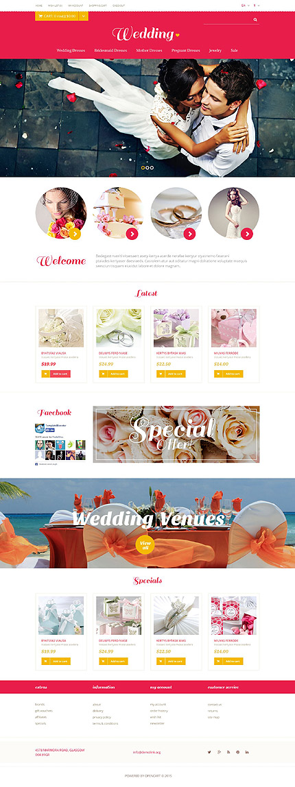
The header is designed in red, the color of love, with a yellow drop-down
menu, yellow buttons and plenty of whitespace for that look of elegance.
The slider for this Wedding Store Responsive OpenCart Template shows
romantic images of a bride and groom while highlighting the products available on the site. Images in circles below the slider have arrow buttons that lead right into product pages with product slideshows, product descriptions, videos, color options, stock availability, price, data sheet, reviews, social sharing icons, shopping cart. Related products are shown below in a product carousel. Search, shopping cart, checkout and account links are prominent on top. Banners on the homepage highlight special offers. The footer contains useful navigation links and a sitemap, on plenty of whitespace. The sub-footer within scalloped borders has the address, social sharing icons and email address.

This flat design Fruit Gifts Responsive Shopify Theme with Bootstrap uses color blocks, ghost buttons, circle buttons and banners with overlays on images of fruit, while illustrations for customer quotes make a personal and unique statement. Orange, yellow, green and blue circles are repeated in banners of the same color, interspersed with neutral grey. The template design thus focuses on fruit while highlighting store offers. The header slider changes the background picture of fruit while the messages in the colored circles remain the same. The carousel in the yellow banner changes the images of the fruit baskets and invites the user to view all collections, leading her into the categories page. Clicking on one of the circle buttons on a product shown on a category page leads her into a product page with product slideshows with image zoom, product description, price, social sharing icons and other products with transition effects. The footer has useful links for navigation and a Facebook social sharing plugin. Login, checkout, search, shopping cart are prominent on top.
Template 53282 – Whole Sale Responsive PrestaShop Theme
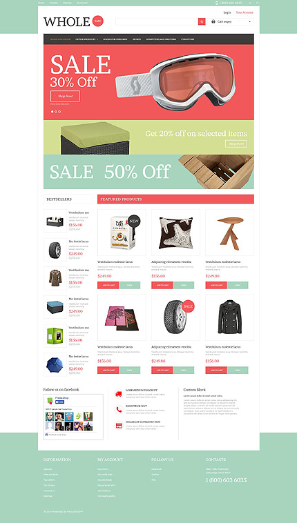
Colorful banners in red and green with large fonts, animation, zoom and hover effects call attention to sales messages with energy and positive appeal on this Whole Sale Responsive PrestaShop Theme with plenty of whitespace. The pizzazz invites the user to click through to a product page with slideshow and zoom, product description, review, data sheet, price, shopping cart and payment options. Other products can be viewed in a product carousel below. The menu makes it easy to search for product categories. The footer has links to important pages on the website, and contains a sitemap, a Facebook social plugin, the site-user’s personal account links, store contacts, social media links and feeds. Login, account, contact, search and shopping cart links are prominent on top.
Template 53292 – Luxlinen Luxury Responsive PrestaShop Theme
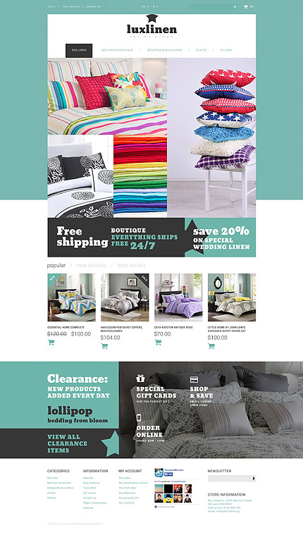
This attractive Prestashop Theme for a linen store has grid-style banners
with animations, zoom effects on hover, and is designed on a textured green and white background. Bold fonts in white and black on green and stars (from the logo theme) that animate, draw attention to the messages on the banners. Product pages have a product slideshow with image zoom, video, product description, data sheet, price, stock availability, shopping cart, payment options, social sharing links. A neatly designed footer links to important pages on the website, and contains a sitemap, a Facebook social plugin, the site-user’s personal account links, store information and a newsletter signup. Sign-in, account, contact, search and shopping cart links are prominent on top.
Template 52947 – Charity Responsive WordPress Theme with Parallax,Blog and Portfolio

This template with its bold yet elegant fonts, whitespace, color, transparent overlays on a black and white image has a unique look, with a header designed in grey on grey with menu dropdowns. The red Donate Now button provides a call to action on the grey. Parallax provides a 3D effect while scrolling, with banners of red, yellow and green overlaid on a black-and-white image of an adult’s hand holding a child’s hand. Buttons from the banners lead into the blog which engages the reader through comment forms. Text on white below the banners calls for volunteers and donations for charitable projects. On the right sidebar, color bars in red, yellow and green with hover effects invite readers to read more about the different programs of the charity in the blog with comment forms. The gallery in image, slideshow, gallery, audio and video media can be viewed by category. Banners and links provide information on the charity’s mission, goals, facts, people served, programs, need gaps that remain, and highlight the need for volunteers and donors with several calls to action – donate now , read our report, volunteer. The logo is placed on plenty of whitespace in the footer.
Template 53263 – Fashion Agency Responsive WordPress Theme with Portfolio and Blog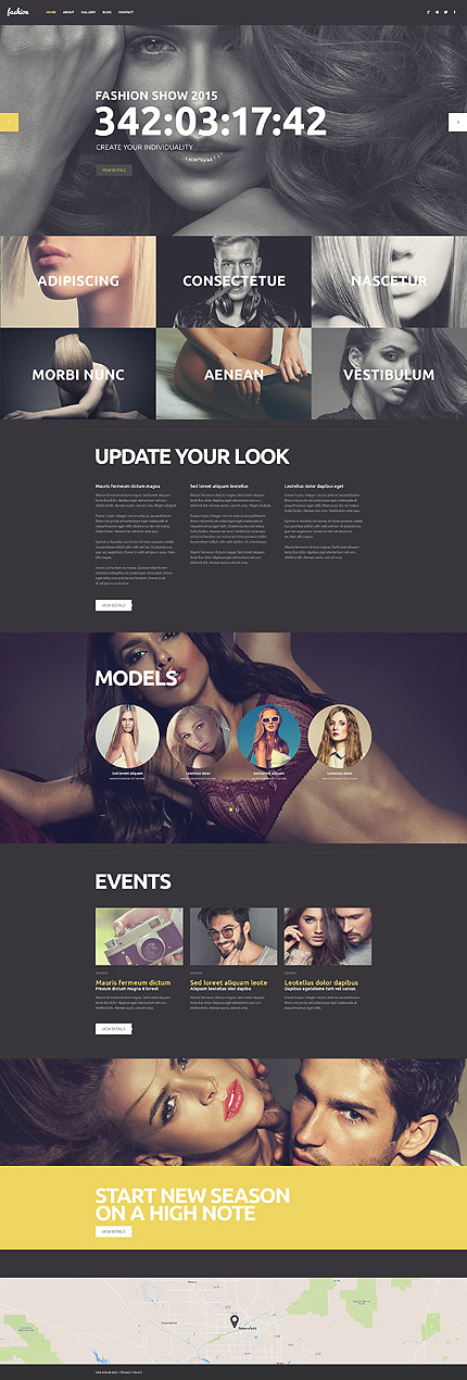
This Fashion Agency Responsive WordPress Theme designed in contrasting colors of black and yellow has a slider with black-and-white images, a gallery with hover effects that leads into the portfolio, text banners in black and yellow interspersed with parallax banners with closeup images and sliders, leading into the blog, and a map. The yellow banner appears above the map footer with large text in capitals and a View Details button leading into the About Us page. Navigation is simple through the menu on top in black and drop-downs in yellow, with social sharing icons on the menu bar and a script font for the logo.
Template 53436 – Cafe and Restaurant Responsive WordPress Theme with Slider, Gallery, Blog, Parallax and Lazy Load Effect

A yellow header menu with drop-downs, yellow banners, buttons, transparent yellow overlays and captions on hover for images, yellow text on hover for testimonials give a cheerful look to this Cafe and Restaurant Responsive WordPress Theme designed with plenty of whitespace for a look of elegance. The parallax slider with yellow banner below showcases delicious food in closeup. A parallax box shows animations of several images which float into the frame from left and right. These images have rollover captions and yellow overlays highlighting the chef, the location of the restaurant and the delicacies it is known for. Recent blog posts keep visitors browsing and lead into the blog with large images, more posts and comment forms. A banner with transition effects catches the eye on scroll and on hover the text changes to yellow, inviting the user to read the customer testimonial. A location map is shown in the footer. The restaurant’s menu is presented attractively in a gallery in image, slideshow, gallery, audio or video media formats, viewable by category.The blog engages the site visitor with news about the restaurant’s events, menu and specials by the chef.
Template 53349 – Yacht Club Responsive Drupal Template with Slider, Portfolio, Blog, Parallax, Lazy Load Effect

Blue-tinted photographs like the night sky at sea lend an air of mystery to this Yacht Club Responsive Drupal Template. Menu overlays in shades of blue; site icons, buttons and arrows in blue on a background of white give a look of space and elegance. The homepage gets down to business- selling yachts for those who love them, with image overlays on larger images of the yacht, giving information with text on a navy-blue background and leading into the blog with more details. The gallery can be displayed in 4 different formats, with parallax and lazy load effects for maximum advantage. The icons and text on the homepage introduce the purpose of the yacht club and its services. A text slider below is superimposed on a beautiful image of a yacht at sea, with testimonials from yacht club members. Videos to show yachts in full sail can also be posted on the gallery. Latest posts from the blog keep the visitor browsing. The navy-blue footer contains useful navigation links including blog archives and contacts. Social sharing icons are placed in the light blue sub-footer.
Template 53172 – Tennispro Responsive PrestaShop Theme with Slider, Product Slideshows with Zoom, Carousels, Video
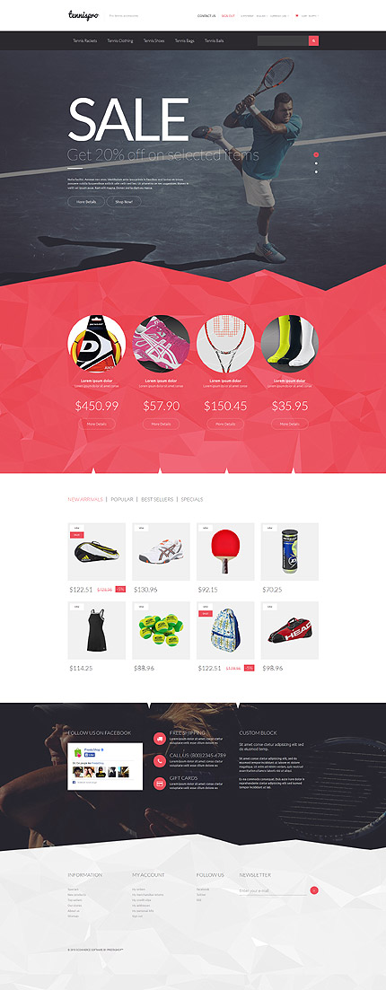
Pink and grey polygons form the modern, geometric design of this Tennispro Responsive PrestaShop Theme. Subtle grey polygons form the backdrop of the broad dropdown menu that helps a customer finds his way around the site with speed and efficiency. Large fonts, images, pink buttons on grey guide the user through informative slider banners with sales messages and call to action buttons. Below the slider, circles on the pink polygon banner below rotate to grab attention and show products that are stocked at the store, with their prices and descriptions prominently displayed on the pink banner and leading into a catalog page with a quick product view, product slideshow with zoom, product description, review, social media links, payment options, shopping cart, data sheet, other products in a carousel and video. A banner with a jagged outline above the footer has calls to action, a social plugin, a content block superimposed on an image. The footer on a subtle background of grey polygons has useful navigation links including a sitemap and newsfeed, a newsletter sign-up and email capture.
ECommerce Website Templates:
CMS Website Templates:
Business Categories:
