Simplify the task of creating a professional website by using a website template that’s thoughtfully designed keeping the best user interface and user experience in mind – to make sales and conversions from your site, create a better image for your company and connect with your various customers. These templates below have great looks combined with video, animation, zoom and hover effects; the latest in website technology from parallax to lazy loading that delays loading of images until the user scrolls to them; ease of navigation and functionality with menus, navbars, buttons, arrows and forms; modular content;full-width images to catch the eye.
Check out our latest collection of responsive website templates with UX and UI design. They have flexible designs that adjust to different types of screen resolutions, from desktop to tablet to mobile.
Template 53539 – Figure Skating Responsive Website Template with
Lazy Load, Gallery, Carousel
This template designed in purple with a sprinkling of stardust and circles for the logo and spotlights on the dancers, has a magical and inspirational effect. A beautiful full-screen image header catches attention and the images and numbers in circles act to lead the user’s eye to important content. Latest blog posts with a purple hover effect are shown in a carousel and lead to the blog. The team is shown below and the footer with purple text aids navigation. The training section has circles that float into the screen, an impressive visual effect. The gallery with lazy load shows more figure skating shots in action with details of the performances on hover.
Designed in soothing green with icons, hover effects and animations, this Fishing Store Responsive PrestaShop Theme shows its fishing tackle in action in a slider and banners. Modular content blocks and transparent image overlays add interest to social media plug-ins and special services. The footer offers ease of navigation, account links, special information, a sitemap and store address. The mega drop-down menu has all the sub-links a customer could look for and leads into the site. Product pages have product slideshows with image zoom, product details, price, payment options, stock availability and shopping cart. Other products are shown in a carousel. Video integration is also possible. Modular content blocks and transparent image overlays add interest to social media plug-ins and special services. The footer offers ease of navigation, account links, special information, a sitemap and store address.
Template 53655 – Pink and Grey Family Life Responsive Joomla Template with Slider, Blog, Forms
Pink is nurturing, caring, understanding, intuitive and sensitive and grey is reliable, soothing and calming. Designed in pink and grey with white space, icons, banners, panels and hover effects,this Family Life Responsive Joomla Template has attractive images of parents with children, along with modular content that allows the eyes to travel easily from one subject to another. A search bar makes it easy for the user to find what s/he is looking for. A sign-in form and user registration form enable data collection. A blog, marriage center and a personalized advice column provide helpful tips for parents, children and teens on various issues like healthy relationships, healing from trauma, parenting advice, marriage counselling and more. Social media icons, Twitter and Instagram feeds enable users to connect. Images and text float into frame on the Services page and icons in red circles stand out on grey banners with images of surfing.
A full-width header image and beautiful images in large banners with zoom effects on the homepage flag off the product categories in this Wedding Store Responsive WooCommerce Theme. Featured products lead the user to click to a product page with product slideshow, product description, reviews, price, stock availability, shopping cart and social media icons. The gallery shows products with zoom effects and can be viewed by category. The blog displays the products in use with attractive images and helpful text. Search and shopping cart are prominent on the top of the page.
Template 53663 – Sunglasses Responsive PrestaShop Theme with Slider, Parallax, Video, Product Slideshows with Zoom
This Sunglasses Responsive PrestaShop Theme has been thoughtfully designed to promote sunglasses in an online store – displaying the range and price along with product descriptions so that the customer can select the pair s/he wants with ease. The slider with full-width images shows close-ups of men and women wearing sunglasses of different kinds. Banners with special offers and zoom effects on hover call attention to the different product categories offered by the store. Featured products lead to quick views with product slideshows and image zoom, product descriptions, reviews, price, shopping cart, payment options, and presents other products in the category in a carousel. An entertaining video promotion shows the range in use with a youthful audience. A large parallax banner calls attention to a model wearing premium sunglasses. A vibrant yellow banner highlights icons and text with arrows that lead into product pages with details. On the left navbar on the product pages there is a link to the stores selling the sunglasses, leading to a map showing their locations. Social media plugins and icons, footer navigation and a newsletter signup keep the user connected.
Template 53535 – Surfing Club Responsive Website Template with Slider, Parallax, Blog, Video
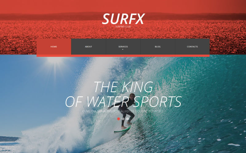
Red and grey are the dominant colors in this website, red on the header, grey on the footer with a red and grey drop-down menu. Exciting surfing photographs in color and black and white are shown in the slider parallax banners, with fonts leaning surfer-style towards the wind. A banner with black-and-white image and text shows a coach introduding new learners to surfing. The next banner with a really large ‘Join The Club’ button attracts the user to click it. Club events, club information and a video are given below to engage the user. The blog with attractive images and text on surfing keeps the user connected to the club. The footer with black-and-white action photograph captures the excitement of surfing and contrasts with the red of the header while social media icons in red circles pick up the red accent.
A mouthwatering full-screen image grabs the eye in this Bbq Restaurant Responsive Website Template with logo in the center, a centralized drop-down menu, photo collage and image overlay footer. Red and yellow banners call attention to special offers. A taste of the menu is presented on the homepage in a collage of images with rollover text and prices. A slider shows the live entertainers who will get the place swinging, with the names and dates on hover. The About Us section promises a fine dining experience, and introduces the chefs with animations and zoom effects. The menu page is presented invitingly with food categories and prices. Animations of food are shown on the image overlay footer that boldly repeats the centralized logo, and uses icons to attract attention to food categories.
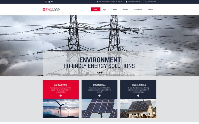
Blue spells trust, integrity and dependability, and red denotes energy, passion and action. Blue and red with hover effects, with black,grey and whitespace are used in the design of this responsive website template for a company that provides Environmentally-Friendly Energy Solutions. The slider shows examples of ways to generate, manage and transmit efficiently and save money. The page on Programs with hover effects, images with zoom effects and text,shows different categories of energy and resources and provides facts to support the usage of environmentally friendly energy solutions. The Solutions page uses icons to focus on businesses that can save by implementation of environmentally-friendly solutions, and more icons highlight the savings they can effect. Current and featured projects show energy projects in action in the form of a gallery that can be enlarged and watched as a slideshow. The contact page with contact form and map invites customer response.
Template 53482 – Home and Family Care Services Responsive Magento Theme with Slider, Blog, Product Slideshows with Zoom
This Home and Family Care Services Responsive Magento Theme has been carefully designed with lots of details in mind. Modular content allows quick access of important content on all devices from desktop to mobile. The slider with thumbnails highlights photography of the end results of home care with a smile – work is taken care of at home by our trusted handymen and women – from carpentry to gardening and wallpaper and lots more! Below the slider, a wooden textured panel highlights handyman services for a special discount with a Shop Now button. Childcare, elder care, party planning and entertainment are other services required by busy home-makers are offered on the site. Service categories buttons lead the user into pages with more details. The New Products section on the homepage highlights special services with prices, shopping cart button and details. Latest posts from the blog are featured below and lead into the blog with comment forms and newsletter signup. Footer navigation includes links to store information, advanced search, a sitemap, reasons to buy from the company, account links, social media and newsfeeds.
Bright colors in the banners, icons, text animations and buttons give a lively look to this Babies and Kids Wear Responsive PrestaShop Theme. The slider banners highlight the attractive kidswear on offer and lead into the site. The Categories 3-stroke navbar enables users on all devices to navigate through the site. Colorful hover effects draw attention to attractive discounts and special offers. Shop Now buttons are calls to action and text on image overlays pull users to page visits. Blog posts lead into the blog with large attractive images, comment forms and related posts. A map, newsletter signup, a footer with useful links, sitemap and account links makes navigation easy too.
Template 53469 – Skydiving Club Responsive Website Template with Video, Parallax, Gallery, Lazy Load Effect
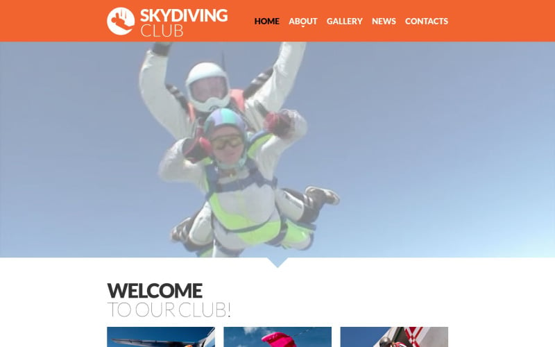
Excitement is the name of the game in this Skydiving Club Responsive Website Template. The full-width video header gives you a rush of adrenaline as you can feel the wind in your face, diving safely down from the sky in a parachute with a trainer. Orange is the color of adventure, optimism and happiness, and that is the dominant color in this website, in the logo, buttons, banners and headline text. Orange is balanced with black, grey and white black and grey to give a look of reliabiity and authority. Arrow navigation leads the user’s eye through the site and lazy load optimizes image loading and animation loading time on scroll. Parallax banners lend a 3D feel as the user scrolls down the page. Gallery images lead into the gallery, designed grid-style with zoom effects on hover and images enlarging on click. Testimonials in banner format lend credibility to the website and attract users to try out skydiving. A location map and social media enables user engagement.
Template 53480 – Call Center Responsive Joomla Template with Slider, Blog and Gallery
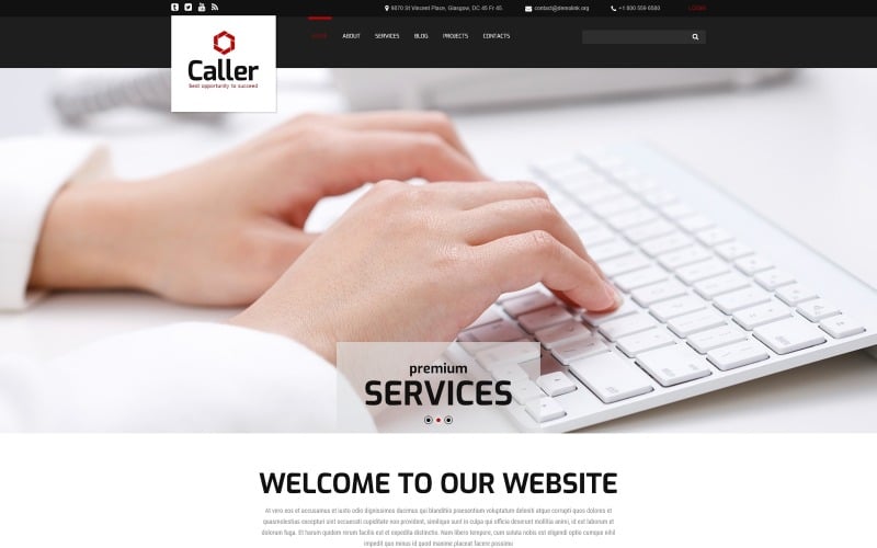
This Call Center Responsive Joomla Template with clean layout and drop-down menu makes it easy for the user to navigate through the site. The slider with changing text on a transparent overlay draws attention to the strengths of the call center. Team photos with zoom make the presentation a lively and engaging one. The blog connects with customers and provides useful content. The Komento extension is embedded to enliven the blog with your customers’ comments. Full-width video enables an impressive look at the Call Center and its achievements. Projects are presented in a gallery that can be viewed as a full-screen slideshow. The Facebook Like Box in the footer helps users connect with the company.
Template 53563 – Transportation Muse Template with Parallax Banners
This website template gives you a feeling that you’re on the move, wherever on the site you happen to be! A black header with bold white logo that appears as if moving out of sight, and banners in yellow, green and blue combine to make an attractive website design for a transportation company. These horizontal parallax banners provide a 3D feel on scrolling and are designed with transparent image overlays and icons reflecting their service category: Trucking, Marine and Air Transportation. Banners in black and white carry text about the company and the footer has a map in grey. The attractive contact page with map and banners on image overlays in yellow and green invites response.
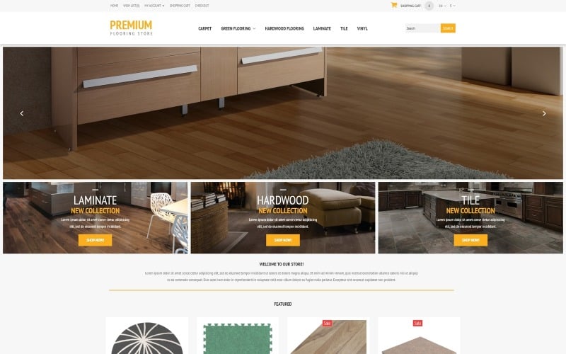
This Flooring Store Responsive OpenCart Template has been thoughtfully designed to display different categories of flooring products to advantage and to help the online shopper choose and buy from them. Drop-down menu relating to products and footer menu relating to company, customer services, extras and account, enable quick and easy navigation through the site. The image slider with stylish headline typography draws attention to the different flooring products offered by the store. Below the slider, different flooring categories are specified so that the user can identify what s/he is looking for. ‘Find a Gift’ and ‘Shop Now’ buttons in a lively yellow call the user to action. Featured products are shown in a carousel with shopping cart and price. A full-width parallax banner with 3D appeal displays products and below that, brand logos are displayed attractively in a carousel. Banners in white, black and yellow attract attention to special offers. Clicking on a product leads to a product page with product slideshow and image zoom, product description, reviews, price,options, social media, and related products shown in a carousel. Shopping cart, search, account, checkout, currency options are prominent on top. The footer has useful links, account links, contact information, social media and a sitemap. A newsletter sign-in link on the footer promotes user engagement with helpful updates.
Template 53572 – Design Agency Responsive Website Template with Portfolio and Lazy Load
The future is rosy with cutting-edge projects for a young team – that’s what this design website template says. Pink is the color of intuition and insight, empathy and nurturing – everything your brand would require to achieve success in a competitive marketplace. A full-width header image with a pink tint draws attention to the young creative team behind the projects. The grid-based design uses vibrant pink, blue and yellow to differentiate social icons and design categories, and whitespace to lend visual balance. This template has lazy loading that delays loading of images in long web pages until the user scrolls to them. The portfolio is shown below with zoom effects on hover and leads to the portfolio page that can be viewed as a full-screen slideshow. The contact form with text flying in attracts attention and invites customer response.
Template 53678 – Modelling Agency Muse Template with Slider, Parallax, Circles and Hexagons
A full-width slider captures the viewer’s attention at first look in this Modelling Agency Muse Template. Images of models are shown in black-and-white and color in circles on whitespace, with an overview of the company below. Circles and hexagons symbolizing nature’s perfect shapes are used to showcase more images of models on a parallax banner with a hexagon background in shades of orange and red. A simple contact form, contacts and social sharing icons on a textured background complete the homepage design. The vibrant circle-and-hexagon theme is continued with variations in the gallery and inner page design.
Template 53454 – Business Responsive Joomla Template with Slider, Gallery and Blog
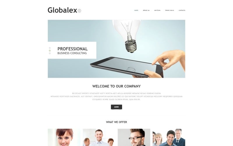
This Business Responsive Joomla Template has a flat, clean design using lots of whitespace, shades of yellow and green, large full-width images and buttons with shadow effects for a contemporary look. The slider conveys the image of a company offering innovative solutions. Photographs of team members emerging from green and yellow boxes give a personalized look to the website and project an image of a company that thinks thinks out-of- the-box. Hover effects and icons on the boxes add to the user’s interest in reading more about the company’s services. Banners with large images and messages sustain the user’s interest and snippets from blog posts lead into the blog. A contact form, map and footer navigation that includes social media and a privacy policy completes your business website. The company’s services page is displayed as a gallery that can be viewed as a slideshow. Latest news is presented in a blog with full-width images, video integration and comment forms.
Template 53505 – Marine Store Responsive PrestaShop Theme Carousel, Slider
This Marine Store Responsive PrestaShop Theme is designed in a refreshing shade of
blue with pink and white. The slider calls attention to marine equipment.The broad drop-down menu helps the user quickly find what s/he is looking for. Below the slider, closeups of equipment in circles and Shop Now buttons in pink circles on a blue banner of polygons lead into category pages. Featured products on the homepage lead into product pages with product slideshows with zoom, product desctiptions, shopping cart, payment options, social sharing icons and more products presented in a carousel. The footer on a natural wood background has useful links, a sitemap, account links, social media links and a newsletter signup. Search, sign-in, shopping cart, currency and language options are prominent on top.
Template 53446 – Swimming Club Responsive Website Template with Slider,
Parallax, Carousel and Lazy Load
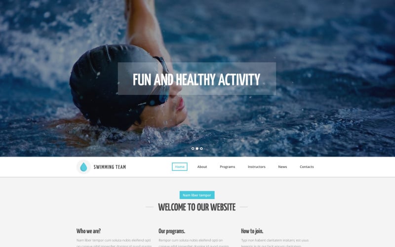
This Swimming Responsive Website Template is designed in cool blue and white with circles, icons and hover effects. It transports the user into the environment of a swimming pool and makes the process of learning swimming look easy with trained coaches.The drop-down menu has a blue rectangle highlight on hover.The slider with large full-width images immediately captures attention and text on transparent overlays sells the benefits of the swimming club. Parallax banners provide a 3D feel and icons in circles change color on hover, focusing attention on special lessons and services provided by the club. Smaller images showing events are shown in a carousel, leading into the news section. The team of swimming instructors are shown in circles alongside a parallax banner. Programs are displayed with text and images smoothly floating into the screen on
lazy load, that delays loading of images in long web pages until the user scrolls to them. Contacts are clearly given on whitespace, followed by the attractive yet functional footer that carries a contact form on an image of a swimming pool with diving board.