Our range of amazing responsive website templates are designed to fit desktop to mobile devices. Our web designs use modular content blocks and UI design are used to optimize the user experience and engage the user. Take a look at our ecommerce PrestaShop and Magento templates, CMS templates like WordPress and Drupal, Landing Page templates that increase conversion rates, templates with flexible layout options, so easy to customize. Our templates have awesome features like parallax and lazy load, background video or video integration, animation, zoom and hover effects, full-width images, sliders, galleries and carousels. Check them out!
Template 58452 – Prestashop Fashion Wear Responsive Website Theme with Carousel
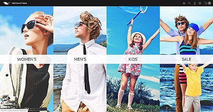
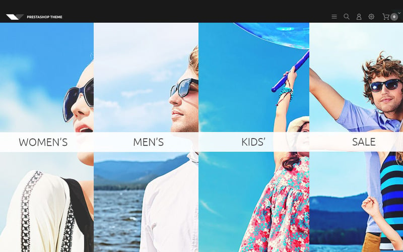
Images of women’s wear, men’s wear, kid’s wear and sale items capture attention as they come into view one at a time on mouse hover in this neatly designed Fashion Wear Prestashop Template Responsive PrestaShop Theme . Icons on the top help the user to search, sign-in, buy or navigate the site. Products can be viewed by simple scrolling with Quick View options giving price with discounts if any, size, color, description and shopping cart . Other products with prices are shown in a carousel below. The footer has useful links, a newsletter and social sharing icons.
Template 52120 – Wakeboarding Runner Responsive Website Template
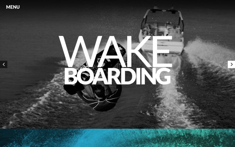
It’s action all the way in this Wakeboarding Runner Responsive Website Template. Right from the headline with bold text and the wakeboarders in black and white shots behind, to the blue spray welcoming you to the fresh, bracing feel of wakeboarding, to the action shots on red and yellow below. The footer lends continuity to the header with the wakeboarder being towed by the boat, concentration on his face. Instructors are showcased in hexagons instead of boring squares, showing that they are complete professionals at their chosen sport. The image of the wakeboarder in action behind them in black and white adds to the excitement and anticipation of attending one of their classes. As you scroll down there’s a beautiful photogallery of wakeboarders doing their thing – and the “click to enlarge” button is a hexagon too! A Google Map completes the website. This template enables you to add cool stuff like a portfolio, slider and social media plugins.

Unlimited page layouts at your fingertips to give added room for your creativity! Check out the drag and drop page layouts page builder layouts in the live demo. This Event International Responsive Landing Page Template is perfect for a conference or public event. It provides registration, event details, dates, schedule downloadsvideos, speakers, locations, reasons why the person should attend, and fields for customer email and subscription, price lists, registration forms, sponsor logos and contact details with Google map.

Template 58416 – Summer Camping Responsive Moto CMS 3 Template
with Parallax, Slider, Carousel
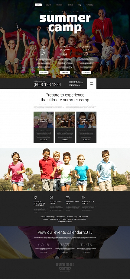
This responsive template with flexible layout options, is suitable for customization
for websites for camps, or for families or children. Big bold fonts announce
Summer Camp against a colorful parallax banner with a 3D effect. Icons call attention
to different camping programs. More content sections speak to parents about
Junior Camp, Middle Camp and Senior Camp, clearly specifying age groups.
Colorful banners catch the eye as the reader scrolls down and more icons in white
on black draw attention to content about other camp activities. An Events Calendar
is presented in a parallax banner at the footer. The logo below turns to bright white
on mouse hover.
Template 58124 – Blossom Clothes Store Responsive VirtueMart Template with Banners,
Video, Slideshow, Catalog and Blog
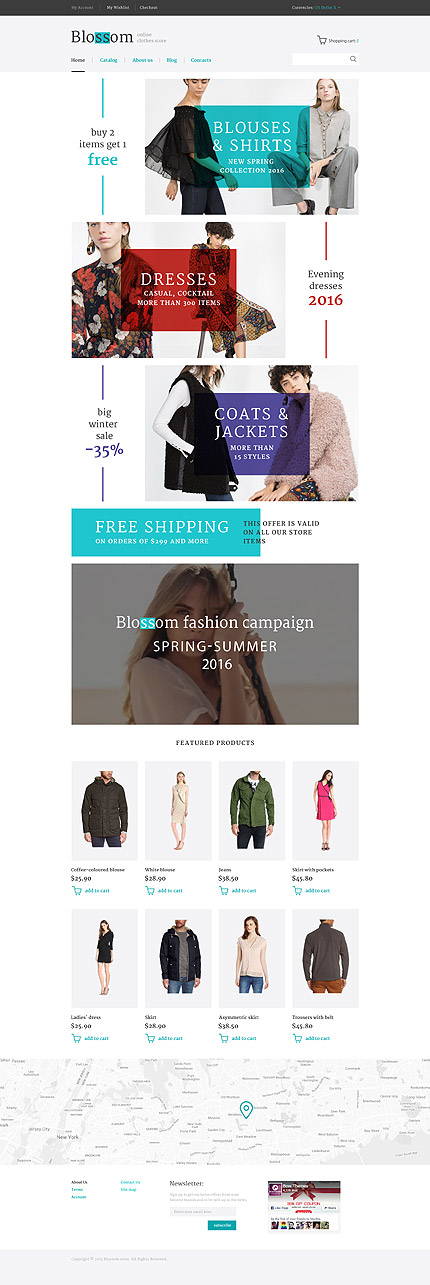
This template is a contemporary responsive Clothing Store VirtueMart Template optimized for desktops, tablets and smartphones. Colorful banners with zoom on hover direct the viewer’s eye to the store’s special collections, merchandise and special offers, and free shipping on orders above a certain value. Background video with a product message demonstrates fashion in action. Featured products reveal (on click) slideshows, detailed information, price, shopping cart, video and related products. This template contains a Catalog with category-wise navigation, an About page with icons and graphics, a Blog, a Newsletter subscription and Contact page with Contact form and map to make it a complete corporate website as well as e-commerce template.
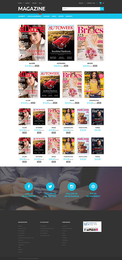
Template 55692 – Magazines News Responsive PrestaShop Theme
with Parallax Banner Footer and Customization Tool, Blog
This Prestashop theme with clear and attractive display is ideal for
an online magazine store. Prices and discounts are clearly mentioned and a
Quick View button takes you into a product description with price,discounts
or sales and checkout. Social media buttons are prominent on the parallax banner
with 3D look above the footer that catches the user’s attention. A handy
customization tool makes it easy to change the theme colors, add a newsletter
pop-up and add a chat button. The footer contains useful links, the customer’s
account information and categories of magazines available. This PrestaShop theme
has 5 languages, 2 currencies, sign-in, sitemap, a search feature and a blog.
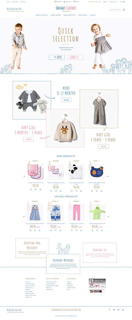
Hand-drawn illustrations of little children, buttons, borders and labels, hand-lettered fonts make this Magento Responsive Template for an Infant Baby Shop delightfully different from the rest. You can shop by age and sex, while new and special products are separately presented. It’s interesting how borders appear around the selected product, which takes you into a page with product details, slideshows, color options available, description, price, stock availability, reviews, video, shopping cart, and related products in a carousel. The footer has useful links, a sitemap, and links to the user’s account. This template has a search bar on top and supports 4 languages and 3 currencies.
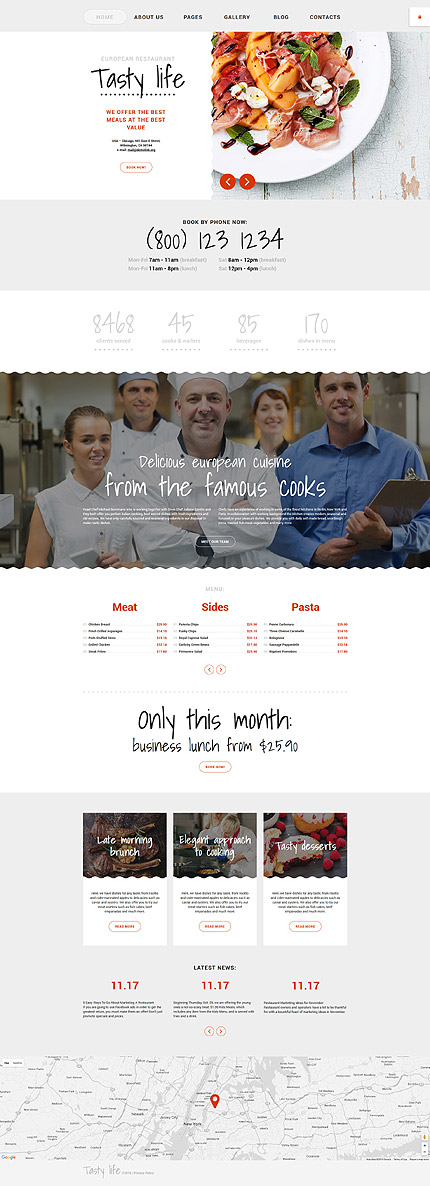
Scalloped borders add visual appeal to the attractive header slider images, parallax banner and content boxes with appetizing images of food being served. Megamenu dropdowns provide easy navigation, information and a closeup of a product with the
price. This template with its minimalist design has unobtrusive ghost buttons and handwritten fonts in black or grey on white that add personalization and character.
The customization tool allows you to make changes in the theme color. The chefs
are introduced in a parallax banner that adds 3D depth to the image. The menu is presented in a carousel with a special offer highlighted in bold fonts below. Modular content boxes with a frame of black and white illustrations of fruits and vegetables, followed by more content in a text carousel and a map, complete the home page.
The Gallery has mouthwatering images of food. The blog with attractive header and
scalloped borders on the images offers continuity to the design of the website.
Template 57940 – Tools Store Responsive PrestaShop Theme with Carousel,
Sample Data Installer and Theme Color Switcher
Different categories of tools are showcased up front in the header banners with
zoom effects, with New Arrivals catching attention on top and 20% discount big
and bold below. Popular products are displayed below. Different views of the
products are shown on mouseover, and on click, the user is taken to another page
with slideshow, data-sheet, description, price, shopping cart, reviews, payment
methods all provided. Other products are shown in a product carousel below with
prices and options to buy. The footer contains useful links, a sitemap, links to
social media pages of the company, and user account links. The template has
a Sample Data Installer and Theme Color Switcher. This Responsive Magento
template supports 5 languages and 2 currencies and has a search function, blog
and sign-in.
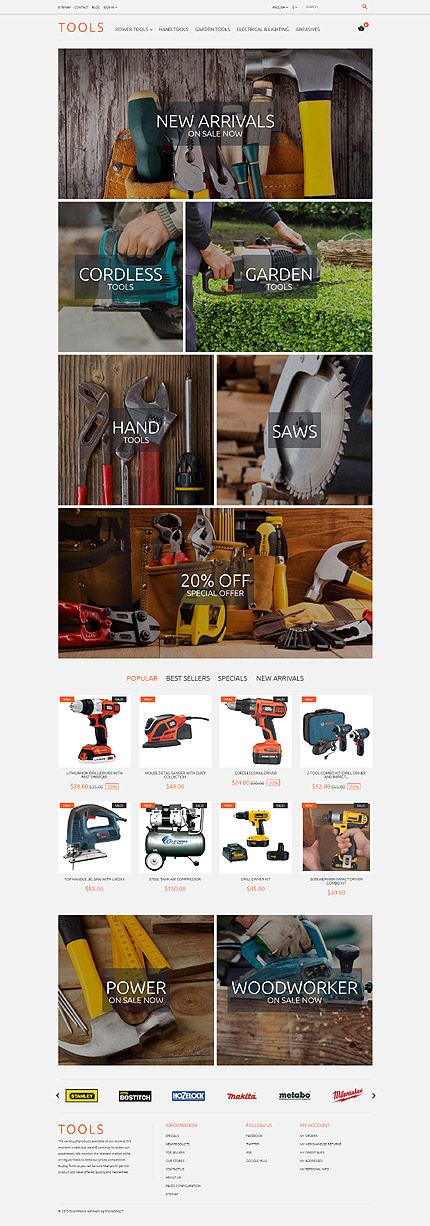
Different categories of tools are showcased up front in the header banners with
zoom effects, with New Arrivals catching attention on top and 20% discount big
and bold below. Popular products are displayed below. Different views of the
products are shown on mouseover, and on click, the user is taken to another page
with slideshow, data-sheet, description, price, shopping cart, reviews, payment
methods all provided. Other products are shown in a product carousel below
with prices and options to buy. The footer contains useful links, a sitemap, links
to social media pages of the company, and user account links. The template has
a Sample Data Installer and Theme Color Switcher so you can easily insert data or customize theme colors. This Responsive Magento template supports 5 languages
and 2 currencies and has a search function, blog and sign-in.
Template 58372 – Residential Remodel Responsive Website Template with Parallax Banner, Theme Color Switcher, Gallery
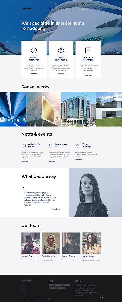
This Residential Remodel Responsive Website Template is perfectly designed for your architecture company and is optimized for desktop and mobile devices. The large parallax header banner gives a 3-D look that captures attention along with a headline that sells your company’s capabilities. Text banners with icons present the company’s strengths. Images with zoom present your portfolio with flair. A testimonial from a customer conveys a message about your skills. The team members are shown below with one-line introductions. This theme has a Color Switcher that makes it easy for you to customize your color theme. The template has an About and Services page to present information about your company. Projects can be zoomed and watched as a slideshow. The Contact page with contact form and map invites customer response.
Template 55004 – Food Online Responsive Magento Theme with Newsletter Pop-up, Parallax, Ghost Buttons
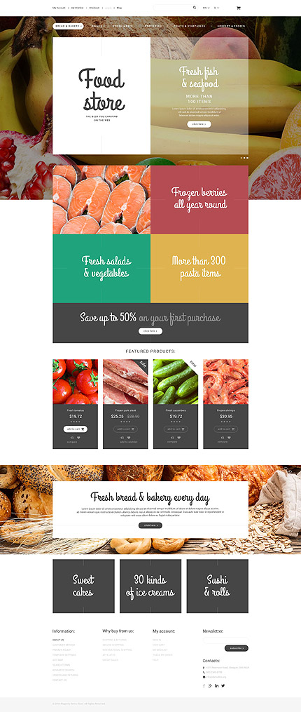
A newsletter pop-up on opening the template, introduces you to the Food Store.
The slider with the logo on the left shows the items available on sale, through
changing images in the background viewed through the transparent box. Ghost
buttons, cursive fonts in white oneye-catching, appetizing colors, a “Save up to 50%
on your first purchase” banner on grey that is sure to get a customer to buy, smaller content boxes featuring products with prices and discounts on grey. A parallax
banner below provides depth to the image with a text box on top. Three more
content boxes have interesting text effects on hover and reveal images of different
types of food. The footer has useful links, user account navigation links, a site map, newspaper subscription button
Template 55343 –Photography Studio Responsive Drupal Template,
Parallax Slider, Slideshow, Video, Blog, Portfolio
The homepage of this Photography Studio Responsive Drupal Template provides
an overview of the photographer’s strengths in the visual arts – from photography to videography. The parallax slider shows images of him at work and the finished work, with headlines that reflect his professionalism and talent. Homepage content and graphics provide information on video production, while images displayed reflect the work of different photographers and can be viewed by category. A newsletter form in a parallax banner gives 3D depth to the image. Excerpts from the blog lead into the blog. The gallery with its rich display and shutter-like effect opens to reveal close-up images. It can be viewed by category. Images can be zoomed in and have descriptions. The blog gives useful professional tips on videography and photography and has a poll. This template has video integration. The footer with map and social media icons and company logo calls attention to the header menu which is in simple white and contrasts with the black of the map. Through this menu the user can navigate anywhere in the site, or head straight to the Contact, Login or Search page.

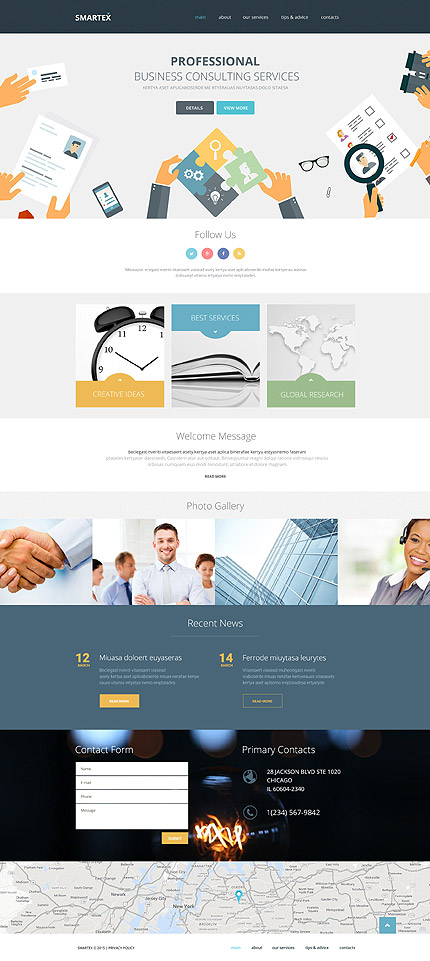
Designed in yellow, green and blue with grey and white, using illustrations,
icons and graphics, this Smartex Business Consulting Services Responsive
Website Template has a contemporary, trendy look. Animation is used in the
content blocks in the form of text fade-in effects and in parallax banners with text
displays, with lazy loading effects. Text boxes have images and yellow, blue and
green animated caption holders that enlarge on hover to fill each box and change
the caption. The page leads to a new page on click. The photo gallery has images
that can be enlarged on click and watched as a slideshow. News is presented on
a blue banner with ghost buttons that turn yellow on hover. The contact form is
inserted atop a video background banner which catches attention with glowing
planets that blink and fade. The address is given on this background. The site
can be navigated through the main menu on top which includes a contact page
with map.
Template 56092 – Fine Art Responsive WordPress Theme with Black and White Geometric Shapes Gallery, Blog, Carousel
This template uses black and white most effectively to contrast and elegantly
showcase beautiful works of fine art. Geometric shapes like a rhombus, square,
circle and hexagon are used in black or outlined boldly in black with white in the
center, to act as visual breaks and section dividers, and contrast with the ghost
buttons that turn white on click or hover and are the action points that guide the
user through the site. Customer testimonials are presented in a carousel. The
contact form is flagged off with a circle in a black outline. Parallax banners and background video enhance the visual appeal of the site. A skilfully designed, contemporary website, it focuses attention on each individual section from video
to gallery to carousel to sponsors’ logos and news. Simple navigation links from
the top menu allow the user to navigate the site without too much scrolling. The
blog enables display and discussion of art on a higher level.

Template 55671 – Motoraces Racer Moto CMS HTML Template with Slider and Gallery
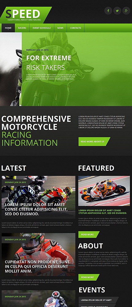
This amazing Motoraces Racer Moto CMS HTML Template has everything going for it – speed, action, focus, energy and color. The vivid green color catches the eye and casts a filter on the action shots of speeding bikers in the homepage slider. This Moto CMS HTML template with its user-friendly control panel has gallery/carousel options, and page layouts with image backgrounds, video and textures, event schedules, racer profiles, Facebook Likebox and Twitter Timeline and Google Map for a complete website experience. This mobile-friendly website requires no special skills to customize using the control panel.
ECommerce Website Templates:
CMS Website Templates:
Business Categories:
