Give your website design that zing that makes all the difference.
Think BIG. Big images, big fonts, big banners and spaces in between.
Think MORE. More content. More effects. More media.
Engage the user from the word go.
Think ORDER. Use color and shape to differentiate, categorize and catch the eye.
The templates below use a range of designs that draw users into the websites. Choose from CMS templates like Moto CMS 3, Joomla, WordPress and Drupal, Ecommerce Templates like PrestaShop, Magento, VirtueMart, OpenCart and Shopify for different products and services from motorcycles, wines, jewelry, sports products and clothes to graphic design, business consultancy, photography and security services to private tuition services.
These templates use the latest web design techniques to engage the user, from parallax and lazy load effects to sliders, carousels, video integration, banners and grid layouts, animations, icons, statistics with graphics, a striking use of color and white space, flat design and minimalism to keep the template lightweight and easy on the eye. Responsive website design ensures that layouts adjust to screen sizes of popular desktop, tablet and mobile devices.
The full-screen header shows a graphic designer at work with rough sketches and highlighters, a laptop and coffee at hand. The menu is presented on a text box with a red-to-yellow color gradient that hints at the range of possibilities in design. The red and yellow color theme with a lot of white space conveys action and energy, optimism and creativity. A welcome message stands out on white space and images of projects are displayed below. The first three images have overlays of opaque white which reveal the design on hover. They have text boxes in white that highlight the black text on the company’s capabilities. Text in orange and red banners tell a customer how to get started working with the design company and give an overview of its history and the industries it has served. Images with lazy load effects, fade-in animations and text focus on the different services of the company. A banner with an image and text communicates the personal approach of the design agency. Statistics provide information on the company’s achievements . The Gallery showcases images of projects that enlarge on click. The About page introduces the company, its strengths in specialized areas of design, and gives the customer reasons to choose the design agency., with its advantages highlighted in a banner below. The Gallery with short descriptions showcases the agency’s best work and images can be zoomed. The Blog presents the latest projects and gives tips on design, follows trends in design and draws attention to current events in the graphic design world.
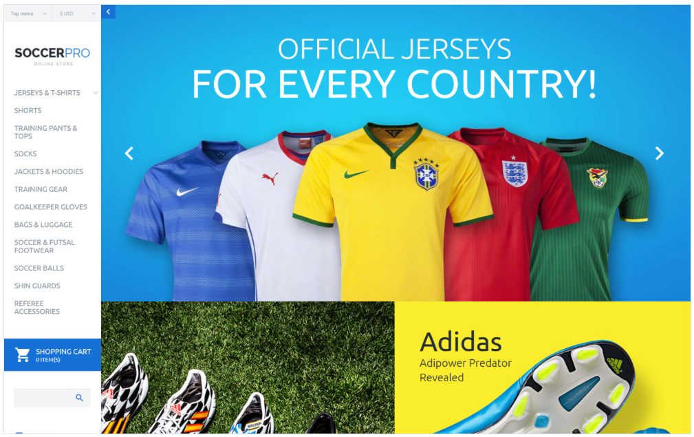
Template 59031 – Soccer Pro Responsive VirtueMart Template with Parallax, Slider, Bootstrap, Blog, Newsletter Popup
The header slider presents colorful products with a 3D look. Image boxes below with hover effects and colorful Shop Now buttons lead to product pages with slideshows with zoom, prices, shopping cart, descriptions, information, reviews, video and social media icons. Products on the homepage can be viewed by category. The Newsletter popup in bright yellow invites the user to subscribe, on entering the site. The Customization Tool enables you to make changes in the color theme of the template. A banner promotes specialized products and offers with a Shop Now button. The footer in neutral grey contains useful links that aid navigation, including the catalog and sitemap, gift vouchers and specials. The About page introduces the store and the team, uses icons and statistics, presents testimonials in a carousel and has modern graphics to represent the team. The Blog shows products in use by sportsmen with tips on sports and equipment.
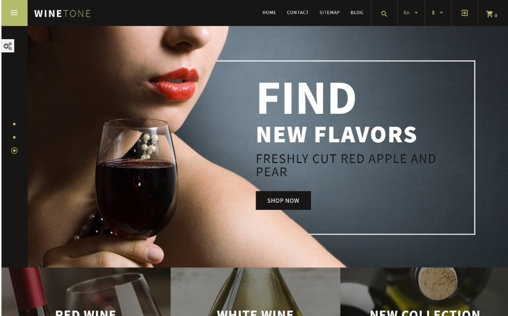
This Wines Wine Responsive PrestaShop Theme is beautifully designed with high-quality bordered images that show the quality of the wine with Shop Now buttons. Wine collections and categories are shown attractively in a carousel, leading into category pages. Images on hover have elegant understated borders and zoom effects and ghost buttons.Products featured below can be viewed by category in a carousel. A parallax banner promotes customer satisfaction with statistics. The Theme Color Switcher enables you to customize your theme. Special wines are showcased below. Products have dropdown carts and link to product pages with slideshows with zoom, descriptions, data sheets, videos, prices, shopping cart and other products in a carousel. Excerpts from the blog on the homepage lead into the Blog with useful articles on different kinds of wine and the processes used to make them. A green banner on the homepage with illustrations in white leads into different sections of the site. The hamburger menu tucked away in the left sidebar reveals a dropdown Megamenu with an image that gives room for promotional messages. The footer has useful links and a sitemap.
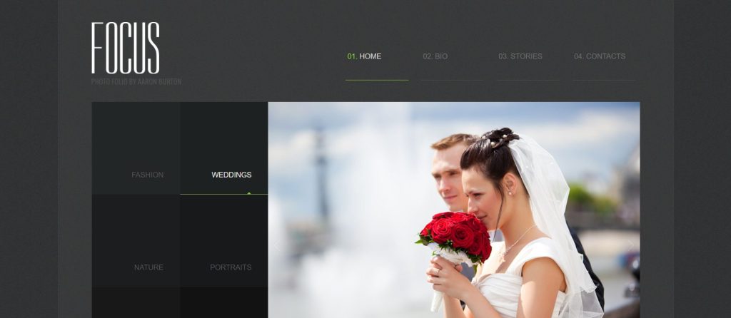
This stunning gallery-at-a-glance is an all-in-one showcase of a photographer’s capability and works of art. Images with with hover effects open into pages with descriptions in the Blog. Image themes feature cityscapes to fashion to outdoor scenic views with individual accents, to individual studies, urban life and international travel, the homepage pretty much sums up everything this photographer can bring to an assignment – a keen eye for detail and a penchant for looking beyond the obvious to getting a memorable shot. A customer just needs to click on the icon on the left sidebar for a popup login form for him to register and create an account. A hamburger menu opens up to access the different pages – an About page that gives the photographer’s bio and customer testimonials, a Blog with the photographers thoughts on photography and travel, life and fine details, and a Gallery with images that can be zoomed and viewed as a slideshow. The Customization Tool enables you to make changes in the color theme of the template.
Orange, textured grey and blue make a striking combination in this Cement Company Responsive Moto CMS 3 Template. Orange is warm, vibrant, energetic and used in an industrial setting it lends an active and friendly look. It is used in the image slider as a box with white text and as a banner in the center of the template. The grey is a neutral color that balances the stronger color of the orange. The slider highlights the equipment, the cement misers, the raw materials and the cement factories. The banners below focus on the services offered by the company, each with social media icons. Images shown in an orange banner can be zoomed and viewed as a slideshow. Captions appear on hover. Icons and text with lazy load effects and fade-in animations, focus on the company’s strengths. Excerpts from the blog lead into the blog. A blue banner highlights the cement-making process with images that enlarge on click. A customer testimonial is presented in an orange blue banner generating trust and credibility. The Services page talks to manufacturers of building materials and shows the process involved in processing cement, and the types of products that can be supplied to the customers. The Quote Request page actively solicits customer inquiries and offers to provide a quote for different products from the company. A page on Careers highlights the opportunities and benefits of working in the company. The Blog has information about the cement industry, trends in manufacturing and events related to the cement industry.
Template 58870 – Student Activities Responsive Joomla Template with Blog, Gallery, Bootstrap
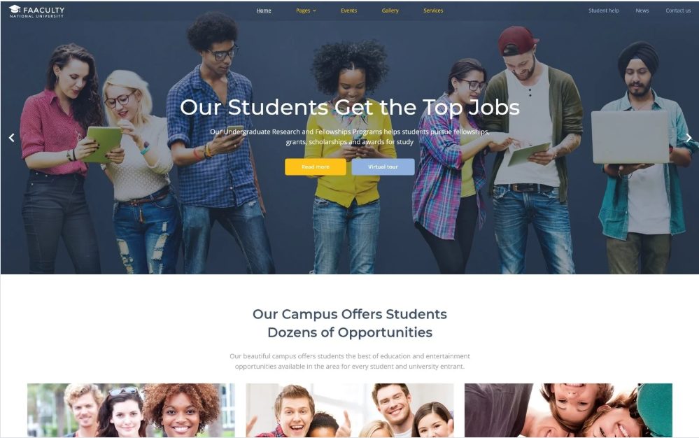
This Student Activities Responsive Joomla Template is ideal for a student blog. This blog has shows all the activities at a college at a glance in its homepage, with colorful bands of color for the text captions and blog categories. Read More links take the user into informative pages in the blog with content that helps students choose their career paths and prepare for interviews. The About page introduces the Student Activities organization, its purpose and programs and introduces the team, showcases testimonials that build credibility and enthuses other students to join the organization. Images in the Gallery can be zoomed and viewed as a slideshow. A pop-up login form is accessible from the icon in the right sidebar and can be used for registration of user accounts.
Template 58432 – Car Repair Responsive Moto CMS 3 One-Page Website Template with with Slider, Carousel, Bootstrap and Gallery
Red and black with text in boxes on transparent overlays makes a unique and good-looking design for a Car Repair Responsive Moto CMS 3 Template. It’s businesslike, putting all the hard-hitting selling messages where they really count – up front, in large readable text that immediately attracts the eye because of the attractive red color background and the location of the text box to the image of the skilled technician, already hard at work on the car, which can be seen right through the boxed text.. This visual technique is followed right through the template and is highly effective in combination with the text., showing a variety of car repair services under way and summing it up with a selling message – The fastest car recovery services, supported by quality, professional service and price. In the middle section of the homepage, text panels are in solid black with outlines of grey and text in white for easy readability, focusing on the main car repairs undertaken by the company. Below, text on transparent overlay over a visual promotes the range of repair work undertaken by the company. The Gallery shows different car repairs and processes in progress. Images can be zoomed and viewed as a slideshow. Contacts and a reservation form are designed in smart red and black boxes on the background of a map. The Menu takes you into different sections of this one-page website.
Template 58470 – Djuci Design Moto CMS HTML Template with Slider, Gallery and Blog
This colorful template for a Web Design Studio uses red, blue, green and yellow color blocks to emphasize its services, while in the menu the colors black, green, yellow, red and purple are used, along with a generous use of white space. The header slider uses overlays to slightly darken the images so that the bold headlines stand out, focusing on what the design agency has to offer. The team is shown at work in the introductory panel, followed by color blocks with icons and an image alongside a banner selling the benefits of having a web design team to do the work of managing a customer’s website. A banner with large text highlights the round-the-clock availability of the team, while circular images below focus on their specialized strengths. The portfolio is presented below with images that can be zoomed. A link in a yellow color block leads to the Gallery showing all projects. Excerpts from the blog below lead into the Blog with articles on design, trends in design, events in the web design business, awards and new projects. This template can be used for a designer, design studio, creative agency or photography website.
Template 58398 – Photorx Studio Responsive Website Template with Full-Screen Slider and Gallery
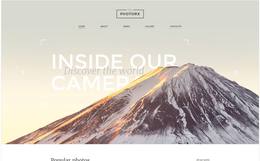
Spectacular images in a full-screen slider catch the eye immediately on entering the site in this template for a photo studio or photographer. Images presented in banners and tiles in a grid below promote the quality of the studio and provide a preview to the gallery, while white boxes leave space for captions and provide breathing room between the photographs. The user is invited at each box to click a link to “View the Gallery”. The Gallery is presented in a grid format with images that expand on click and can be viewed as a slideshow. Useful information is presented in image banners with text below. Last Added photographs in the Gallery can be viewed as a slideshow in a carousel. The About page introduces the Photo Studio and the team, and describes the passion the photographers bring to their art.
Template 58825 – Bank Online Responsive Website Template with Slider, Carousel, Lazy Load Effects
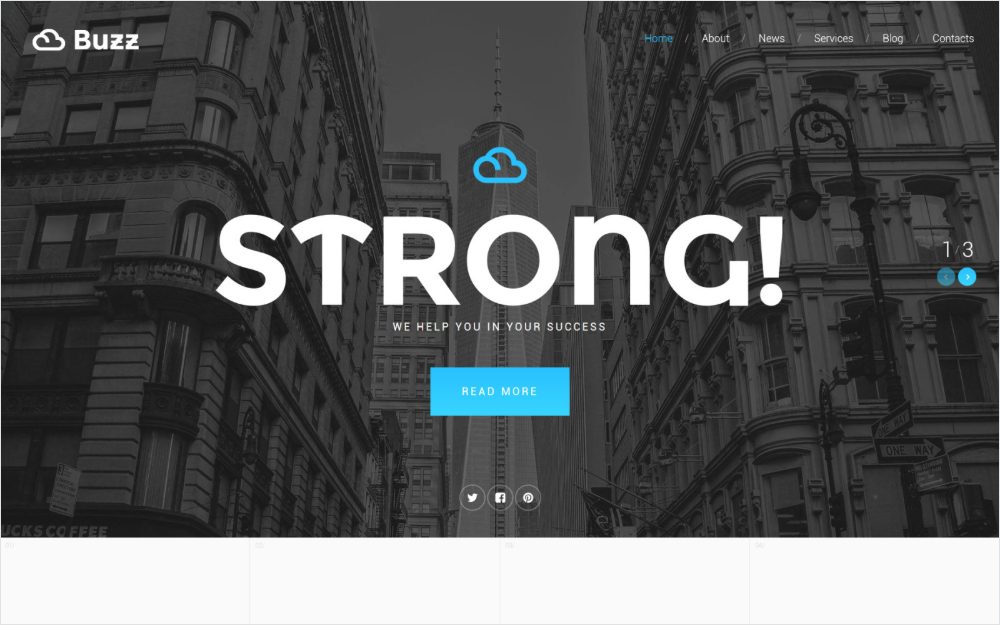
Lazy load effects and fade-in animations, large unique headline fonts, images and text in sliders, banners and grids, animated graphs and facts that convince the customer and a blog that provides useful advice, work together to make an effective website template for a bank and financial consultancy company. The full-screen slider with large bold headlines in an exclusive font on a darkened image background attracts attention to the strengths of the company. Text blocks with icons turn blue on hover, leading to pages on about the company, its services, information on business development through the bank’s specialized management consultancy and financial advice. These content blocks lead into the Blog, giving useful tips on several aspects of a successful business, whether it is planning or budgeting for the next phase of business growth, or international marketing and surviving the unexpected, or making a succession plan. A welcome message in a white banner is followed by text in three columns on a blue background, giving more information about the company’s services. An image banner in light grey gives a positive message about the company. Excerpts from the blog are shown in a carousel and lead into the Blog with large banner images and text. More images and graphs support the company’s story of success and a contact form invites customers to get in touch. The About page introduces the team and the company’s approach to doing business. The Services page with grid and banner format and lazy load effects describes the company’s business consultancy services. News highlights news and events in the business and financial world with a paragraph about the company.
Template 58236 – Wedding Store Responsive Shopify Theme with Slider, Newsletter Popup, Bootstrap
This Wedding Store Responsive Shopify Theme is elegantly designed in banners and grids with a pink, grey and black color theme and a lot of white space to give prominence to the products. A Newsletter popup with a romantic image of a bride and groom under gorgeous flowering trees with white flowers invites the user to subscribe. The header slider with a frame for the text on the images focuses attention on the messages which promote personalization of gifts for bridesmaids and groomsmen. Products and locations with hover effects are shown below and link to category pages with collections, while the user is able to browse product types and bestsellers in the left sidebar. Featured products with Quick Views lead to product pages with slideshows with zoom, prices, descriptions, video, shopping cart and social media icons. The Blog showcases wedding themes and venues and gives tips on organizing the perfect wedding, choosing color themes, favors, gifts and flowers and doing it on a budget that meets your needs. Navigation is easy through the dropdown menu, the sidebar and footer navigation.
Template 58117 – Motorcycle Club Responsive OpenCart Template with Parallax, Slider, Newsletter Popup, Bootstrap, Blog
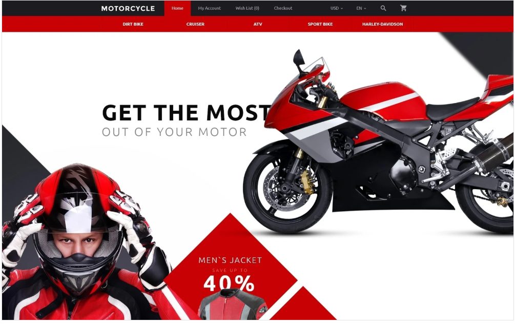
The Newsletter popup with motorcycle animation is the first thing that catches the eye and attracts the user to subscribe, in this Motorcycle Club Responsive OpenCart Template. The bold red and black design of this website template on a white background speaks of action, energy, power and sophistication. A parallax image with animation of a motorcycle gives a 3D look. A bike rider with a red helmet and red apparel stands in front of a black triangle that points to the right, focusing on Special Offers in the red rhombuses showcasing products. Rhombuses or diamond shapes used in the design have a contemporary look. Here they are used as an interconnected pattern in a grid with other diamonds, and also with triangles and diagonals in the design along with images and animations. Triangles used in the layout add a dynamic and active element, a black triangle on the right of the page pointing to the left leading the eye to products, and a light grey triangle resting on its base, which is the strongest and most stable position for a triangle, representing progression and purpose. This triangle points upwards towards statistics and Technical Aspects in the text, leading the user’s eyes to these elements. Featured Products with dropdown carts lead to product pages with slideshows with zoom, prices, details, descriptions, specifications, reviews, video, shopping cart, social media icons and other products. Logos of top brands and Technical Aspects of the motorbikes along with statistics in a graph with animations are featured below. The template has a Blog that promotes new products and a footer with useful links and a sitemap. Navigation is smooth and easy through the dropdown menu with an image where promotional messages, new products, sales and discounts can be added.
This elegant template uses polygons and geometric shapes in the design of this website, a blue and white color theme, a background video with text messages on the header and ghost buttons with rounded edges. The header video which continues on inner pages, shows a student turning the pages of a book and invites students to choose a private teacher to progress in their education. Blue icons on white give the advantages of the private tutoring. The parallelogram shapes in the logo and in the image shapes in the blue banner show consistency in the layout. Polygons in the background of the blue banners have an active and dynamic look. Teachers and their specializations are presented in black-and-white images in circular shapes on a white banner. Testimonials in a carousel on a blue banner, with the experiences of satisfied students build credibility and inspire new students to sign up for classes. The About page focuses on the services provided by the teachers, the goals of teachers for students at different levels, from school to college, the advantages of private tuitions in boosting students’ grades in competitive exams, enabling them to enrol in better colleges and get better jobs. Information on Teachers is presented in a Gallery with black-and-white circular images that can be viewed by category. The Blog with circular images in black-and-white has articles on topics that students find helpful. A contact form and map enables students to get in touch with teachers and enrol for private tuition.
Template 57720 – Christian Church Responsive Website Template with Carousel,
Lazy Load Effects
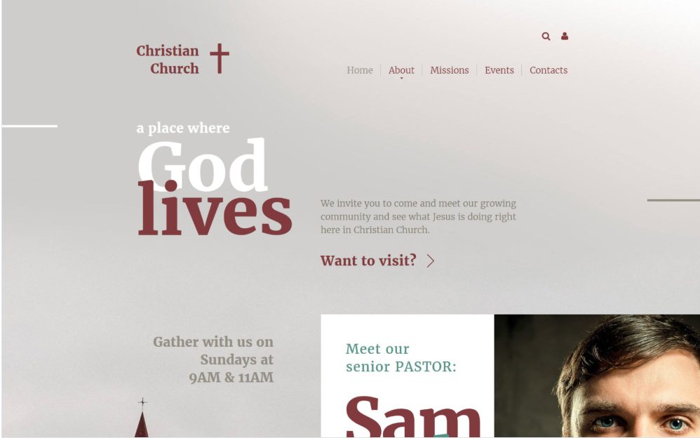
This Christian Church Responsive Website Template is neatly designed with image overlays, bold white text and color for contrast, text boxes to focus on important content, interspersed with content in grey on a black background, while images are used thoughtfully to personalize the template and attract users to the church. A carousel is placed under an image of people to reveal the kind of activities that members can expect in the church. The homepage has a calendar that highlights weekly events, invites the user to attend a new member class, listen to weekly podcasts and get to know the church better. The footer invites the user to subscribe to the church’s newsletter and provides a location map. Pages have images and text with lazy load effects and fade-in animations. The About page introduces the church, its mission, history and and the team. Missions are highlighted and Church Events are presented in a calendar.
This template for a business leadership training company effectively uses photo and text overlay techniques using overlapping images of an executive with a mobile phone, a cityscape and sky with clouds to create a composite image. The image is darkened with a color overlay to allow header text to stand out. Text on buttons is presented on solid background colors of blue and white for easy readability and invites prospective users to register for business leadership training programs. The template uses theme colors of blue and white that are associated with trust, intelligence and dependability; happiness, sincerity and modernity. The header slider promotes the selling points of the company – Experience, Quality and Reliability with text animations as the slider images show the executive in front of changing cityscapes that symbolize business challenges. A white banner below with blue icons and text in four columns highlights the capabilities of the company. Hover effects turn the white columns to light blue to engage the user in reading. Excerpts from the blog with images and text lead into company’s business blog with inspiring messages, articles on trends in business, events and seminars. A blue banner on the homepage focuses on impressive statistics about the company’s people, to attract new talent. The white banner below has images which are largely white and text that underscores the involvement of the company with the individual’s progress. The hamburger menu opens up to reveal an About page that introduces the company and the team, a Services page that is presented in a Gallery that and can be viewed by category. Media can be uploaded in Image, Slideshow, Gallery, Audio and Video formats. Customer testimonials that generate credibility, a location map and a footer with links to the blog and contact information makes this a complete template for all your business needs.
Template 50485 – Handmade Jewelry Responsive Magento Theme with Slider, Carousel, Video Integration
The header slider displays images of women wearing beautiful handmade jewelry, attracting the user to read the caption below on a transparent overlay, and click the red Shop Now button. Products displayed below the slider lead to category pages. New products displayed in the homepage lead to product pages with slideshows with zoom, details, prices, shopping cart, social media icons and other products. The template designed in white and grey sets off the beauty of the jewelry. The footer has useful links and a sitemap.
This template with a flat, minimalist style has a contemporary look to it. Colored blocks with images and icons in the header of this Business Consultant Responsive Website Template focus attention on the different areas of business the company specializes in . Hover effects reveal white text that describes what the company offers in this field. More business solutions are presented in black-and-white images and in bold text below. A slider with selling messages strongly positions the business consultant as a business partner that can boost a company’s business productivity. Excerpts from the blog below the slider on the homepage, lead into the Blog. The fixed hamburger menu can be accessed from anywhere in the site as the user scrolls through the page. It leads into other pages of the site with an About page that introduces the company and the team, a Gallery that presents the company’s Services in Image, Slideshow, Gallery, Video and Audio format, and a Blog useful tips for business and industry. The hamburger menu on top opens up to access other pages of the site.
This template for a professional security company has a serious look as befits the subject. Blue is a color that inspires trust and dependability. and black symbolizes power and strength, while white is associated with sincerity and reliability. The header with the a symbolic image in grey of a stylized computer chip shows the brain and backbone of contemporary intelligence and security systems. The slider shows various surveillance and security systems and trained professionals at work while circular images on white space zoom in on the focus areas where security is provided – home, office, information and hardware, as well the types of protection services offered by the company – temporary, private, integrated and premium services. The Company offers a professional Security Consultant to assess the customers needs. The commercial centers and industries that the company addresses are highlighted. A testimonial in a parallax banner generates credibility. Excerpts from the blog lead into the Blog with tips on security plans, investing in security systems, news about the latest security products and more. The About page seeks to take the worry out of security by introducing the company, building trust by presenting its capabilities in a convincing way and providing reassurance to customers by the reputation and credentials of the company, its history and its team with a background of professional training and specialization in different areas of security.
This Video Box Responsive WordPress Theme for a content production company is a showcase for videos showing multimedia, animation and video effects. The slider provides a glimpse of the types of videos on display, with descriptions. Latest Video previews are featured below, leading to pages with descriptions and videos. The right sidebar enables you to view posts by category such as Motion Graphics, Travel, Entertainment, Films, Video School in this video blog while a search bar on top makes it easy to find what you’re looking for. The Portfolio can be uploaded in Image, Slideshow, Gallery, Audio and Video formats with descriptions. The Blog has useful information on various genres of video content and their production. This template shows just how versatile a WordPress website template can be, for uploading and managing content of
all kinds.
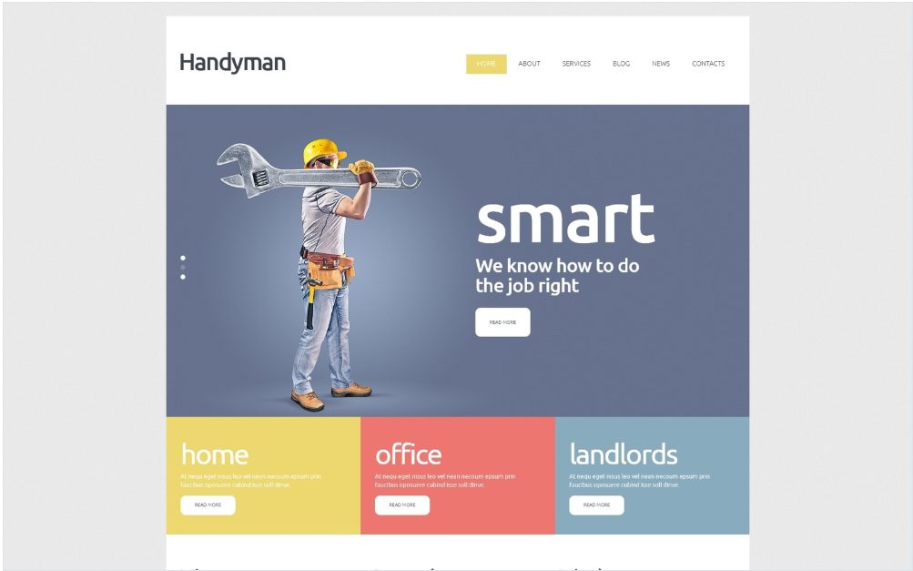
The slider focuses on the advantages of a professional handyman over a DIY repair job – s/he works fast, smart and clean and knows how to do the job better than you. Color blocks and text below the slider zoom in on specific target audiences – homes, offices and landlords. Content and images on the homepage give the advantages of the company, the services it provides, and the latest news on the handyman circuit. The About page highlights the strengths of the company in color blocks, presents a video showing handymen in action and introduces the team and provides customer testimonials that build credibility. The Services of the company are presented in a Gallery that can be viewed by category. Images can be zoomed and viewed as a slideshow. Clicking an image also takes you to a page with a description of the process shown in the image. The Blog has useful tips and descriptions on various types of repair work undertaken for homes and offices, showing handymen at work. The latest projects of the company are featured in the News section along with videos showcasing specialized tools and equipment.
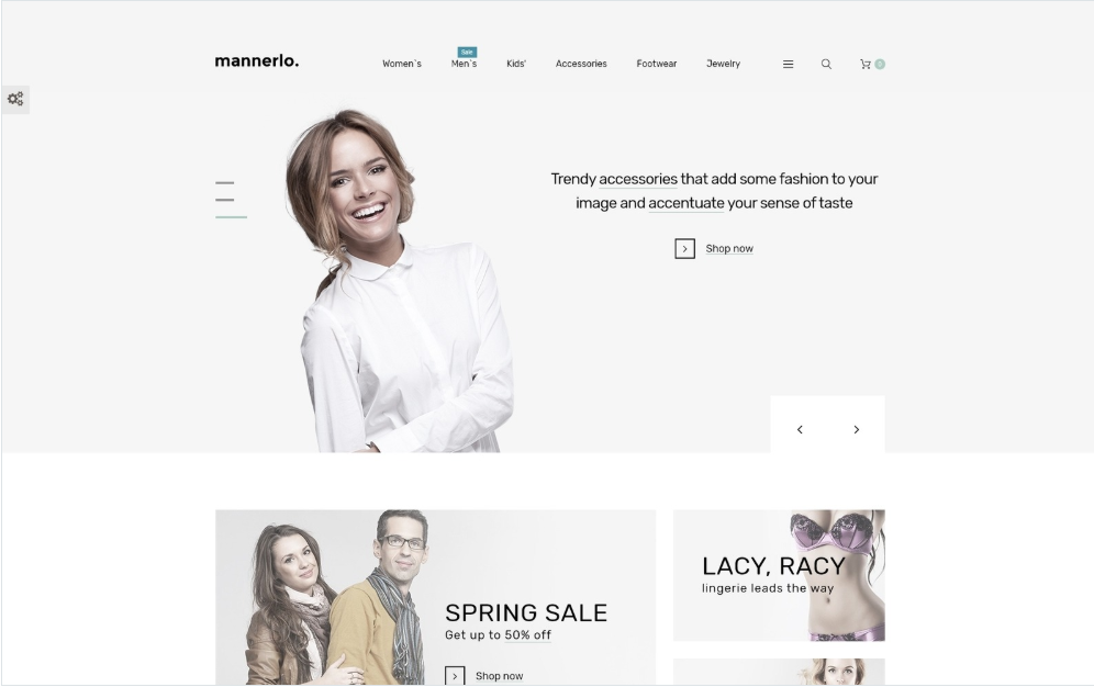
The slider promotes apparel and accessories from the range and leads into category pages. Products in banners and tiles with hover effects attract attention to discounts and new apparel and induce users to click the Shop Now button. Popular products with hover effects and drop-down carts are featured that can be viewed by category. Products when clicked lead to product pages with slideshows with zoom, descriptions, data sheets, reviews, social media icons product prices, shopping cart, and other products with large images in a carousel. Collections and accessories are highlighted in image boxes on the homepage above the footer, tempting the user to browse some more. A Newsletter signup above the footer invites the user to subscribe. The Megamenu with images makes navigation and integration of promotional messages easy. The Theme Color Switcher enables you to customize the theme colors. The Sample Data Installer makes the site easy to administer and update.
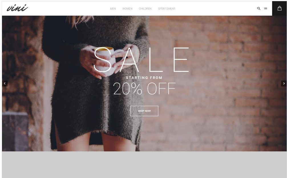
This Architecture Company Responsive WordPress Theme has a sophisticated full-page, full-screen design that works in sections, showcasing the company’s works impressively with large background images. The full-screen parallax slider has a 3D look and selling messages from the company with ghost buttons are presented elegantly in large and small fonts while keeping the focus on the architectural works. Lighting in the first slider image, which stays constant in the header in the inner pages, forms a triangle pointing to the content below. Text boxes with a diagonal slant on the bottom right look like triangles in context with the background image, directing the user’s eyes to the visuals below. Text boxes carry a welcome message to introduce the company, give reasons for the customer to choose the company, and provide a list of services. Images in the thumbnail gallery with parallax, lazy load, hover effects and captions give an overview of the impressive range and quality of the architecture company’s work. A yellow banner below with statistics and icons in circles with lazy load effects focus on the solutions provided by the company. The About page displays the company’s corporate profile in a video presentation, gives its history and reassures customers of quality with bulleted text using icons. Testimonials are shown in a slider and the team is introduced below. Services are presented in a Gallery with hover effects that can be viewed by category. Images enlarge on click and have descriptive captions leading into a Blog page with a description of the project. The Blog features articles on the latest projects and gives useful tips building or renovating a home, on building materials, and on architectural events in the industry.
This beautiful Responsive Personal Page WordPress Theme is ideal for a creative blog – for a photographer, writer, artist or designer. The design has an elegant, understated simplicity, with large images, text on a textured background and hamburger menu on the left sidebar in dark grey, with an image of the photographer in a circle and social media icons below. The Gallery can be v iewed by category and images enlarge on click and can be viewed as a slideshow. Posts can be uploaded in slideshow, image, audio, video and gallery formats. The About page provides the artiste’s bio and details on her skills and experience. Testimonials create credibility and enthuse new clients to try the photographer’s services. The Blog provides details of the photographer’s work and showcases images from her portfolio.
Color blocks in yellow, red, pink and blue catch the eye in this Computer Products Responsive PrestaShop Theme, focusing the user’s attention on the categories of products handled by the shop. The slider background has a color gradient of very light grey which gives the products prominence. Brand names, text animations and Shop Now buttons engage users and prompt him to click to buy new products and upgrade his computer. A welcome message from the company is followed by images of products viewable by category as highlighted in the blue banner. Products with Quick Views on hover link to product pages with slideshows with zoom, descriptions, product features, video, prices, shopping cart, social media icons and related products in a carousel.Excerpts from the Blog on the homepage lead into the blog with useful tips on buying computer products. The Theme Color Switcher enables you to make color changes in your theme. The Sample Data Installer makes it simple to administer and update the template. Navigation is easy with the dropdown menu designed by category. The theme can support 3 currencies and 5 languages.
Ghost buttons give a stylish look while putting the focus on the trendy images in this fashion template promoting apparel. Full-screen slider images promote sales, collections and new arrivals with discounts with Shop Now buttons. Banners below showcase different categories of fashions, leading into category pages with hover effects and drop-down carts. Clicking on a product leads to attractive slideshows with large images and zoom, details, reviews, information, prices and shopping cart. A large full-screen banner on the homepage below the product images introduces the company and leads into the About page designed with icons and statistics with animations, and presenting content on the company, the team, and customer testimonials in a carousel that build credibility. A Megamenu with images enables cross-selling of products, promotional messages and ease of navigation. A Newsletter signup on the footer invites the user to subscribe.