Rich colors. Amazing images. Great functionality. Intuitive navigation. These website templates have it all. Choose from content management systems like WordPress or Joomla, or ecommerce templates like PrestaShop, Magento and Shopify with animations, sliders, galleries, carousels, lazy load and hover effects, parallax, video and more! These responsive templates adapt to fit the screen sizes of most popular desktop, tablet and mobile devices. Attract visitors to your website and get ready to get noticed!
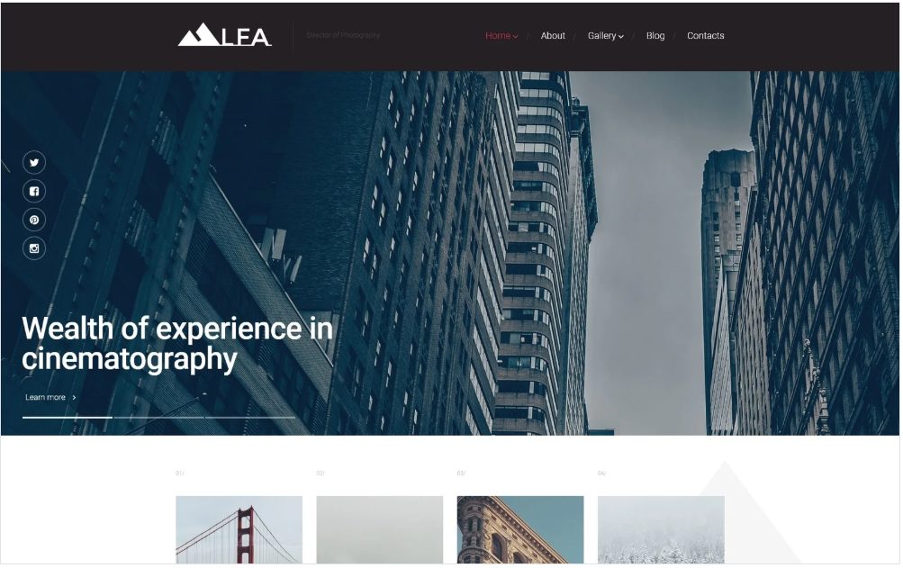
The director of lighting is critical to the quality of a film. This Lfa Director Responsive WordPress Theme with its full-width slider, banner and grid design with rich imagery with its highly visual yet business-like presentation that showcases perfect photography and cinematography along with information and graphs about the company. The full-screen slider with fade-in titles and social media icons has stunning imagery. Four content boxes lead into the blog with rich imagery and text. Grey polygons in the background echo the look of the logo and are repeated in banners and the footer. The megamenu showcases image and text descriptions. The gallery with logo branding can be viewed by category and leads into pages with larger images and descriptions with comment forms. Gallery presentation can be displayed in Image, Video or Audio formats.
Template 58775 – Simona S Responsive WordPress Theme with Slider,
Carousel, Portfolio, Bootstrap, Video Integration
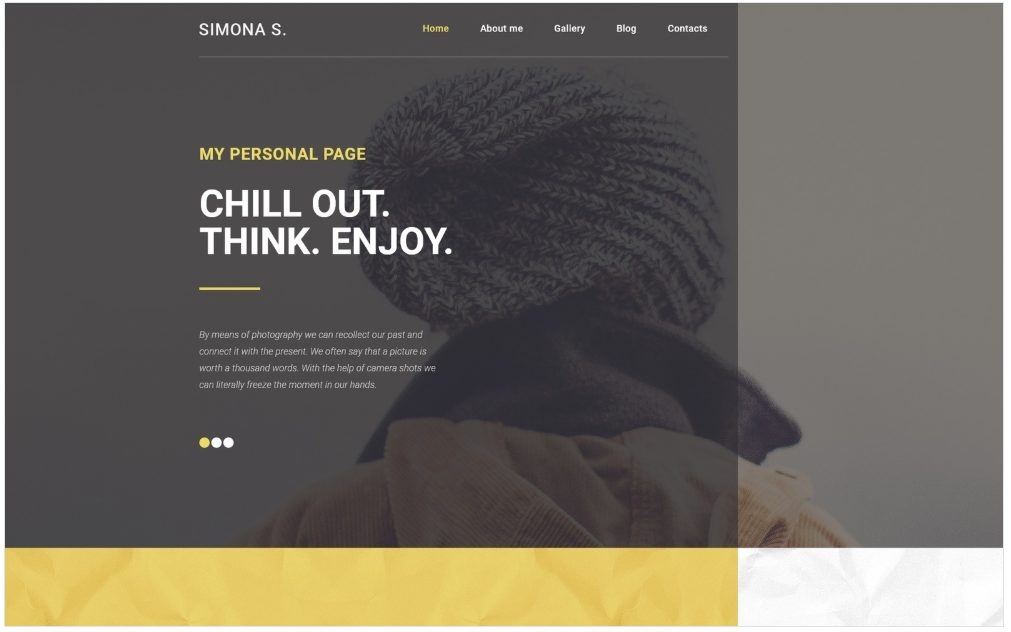
This personal page WordPress Art and Photography Theme enables the photographer to communicate with her audience in a special way and is easy to upload images and update manage content. Slider images show close-ups of a model with an introduction from the photographer. A banner in cheerful yellow below gives a very positive feel to the website and has a welcome message that leads into the artiste’s biography. Snippets from the blog lead into the Blog with large images, presenting the artiste’s approach to photography. The Gallery is displayed in image, video, gallery and audio formats and can be viewed by category. Images can be enlarged. Animated statistics above the footer tell of the impressive number of clients served, images uploaded and photo shoots completed by the photographer. The footer has a map with social media icons in yellow.
Template 58650 – Sketchfield Creative Responsive WordPress Theme
with Carousel, Slider, Blog

The big, bold design of this blog website design is a winner for a graphic designer’s personal blog with a page about him. The header slider with bold titles catches attention and directs the user to the top posts. Below, tiled content is posted category-wise with color coding, followed by video and image banners. The footer has Instagram content, a calendar and social media icons. The homepage menu has options to tweak the settings and look of the page. Content is organized with a dropdown menu and posts lead into pages.
Template 58439 – Rombic Fashion Responsive Website Template with Gallery, Parallax
Black and white rhombuses in transparent and solid colors, with touches of purple, form
a grid with images and text in this website template for a fashion photographer. The homepage gives a biography of the photographer at a glance. – his works, his experience, awards and a link to his portfolio. Lines, arrows and rhombuses in white and purple on shades and textures of black lead the eye through content. Ghost buttons turn white on hover and lead into the site. A parallax banner lends 3D depth to the image. Testimonials lend credibility. Social media icons are also diamond-shaped and have a purple outline on hover. The rhombus design and parallax banner is repeated in the portfolio page with the photographer’s works. Banners with text boxes and parallax banners with image rhombuses superimposed are posted under News. The contact page is elegantly designed with a contact form in black on a parallax banner with black-and-white image, with a map in black- and -white below.
Template 58322 – Re Conetta Responsive Joomla Template with Parallax,
Slider, Carousel, Megamenu, Blog and Gallery
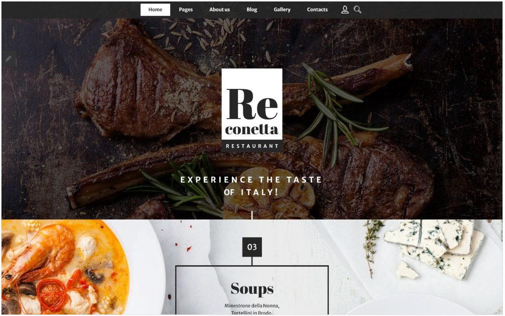
Black and white make an elegant statement in this Cafe and Restaurant Responsive Joomla Template with a full-width header to temptingly display food. Below the header,
a slider displays dishes from different course of a meal on either side of a box showing names and prices of dishes. The menu with descriptions is featured below and leads into the blog with appetizing images of food with hover effects. A black-and-white picture of a chef at work with text highlighted with a frame speaks of the restaurant’s reputation for fine food. Testimonials are highlighted in more frames below . The About page introduces the team of chefs, with images of delicious food on tables in parallax banners. Black-and-white images of a restaurant in parallax banners add an elegant look. The template has a megamenu. The gallery can be viewed by category with images that enlarge and can be viewed as a slideshow
Template 58776 – Photographer Portfolio Responsive Website Template with
Slider, Gallery and Blog
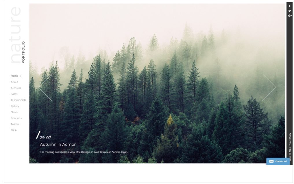
Position your photography portfolio a cut above the rest with this beautifully designed template . The menu on the left on a white panel quickly guides you through the site
with social media icons on the right. On hover, you see the Categories menu and Recent Blog Posts on a neat black panel. The Gallery with titles and descriptions on hover can be viewed by category and as a slideshow. News articles in blog format with comment forms invite user response.
Template 58753 – Lawyers Bureau Responsive Website Template

Template 58071 – Corporational Inc Responsive Website Template

Template 58788 – University Online Joomla Template
Template 58647 – Bikerita Store Responsive PrestaShop Theme with
Slider, Megamenu, Carousel, Parallax, Customization Tool
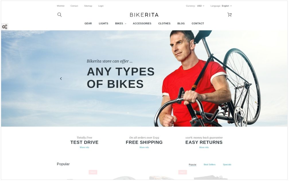
This Bikerita Store Responsive PrestaShop Theme is a complete online store for bicycles and accessories. The full-width slider showcases the products beautifully along with different target customers. The Megamenu features an image of a bicycle with the price along with clickable lists of products. Products and accessories are shown in carousels below with quick views and different angles on mouse hover. Product pages have product slideshows with zoom, prices, specifications, descriptions, social media, and other products. A parallax banner on the homepage with call to action button provides depth and realism to the image. Snippets from the blog lead into the blog. The homepage has a thumbnail Instagram gallery of people enjoying riding the bikes they bought, leading to larger images. What better testimonial could there be? The Customization Tool lets you change the color scheme, change the look of the header, footer or homepage layout, or add a newsletter subscription form.
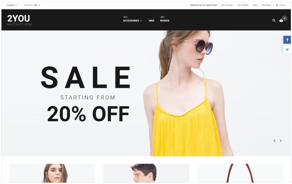
This at-a-glance 2you Clothes Magento Theme Magento Theme is designed for quick-and-easy browsing and shopping online. The homepage has all the features of a fully featured store. An attractive popup Newsletter with image invites you to subscribe. The dropdown megamenu with image can promote products and sales while providing lists of products. The header slider has fade-in animations in large fonts pulling attention to the store’s sales, new arrivals and selling points, while individually showcasing clothes and accessories for men and women. Content boxes below highlight collections for Men, Women, and Accessories, with options to see all collections within each category. On mouseover, products on the homepage show different views of each product in a carousel, with an option to view more details. The Parallax banner on the homepage provides a 3D look and highlights a sale offer with a call to action button. More products on sale are featured below. The template homepage has an Instagram feed for social networking. The menu is fixed to the top and social sharing icons are fixed to the right side of the template while scrolling. Snippets from the blog are featured in the carousel below and lead to the blog which promotes products through articles and cross-sells other products on the sidebar and presents a community poll. The footer has useful links and a sitemap. Category pages have a header image, and products can be viewed as a grid or list. Product pages show product descriptions, attractively present large product images in different views, and give details like size, price, reviews, video, shopping cart,social media icons and related products in carousels for a complete shopping experience.
ECommerce Website Templates:
CMS Website Templates:
Business Categories:
