A collection of well-designed website templates with features like parallax scrolling, background video, transparent overlays and lazy loading to keep your website visitors engrossed. Combined with functionality like an online store, gallery, forum or blog, these templates stand out from the crowd with their use of color, white space and neutrals, shapes, visuals, backgrounds and fonts to create a balance – providing emphasis where it counts and leading the visitor to action.
Template 51191 – Travel Agency Responsive Joomla Template with Slider, Gallery and Blog

Bold fonts stand out on large images of beautiful global locations in the slider and draw the reader irresistibly into the site. Featured locations lead to pages with descriptions that can be shared on social networks. Services are shown in a sortable gallery where images can be enlarged, watched as a slideshow or shown with a description. The images stand out on black and contrast is given by the unusual tint of red used in the footer and buttons. The blog with comment forms engages the user and provides the opportunity to give useful travel tips and information.
Template 49557 – Woodwork Design Responsive Website Template with Gallery, Carousel and Slideshow
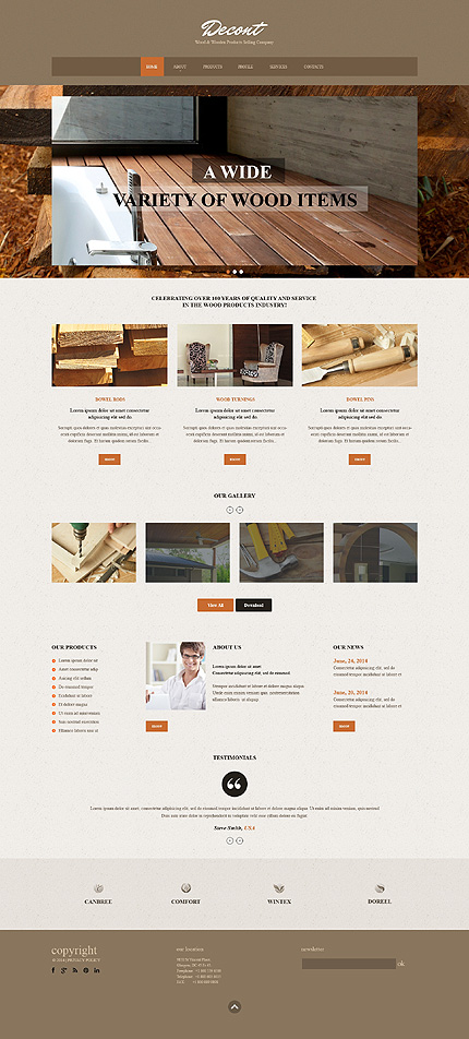
Quality, aesthetics and color – the best woodwork brings out the best in wood.
Wood is rich and enduring and gives floors, wall units, garden units, furniture,
walls, roofing, pillars, and entire houses a touch of class. This website design in
orange and brown with a background of textured beige provides an overview of
the company, showing the wood products in large images in the slider, and more
images below in a carousel that can be viewed as a slideshow. Large text is shown
on overlays in the slider so that it does not disturb the images. Customer
testimonials are also shown in a carousel, leaving the user with the option to view
more and keeping the layout clutter-free.
Template 47949 – Travel Responsive Joomla Template with Slider, Gallery and Blog
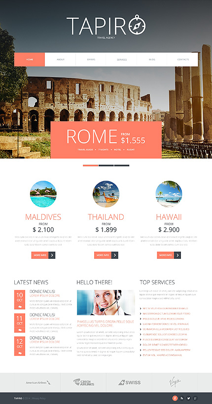
A lighter tint of red makes the red in this site easy on the eye, with overlays calling attention to famous places, locations and prices of travel tours in the slider banner
while images change. Red combines well with grey and black, and off-white lightens
the color palette to help images stand out. Offers are presented in a sortable
gallery where more information is offered on click. The blog with comment forms
and social sharing icons engages customers with location-specific content.
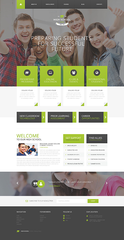
Knowledge is power. Green and black with white spells growth, power, new beginnings and completion. A large image of lively young faces with a message on a photo overlay captures attention. Text boxes slide from the left one at a time with the lazy load effect as you scroll down the page. Icons in circles rotate on hover while green changes to black. Text boxes and banners lead into the blog on click. Fixed parallax effects on a web banner makes the text change and move right on click while the image remains stationary. Courses are shown in a sortable gallery where media can be uploaded in image, slideshow, gallery, video and audio formats. The blog has informative content with comment forms and social media icons.
Template 51760 – Surfing Club Responsive Website Template with Slider and Gallery

For those who are crazy about riding the waves, here is a Surfing Club Responsive
Website Template with animations to match their enthusiasm for the sport of surfing. he slider is revealed in parts with animations. Attractively designed pages slide into the frame. The gallery with action shots of surfers can be viewed as a slideshow. The blog can communicate with club members by giving useful tips from experienced staff and answering questions from newcomers to the sport.
Template 51109 – Fast Food Responsive Website Template with Bootstrap, Overlays, Hover Animations
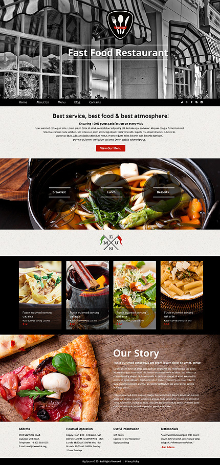
This template is designed in black and white with touches of red – powerful colors that spell elegance and attract and hold attention. The central picture is of a restaurant exterior with its striped awning and windows, semi-triangular logo with rounded edges and cutlery, making a powerful statement. Hover effects on the menu in red and black, keep the reader’s attention. A grey textured background for text, black overlay circles with interesting hover effects emphasize the restaurant’s breakfast, lunch and dinner capabilities. Menu samples are shown below in images in full color, with prices and captions on overlays with hover effects, followed by some background about the company. The customer can take a look at the menu and get an overview of readers’ responses on the blog, where the images are larger and the red accents play a more important role in the design.
Template 51222 – Basketball Group Responsive Joomla Template with Blog and Gallery

A hexagonal design is the concept for this Basketball Group Responsive
Joomla Template. The hexagon (six-sided figure) is found all through nature –
in beehives, snowflakes and turtle shells. The hexagon has come to symbolize communication, community, union, balance, interfacing and efficient growth.
Images in hexagonal shapes are arranged in a flexbox slider and the photos
change on arrow click. News is presented in horizontal panels with images and
text. Images turn black and white on hover and text expands on click. Testimonials
with black hovers and hexagonal images look vivid and authentic. Text about the
Group is easily readable on grey. The hexagon theme is continued in orange and
black color blocks, a map and icons on the footer. The sortable gallery and blog
helps you engage with players of different age groups and abilities, giving useful
tips and success stories.
Template 51277 – Software Custom Responsive Website Template in Red, Blue and Green with Animations

This website in red, blue and green is based on a triadic color scheme – three colors equally spaced on the color wheel. The slider with messages on white, red and green and a blue banner below spells out the company’s distinctive solutions. Color blocks balanced with neutrals of white, black and grey organize the text and lead into the site. Products, text and news snippets are displayed with animations. The colors are used in the numbering, circles with icons and in the logo.
Template 51399 – IT Responsive Flat Joomla Template with Lazy Load, Gallery, Blog and Forum
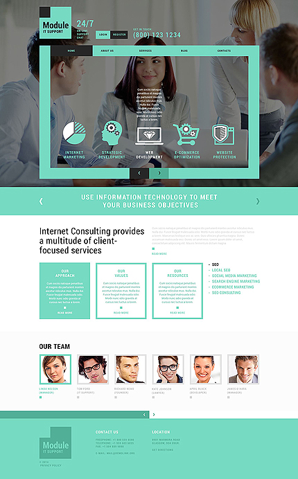
This website in grey and a beautiful shade of green with white gives the look of a professional, growth-oriented company with fresh and innovative ideas. Menu animations in green and black have a 3-D feel on hover. The icons in green and white shown in a carousel, reveal text on hover which describes the service referred to. Text in the text boxes and images in the carousel below are revealed in lazy load, which helps serve up your webpages to your visitors faster by delaying the loading of content or images till the user scrolls to them. The services
of the company are displayed in a sortable gallery that can be viewed as a slideshow. Images lead to pages with more information. The blog with login form, search and categories connects with customers of different target groups. The forum invites discussions on topics of interest and invites suggestions from the discussion group.

This one-page website template keeps the site visitor engaged and presents all
essential information at a glance. Transparent overlays make type readable while video with parallax personalize this website for a design studio. Banners, buttons and fonts with hovers in bright colors lead the user to scroll down or read more. Circular design elements in bright graphics or image sliders with quotes further reinforce the message. The portfolio with captions on overlays that turn blue on hover can be viewed as a full-screen slideshow. The contact form on an image overlay keeps the last communication with the client personal, yet fonts and action buttons stay clearly visible. Social sharing icons remain subdued in grey but turn a cheery yellow on hover. Lazy load on long web pages makes the page load faster. Images outside of viewport are not loaded until the user scrolls to them.
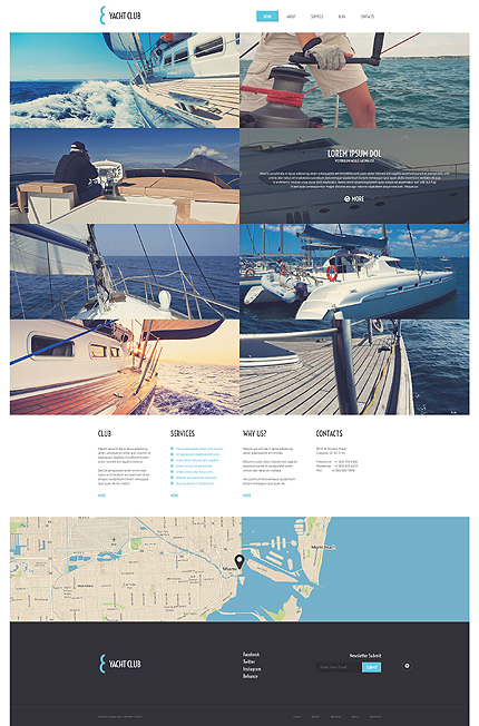
Template 51739 – Yacht Club Responsive WordPress Theme with Grid Homepage, Gallery and Blog
Blue, grey and white with elegant fonts and images with captions are used to present the yachts in this site with flair. The homepage is attractively laid out in grid format with images of yachts in action with transparent captions on hover. Each image when clicked leads into the blog with more details, related posts and comment forms. The gallery can be viewed as a slideshow. Media can be uploaded in image, slideshow, gallery, video and audio formats and can be viewed by category.
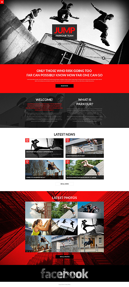
Template 51385 – Jump Responsive Sporting Bootstrap One-page Website Template with Slider and Gallery
Red and black make a heady combination, getting the adrenaline racing and the heart pumping, drawing attention to the danger and power that takes jumping beyond the edge. The navicon opens up to show the menu on click, otherwise staying neatly tucked away into the upper left corner of the frame. Transparent overlays for banners and text allow images to show through while keeping text readable and maximizing image space. More images below uncover captions on hover and the latest ones can be enlarged and viewed as a slideshow. This is a one-page website with gallery and social media options, among other add-ons.
Template 51335 – Transportation Responsive Website Template with Animations
Panels in tints of red and grey divide this smart logistics site into section-wise content for trucking, marine and air transportation. On mouseover, the panels move apart or text moves in to reveal more content. Bold fonts with accent bars draw attention to services. Images on the left look good against the grey panels.

Template 41252 – Fishing Club Responsive Joomla Template with Gallery and Blog
Images of successful fishing trips in fresh water and sea water are displayed on the homepage of this Fishing Club Joomla Website Template on a grey textured background with a brown wooden textured menu. Sections of the homepage content lead into informative pages in the site. The gallery with picture captions can be viewed as a slideshow. The blog is a platform where the experienced fishermen can exchange helpful tips with new fishing enthusiasts and the club can communicate with its members.

Template 51362 – Popcorn Responsive Magento Theme in Red, Green and Yellow with Slider Hover, Product Slideshow with Image Zoom, Carousel
This ecommerce Magento website template really catches your eye in red, green and yellow panels with banners showing product categories below. Images with zoom on hover adds to viewer interest. Clicking on featured products leads to product pages with details, pricing, shopping cart, slideshows with image zoom, product carousels showing other products and
videos. Account, login, checkout, currency and language options, shopping cart and search are placed at the top for ease of purchase. The footer has useful links for navigation.

Template 48080 – Business Responsive Joomla Template with Slider, Gallery and Blog
This Business Responsive Joomla Template immediately catches attention and
retains interest with its bright colors, animations and images. Red stands for action,
blue for trust, green for growth, orange for stimulation, yellow for originality – all
balanced by white for order and grey for professionalism. The menu with icons and
drop-downs has attention-grabbing animation effects on hover. The slider shows
images of friendly staff while changing text slides in from the right. Banners in rich
colors with white icons and text highlight special services and lead into the site.
The company’s latest projects are shown with captions in orange on hover, leading
into gallery pages with more information. All projects are displayed in a sortable
gallery and can be viewed as a slideshow. The blog with informative content and comment forms engages customers of different target groups.

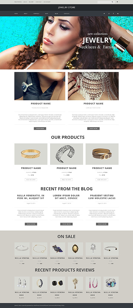
Template 51227 – Jewelry Store Responsive WooCommerce Theme with Slider, Portfolio and Blog
Right from the slider with closeup views of lovely models wearing gorgeous
pieces of jewelry, to the product images below which expand on hover, the
focus is on the fascinating jewelry in this Jewelry Store Responsive
WooCommerce Theme. Text and other elements are kept minimal and the
background is white for the display of the jewelry to the maximum advantage.
Star ratings appear only on hover, and serve to enhance the attraction of the
product. The homepage leads to category and product pages with descriptions,
product slideshows with zoom, prices and reviews. The portfolio shows off
your products to advantage and can be viewed by category. The blog is an
to engage with your customers with more details about the product in context.
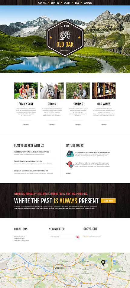
Template 51223 – Traditional Ranch Responsive WordPress Theme with Portfolio and Blog
Nature lovers, ride out into the countryside in the wide open spaces at this old
ranch. Taste the home-brewed wine, take your children on a nature tour.
Conduct a traditional wedding to remember or enjoy a family get-together like
the days of old. You can go riding or hunting, or just enjoy a picnic in the open
with the kids, with the stream gushing by. Breathe in the fresh air and take a
break from the city! The template design with a wooden texture in the hexagonal
logo, menu and footer, has a seasoned look to it – like the old trees that have
stood the test of time despite wind and weather. The gallery with media in
image, slideshow, gallery, video and audio formats can be viewed by category
and can be used to promote the offerings of the ranch.
Template 50486 – Handbag Boutique Responsive Magento Theme with Slider, Product Slideshows with Image Zoom, Carousel
This Magento ecommerce template displays a variety of handbags for the modern
woman, for different occasions – from laptop bags to tote bags to eco-friendly
bags to evening bags and branded bags. The slider focuses on sales messages
and circles on transparent overlays make images visible and captions readable.
A texturized grey background lends interest to the header. Featured products on
the homepage lead into product pages with descriptions, slideshows with image
zoom, color, material and quantity options, pricing, and related products in a
carousel. Navigation and buying is easy with all important links on top and useful
links in the footer with a sitemap.

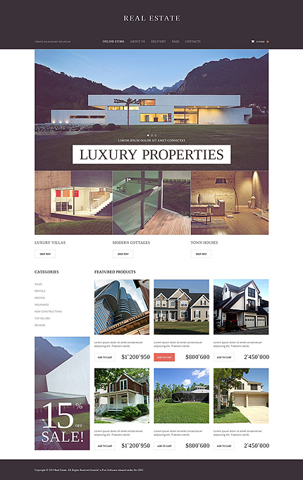
Template 50537 – Real Estate VirtueMart Template with Slider, Property Slideshows with Image Zoom
Whether it’s a luxury villa, a modern cottage or a town house you’re looking for,
shop for properties right from your desktop. The muted colors in the slider
images give a look of sophistication along with the black header while red
buttons provide a call to action. A large vertical banner calls attention to sales.
Stay informed of the best prices, deals and sales, compare your options within categories, look at reviews, ask questions, watch slideshows of new
constructions with image zoom. The category section has an accordion view
that allows more information and links to be added.
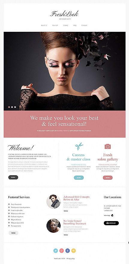
Template 46831 – Beauty Salon Responsive Joomla Template with Homepage Slider, Gallery and Blog
A clean white header highlights the images in the homepage slider with a band
of pink below, in this Responsive Joomla Template for a beauty salon. Responsive website templates include several layout options – each is optimized for proper
screen resolution. There are many width options included, but the major ones are
for desktop, tablet and smartphone screens. Script fonts, pink and blue icons and
buttons, a drop-down menu and a textured background add a stylish touch to the
template. The 4-column Gallery with interesting hover effects leads to the blog and
can also be viewed by category. The Blog engages the reader with relevant posts, comment forms and social sharing icons. The contact page with a map and contact
form enables customers to find their way to the salon or make an appointment or
enquiry.
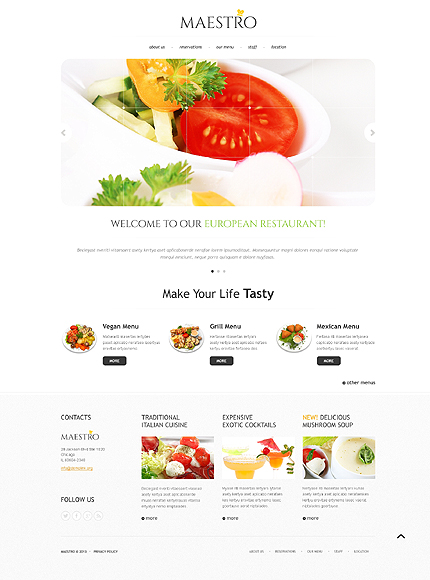
Template 45138 – Maestro Restaurant Responsive Bootstrap Website Template with Slider and Gallery
This elegant Maestro Restaurant Responsive Bootstrap Website Template
uses white space and touches of yellow, black dropdowns, understated fonts
and black buttons that turn green on hover. Images in the slider are seen through
a transparent grid – like looking at tempting food through a glass window. Below
the slider are testimonials from clients or descriptions of tempting food, in a text
slider. The restaurant’s menu is displayed appetizingly in a gallery with captions
and slideshow.
ECommerce Website Templates:
CMS Website Templates:
Business Categories:
