Everywhere we see, we find different typographies. It’s all around us, like in Books, banners, posters, Product Packaging, etc. But what is typography? Is it a text or something else? Yes, typography is text. But it’s an arrangement of text, the style in which the text is written, it’s a visual appearance of the text. We can also say it’s a work of art in text. The main motive of typography is to make text easy to read. With the help of typography, we can convey our brand message clearly to our targeted audience.
In this article, we will understand typography in graphic design and its importance in design. We will also discuss some common mistakes that generally we all make in typography.
Typography is not just about choosing font style and writing but much more than that. It is an essential component of User Interface Design. Graphic designers use text with the help of typography to adjust text within the design. This helps create something creative and appealing. Designers, with the use of typography, create creative works for brands. While using typography, the graphic designer considers some essential things. They make important decisions on choosing font, whitespace, font size, placement, and many other things. So, typography is an important aspect in graphic design.
Graphic designers use typography with the help of text to give the design an impactful appearance and meaning. Designers have to consider several things while applying typography in design. The most important thing that designers must consider is that their design with typography has to make sense.
The designer’s primary goal is to make their design impactful to the audience, and typography is part of it if the text is in the design. The design must convey a meaningful message.
Typography is an integral part of a design. It is a significant visual element that gives the targeted audience an impactful and long-lasting impression. The motive of graphics is to convey your message with visuals, but visuals alone can’t communicate your message correctly. Here comes the role of adding typography to your designs.
Although there are so many fonts to choose from online, let’s have a look at some of the standard fonts:

“Serif” is derived from a Dutch word that means line or dash. Serif font has a classic look, so it’s a good choice for traditional projects like newspapers and magazines. Serif font is easier to read than Sans Serif font in printed work because Serif font makes individual letters look unique and more accessible to remember. The common example of Serif is Times New Roman.

It is called Sans Serif because it doesn’t have extra strokes. Sans Serif means “Without” Serif. This font style is considered more straightforward and more modern than Serif font. Some of the Sans Serif popular fonts are Open Sans, Arial, Verdana, Helvetica, Gotham, Poppins, Work Sans.
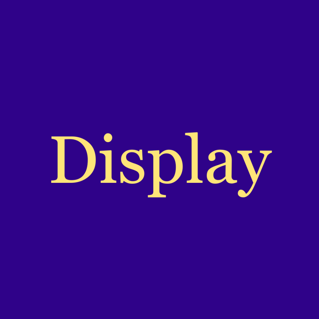
Display fonts are also known as Decorative fonts. Display fonts are creative fonts that come in a variety of styles. Display fonts don’t go well with long paragraphs; they are commonly used for logos, book titles, posters, etc. Some of the Display popular fonts are Georgia, Futura, Helvetica.
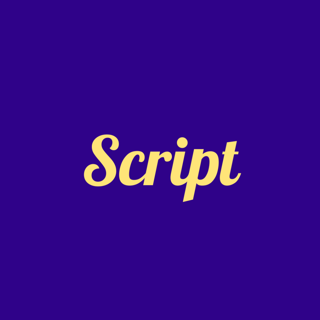
Script fonts are also known as handwritten fonts. Script fonts give a human touch wherever they are used; they come in various styles. Calligraphy, cursives, and handwritten letters identify it. Some of the popular Script fonts are Lobster, Grape Nuts, Allura, Alex Brush, Rock Salt.
Typography hierarchy is a way to make text more clear and readable. It is a prime element to arrange text in such a way that conveys the exact information that we want to convey. That’s why designers should know the typography hierarchy for their design layout, which allows users to find what they are looking for.
Now we know about typography hierarchy, and the main question is why it is important in design. The answer is simple: it’s an important element in the design to arrange information in such a way as to make it easy for the audience to read.There are so many techniques to make a hierarchy visually and make each part of the text look different. Let’s see some ways to do so:
Type size includes creating the important part of your text to look big, like headings. Making important parts look bigger makes it the focus point for the reader, which easily grabs their attention.
Using capital letters in the body is not suitable. We use capital letters in headings or subheadings to make the heading look different from the body. We should use capital letters only at the beginning of the line.
Color is also one of the great techniques that bring the important part of the text to the reader’s attention. Using the high contrast color in the focus area of the text and to create the hierarchy, use different shades of the color.
The position is also a graphic design technique that you use to organize text in your design according to its importance. Keep the important part of the text at the top or in the focus area.
The Alignment is related to the positioning of the text to make the content more transparent. You can play with the alignment and do some experiments with it to make a clear difference between the heading, subheading, and body. It will also make the layout neat and clean and easier for a reader to read.
Adding white space in our layout makes our design look neat and clear so that a reader can read it directly. White space distinguishes one section of the text from another. So, using a white space is a good practice.
Adding color to highlight the critical parts of the text is the best way to bring essential parts into the account of the reader. But remember, using too many colors can hinder readers’ focus on reading, and readers will not know what we are trying to highlight.
Let’s discuss the common typography mistakes that designers make.
Typography is an essential aspect of graphic design. It is the art of styling the text. With the help of typography, we can make our creatives more visually appealing to the audience and convey our message impactfully. Typography consists of many things like choosing fonts, font size, placement, alignment, spacing, kerning and many other things. Typography is the best way by which we can communicate with our audience and deliver our message clearly.
In this article, we have discussed the importance of typography in graphic design and some common typography mistakes that we should avoid. This can help the designers create engaging and visually appealing designs and convey the brand’s message clearly to the audience.
If you are looking for professional help, consider Graphic Designer India. For more exciting articles, visit entheosweb.com


