Footers have evolved since the times when they were narrow panels into which corporate information was tucked away and that’s all there was to it. The rise of the fat footer– developing from UX and UI design – provides an easy and natural way for users to browse to a treasure-trove of hidden pages with high search volume while remaining on your website. You can direct interested users to important pages, answer questions different customers might have, and provide calls to action as well as contact and social media links.
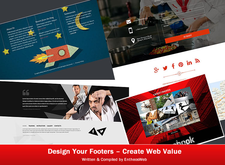
Footers are a functional space. They can provide secondary navigation, which can be arranged in hierarchical columns or rows and de-clutter the main menu. Site-users have the habit of looking for links to corporate policies and terms in the footer, and so it makes sense to put them there – also Trustmarks for security, payment and delivery, sign-up forms and feeds. Footers can also repeat primary navigation and provide a useful anchor for corporate intranets.
Some companies highlight logos of their sponsors or clients.
They also use testimonials, awards or other symbols that create credibility in their various audiences.
Some tips on designing a footer that communicates:
Keep the basic design simple and user-friendly.
Prioritize your content. The footer is not a dumping ground! Create a clear hierarchy and organize footer links into neat tables.
Provide secondary navigation in the footer and take the clutter off the main navigation. Include important corporate information like copyright notices, corporate policies , links to contact us, about us and sitemap pages.
Keep your users browsing. Provide links to blog pages, portfolio, case studies and other content.
Don’t let your users get lost – answer questions before they are asked.
Provide calls to action – contact us forms, telephone numbers, newletter signup, shop now!
Slideshow footer – a gallery provides a look at your capabilities on previous projects and links naturally to the portfolio section.
The company tagline reminds your users of what your company stands for.
Consider a sub-footer. A subtle change of color or texture can mark the distinction between the footer and sub-footer.
It is not necessary to place a sitemap into the footer for SEO purposes. In fact, too many links in the footer may come across as spam to web crawlers. Instead, place a link to the sitemap page. In large corporate sites and intranets, a sitemap footer would be stuffing a lot of content which the user may not use.
People often search for contacts in the footer. Make them clear.
Social media keep your audience interested.
Personalize the footer with people/characters/blurbs/imagery/ illustrations/characters/icons reflective of site imagery – a nice takeaway.
Don’t use too many objects which cause confusion.
Think mobile – think small but not too small. Remember, elements must be large enough to be tapped or clicked.
Use lots of whitespace.
Ensure contrast and readability. Your footer should be designed keeping the website’s overall theme in mind.
Some responsive footers can be tucked away into a drawer in the side bar and slide out when required.
The design and content of the footer depends on the purpose of the website. For example, for a blog footer, a popular video or latest posts would keep readers browsing, while in an ecommerce site, a contact form would work better.
See how the footers below do their jobs well – by focusing on simple design, fewer design elements, neat link organizational structure and hierarchy, sub-footers where necessary to separate disparate elements and guide the user to action. Also observe how they integrate into the overall design theme for their websites and appeal to their audiences with calls to action or keep them browsing.
Footer for Template 52231 – Scrapbooking Responsive Website Template Responsive WordPress Theme

The footer is designed like a scrapbook with a rocket and stars theme and blue background. It divides into three columns, one with content on the company linking to the about us page, one with recent blog posts leading into the blog, one with testimonials on the joys of scrapbooking. While using the site, the visitor finds that the fixed red header resonates well with the blue of the footer and provides a way for the user to navigate back into the site.
Footer for Template 51385 – Jump Responsive Sporting Bootstrap One-page Website Template

In line with the zest and energy of the site design, this high-energy extreme
jumping sport has a gallery footer and grunge design for Facebook and
integrates well with the red and black graphic city background, giving a
3-D look. Here the pictures speak louder than words!
Footer for Template 50507 – Security Pro Drupal Template
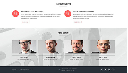
This footer for a website for this Security Pro Drupal Template shows
Latest News blog posts keep the user interested in learning more about
security,leading into the blog that shows shows the main navigation menu.
A look at the team reassures clients with human faces while the background in grey contrasts with the pink of the overlays in the rest of the site. The sub-footer in black carries links to company policies, copyright information and social media icons.
Footer for Template 52133 – Martial Arts Responsive Website Template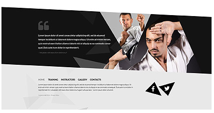
This diagonal footer appears below the site gallery and derives its strength
from the site graphics, where triangles and diagonals are used to divide
the site into sections. A black banner with quotes highlights a testimonial
from a student and is designed in the site graphics using triangles in black
and grey superimposed with images. Animations of social media in black triangular shapes attract the user’s eye and invite him to share. The header navigation is repeated in the footer and the contact link leads to a contact form.
Footer for Template 52324 – Handbag Boutique Responsive Magento Theme
In this highly visual website template for fashionable handbags, the footer has a visual surprize that catches the viewer’s attention – a video background with a model holding a beautiful handbag. Superimposed on the model are blog posts on more handbags with highly visible dates, image and text rollovers keeping the site user engaged and leading into the blog. Secondary navigation in a neatly organized hierarchy of links on plenty of whitespace; account, social media icons contact links provide functional details. This elegant footer is designed in green and grey to balance the brown and grey of the header.
Footer for Template 50663 – Creative Personal Page Responsive WordPress Theme
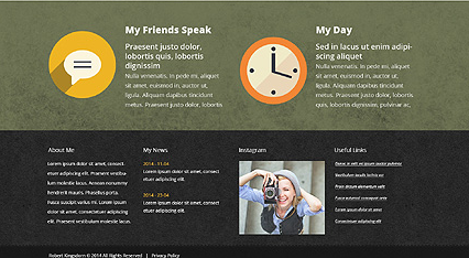
This footer for a creative personal page is designed in different textures
and colors with icons and zoom effects to highlight testimonials and hard work.
The artist’s bio leads to a page about him and blog snippets lead to his blog.
An Instagram image leads to his portfolio. This footer is a good way to present
himself and his work.
Footer for Template 52571 – Globex Business Responsive Website Template
The pink contact form contrasts well with the green bokeh header of this
Globex Business Responsive Website Template, presenting the image of
an innovative company with fresh new ideas. Whitespace allows the address, social icons and privacy policy to stand out, below which the map in grey a nice contrast to the pink of the contact form.
Footer for Template 52601 – Cafe and Restaurant Muse Template
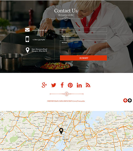
The footer for this Cafe and Restaurant Muse Template shows an attractively designed contact form, a transparent overlay on a parallax banner with a chef busily cooking in the background – one can almost inhale the aroma of the food! The red Submit button, red social sharing icons, red border and arrow are in the theme color of the website. Whitespace allows the social sharing icons to stand out and provides a design separation from the map below which shows the location of the restaurant.
Footer for Template 51129 – Travel Insurance Responsive WordPress Theme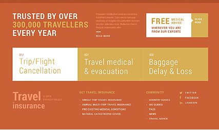
This footer for a Travel Insurance Responsive WordPress Theme uses
a slight change in shade to separate itself from the main content of the page while otherwise staying true to the theme color. Hard-hitting messages, banners, facts
and testimonials in the footer provide credibility and assurance to potential customers. Banners in mustard and white highlight specific instances where travel insurance becomes essential on the company’s free medical advice. Links in the footer focus on different types of travel insurance and lead to more information. Newsfeed and social media keep the user interested. The fixed header with menu in red text on a white panel contrasts with the red of the footer and helps the user navigate into the contact section and anywhere into the site.
Footer for Template 52886 – Personal Assistant Services Responsive
One-Page Website Template

The footer for Personal Assistant Services is designed in two panels – one in black on black, showing a smartly designed form on a smartly dressed man. The other panel with a cityscape in pink and grey with navigation links, contact, location and social media, is reflective of the header theme in blue and pink which shows a young man against a city skyline ready for business.
Footer for Template 52833 – Construction Architecture Responsive WordPress Theme

This footer and sub-footer for a construction and architecture company contains a map, secondary navigation, contacts, a photo gallery of recent projects linked to the portfolio on the site, newsletter sign-up and social media.
Footer for Template 52896 – Friendly Meal Delivery Responsive Drupal Template
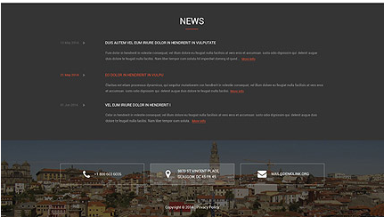
This footer for a friendly meal delivery service follows the site theme of using ghost buttons or hollow tables in the design which allow text to stand out. Newsfeed on a dark blue background invites the site-user to keep browsing. A sub-footer in a lighter blue with the city skyline allows the contacts on the ghost buttons to stand out in a subtle way on hover.
Footer for Template 49240 – Party Hire Responsive Website Template
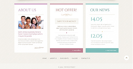
This footer for a Party Hire Responsive Website Template is designed
in the site colors and fonts, with neat tables telling the customer about
the company, highlighting a call to action in the form of a hot offer and
a banner telling him how to save money– now who can resist that? The
third table keeps the user browsing with more news from the blog. The
menu at the bottom leads the user back into the site and the privacy policy
is given in the sub-menu on a lighter shade of grey.
Template 53200 – Sam Bakery Responsive Website Template
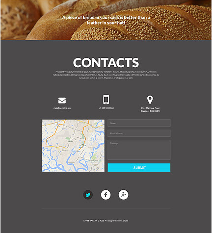
The footer in this Bakery Responsive Website Template shows
close-ups of freshly baked bread, just as the header does – inviting the
user to contact the bakery immediately with a contact form, email or
mobile phone. A map gives the location of the bakery.
Footer for Template 52172 – Design Studio Responsive WordPress Theme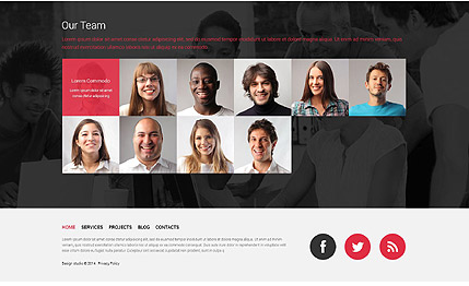
This footer for a Design Studio Responsive WordPress Theme has a personal touch, just as the header does.The photographs of team members are displayed in a grid, with their names and bios appearing on red transparent overlay with white text on hover. The individual photographs of the team are overlaid on a black and white image of the team in action. The menu is repeated below the team photographs, for ease of navigation. Social sharing icons are given prominence. The red used in the footer is the theme color of the site. Red contrasts with black, and neutral grey lends balance and readability.
Footer for Template 53335 – Ski Resort Responsive Website Template

This footer for a Ski Resort repeats the logo in the footer, making an
attractive animation as the user scrolls down the page and calling attention to the line “View our report 2013”, inviting the site-user to click on the link. Blog posts keep the user browsing, and links in red highlight special ski getaways. The interested reader will surely read more!
Footer for Template 52873 – Massage Spa Responsive Joomla Template
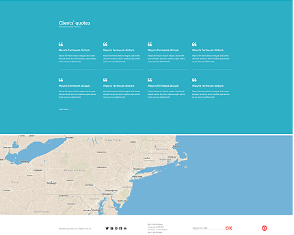
This blue footer for a Massage Spa Responsive Joomla Template contrasts well with the fixed white header,red drop-down menu and logo with black and red text. The header helps the site-user to navigate back into the site. The client testimonials in the footer provide confidence to new customers in the spa’s capabilities and the map shows the location of the spa. Social media icons and other corporate information is provided in the sub-footer below the map.
Footer for Template 53323 – Electronic Online Responsive Magento Theme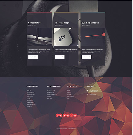
This modernistic footer for a Electronic Online Responsive Magento Theme has a
black technical/studio background with slim pink, yellow and green bands and an orange arrow for the blog post imagery, keeping the site visitor interested in reading. The footer sports geometrics and polygons in reds and browns where links are placed in tabular form. Social media icons are prominent in red.
Footer for Template 53093 – Creo Furniture Responsive WordPress Theme

In this elegantly designed footer with plenty of whitespace, a location map
and address, a red banner wih the date of a new collection release and a
button inviting the user to view all collections; a piece of furniture with text
leading into a blog post displaying beautiful furniture with viewer’s comments,
recent posts and a comment form for the viewer to write a comment; links for
secondary navigation, the logo and social media icons, privacy policy are
all neatly displayed. Shows how much can be fitted into a footer without overcrowding.
Footer for Template 53326 – Helicopter Flying Responsive Website Template
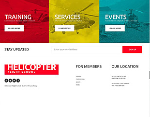
Red , yellow and blue transparent overlays on images of
helicopters call attention to the training, services and events
at this Helicopter Flight School and lead into the site. A newsletter
signup invites you to stay updated with a call to action – your email
address. Links for members of the flight school, location, social icons and a lot of
whitespace heightens the red of the flight school logo.
Footer for Template 53446 – Swimming Club Responsive Website Template
Contacts are clearly given on whitespace, followed by the attractive
yet functional contact form on a transparent overlay of an image of a
swimming pool with diving board.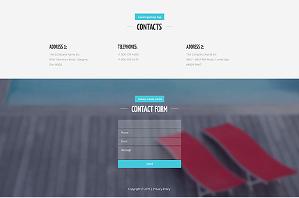
Footer for Template 53535 – Surfing Club Responsive Website Template
In this footer, a featured video is displayed below blog posts on surfing club events, to engage the user. A black-and-white banner showing a surfer, provides contrast to the color photograph of the surfer in the header while continuing his action in the waves. Logos of sponsor companies are shown in a panel above the banner.and social media icons in red circles, provide more options for a user to engage with the club.

Footer for Template 53540 – Bbq Restaurant Responsive Website Template
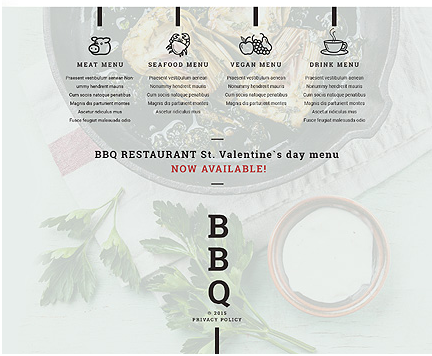
This attractive footer is overlaid on an appetizing image of food. It boldly
repeats the centralized logo and uses icons to attract attention to food categories.
Footer for Template 53663 – Sunglasses Responsive PrestaShop Theme

Icons direct the user’s eyes to content and leads him to click on the arrows,
taking him into pages with more details. Navigation links, social media plugins
and icons and a newsletter signup keep the connection with the user alive.
Footer for Template 53543 – Wedding Store Responsive WooCommerce Theme
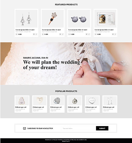
Featured and popular products with Quick View and zoom effects on hover,
lead into product pages with more details like a product slideshow, product
description, reviews, price, stock availability, shopping cart and social media icons.
The full-width parallax banner gives a realistic 3D feel and holds the user’s attention.
A newsletter signup enables the wedding store to connect with the user
with personalized information.
Footer for Template 53546 – Fishing Store Responsive PrestaShop Theme
Footer for Template 53505 – Marine Store Responsive PrestaShop Theme
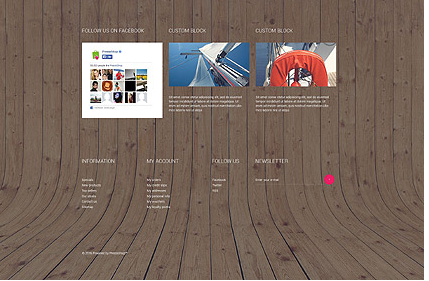
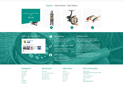
This footer is laid on the rugged background of a curved wooden boat
deck, promising adventure on the high seas. Banners of products with
text below lead into corresponding product pages with more details.
Secondary navigation leading to company information, user account links,
social media plugins and a newsletter signup make this footer a
useful navigation tool.
Inspired by the footers you’ve seen here? Put some thought into your footer design.
Your footer is a valuable piece of screen real estate, a functional space that
pays off in real website value.
