Why use large images?
Large images are favorites among web designers for good reason. They’re trendy and aesthetically pleasing. They arrest attention with an appealing picture and lay the foundation for the text color and site background. For the majority of web users who skim and scan rather than read text, a picture with a short headline can quickly telegraph a message and get them interested in browsing the site. Many sites like image banks, movie sites, music bands and games sites concentrate on selling products using multiple media, like video, slideshows, images and audio and only minimal supporting text.
How are large images used?
They can be used in several ways, such as the hero image, the full-screen or full-width slider, the rotating gallery and the parallax banner, to name a few of the many options open to web designers.
The power behind the magic – CSS3
Thanks to CSS3, we can now have a perfect full-screen image or image background that fills the entire page with a centered image and retains image proportions with no white space around and no unwanted scroll bar. So go on, display your magnificent images at full 100% responsive width across most major browsers.
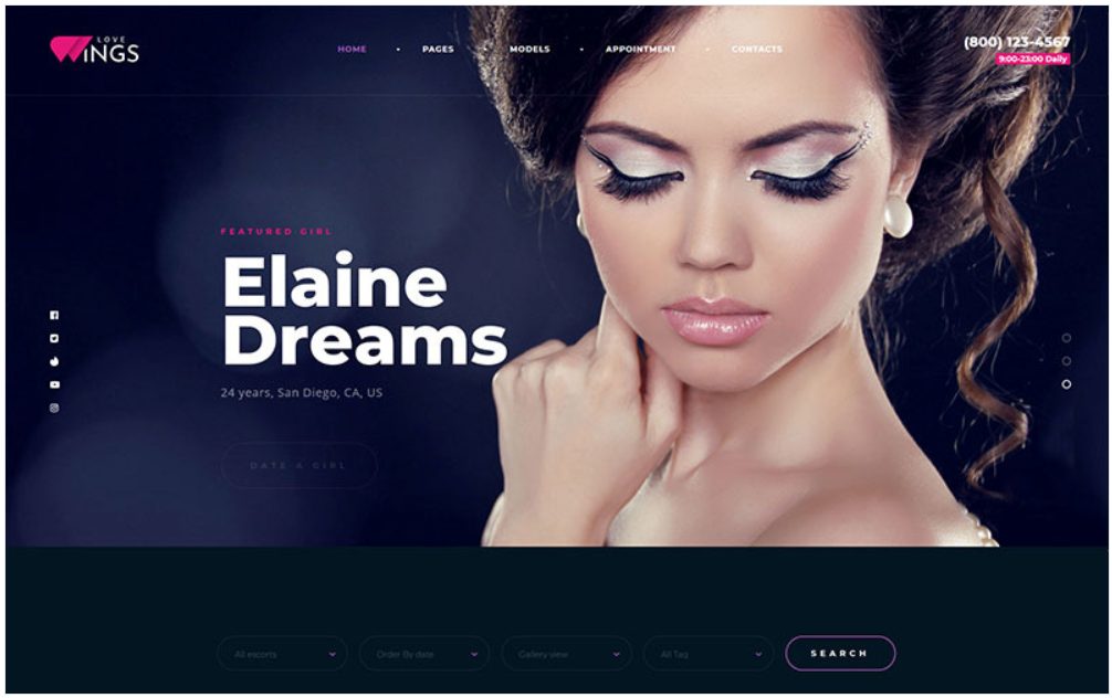
Love Wings Relations and Dating WordPress Theme
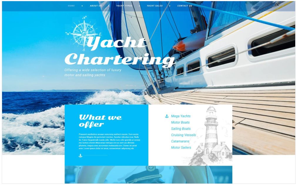
Yacht Club Responsive Website Template with Bootstrap, Parallax, Gallery
This template features large images on the header, and text on large images on parallax banners which give a 3D effect while scrolling. Illustrations in black and white on a light grey background offset the all-blue theme and large grey fonts for headlines stand out on a light grey background. Blue and white illustrations on a blue background are used for the compass logo and a bell. Image and text animations, icons, image zooms, photo overlays, testimonials and a drop-down menu in transparent navy blue all work together to create a website that attracts individual or corporate membership to a yacht club for people who love sailing. Two galleries feature different types of yachts for charter or sale, with text animations, parallax banners and images. Galleries are viewable as slideshows.
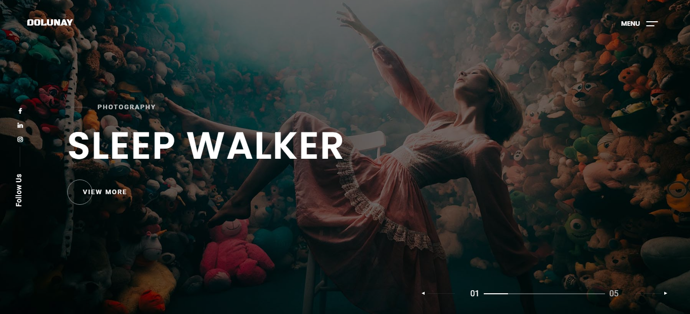
Dolunay – Creative Portfolio Multi-Purpose & Personal HTML Template
Yome – Multipurpose Resume and Portfolio Joomla 4 Template

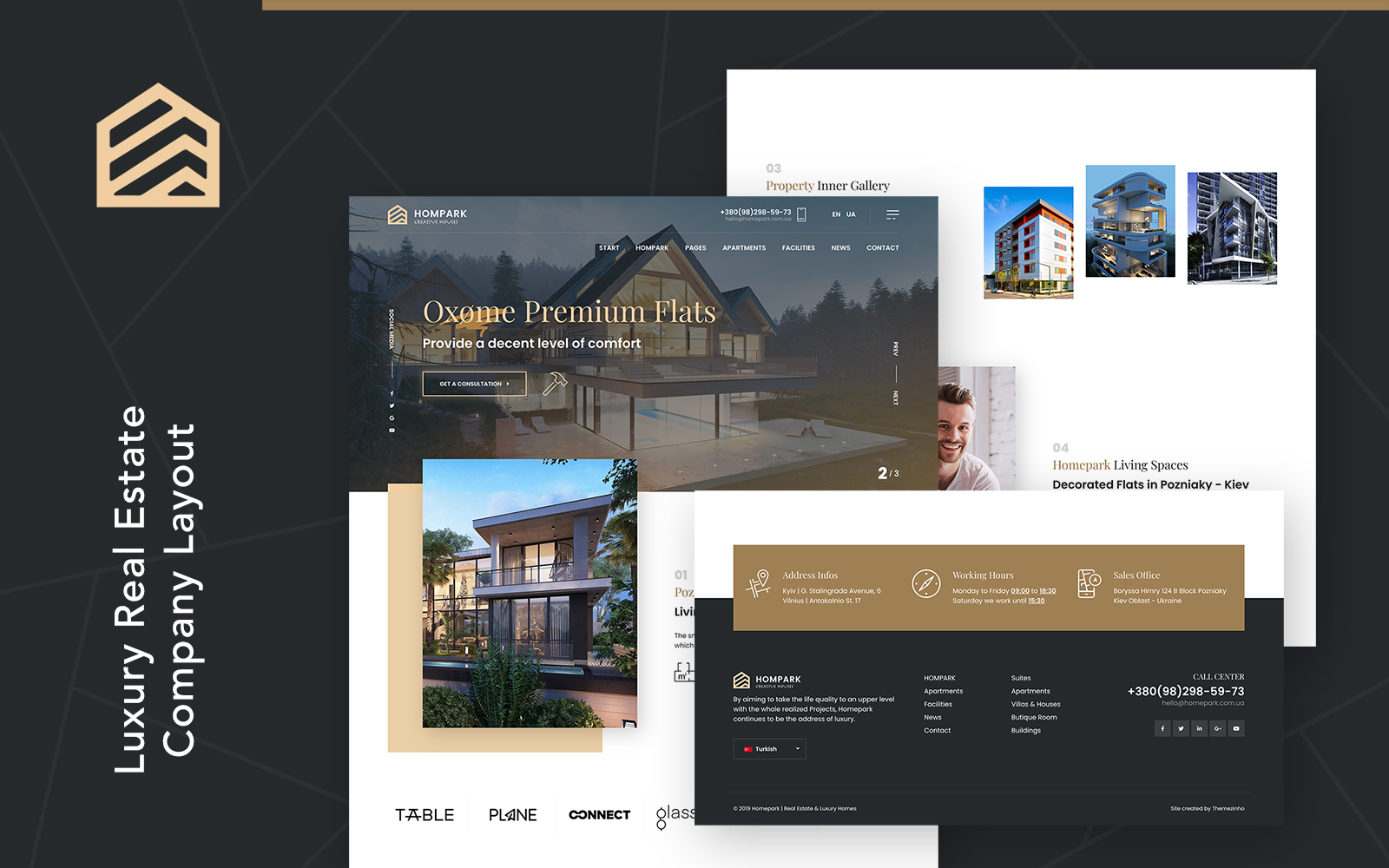
Hompark | Real Estate & Luxury Homes WordPress Theme
