Modular content blocks in responsive web design:
Keep it simple.
Keep it visual.
Keep it scannable.
Keep it flexible.
The objective of presenting content in web design is to keep in mind that readers skim and scan rather than read text. They also access your website content on desktop and mobile devices, which change the way they perceive it. Providing a smooth user experience should always be the purpose of web design. Images and text in banners, grid and section layouts, color blocking, shapes, background video, megamenus, animations and hover effects, all serve to give the user a reason to stay on the site and explore it more deeply. Modular content blocks help the designer stay flexible and provide emphasis in this day of responsive web design.
Focus on one statement at a time. Let the most important content grab the viewer’s eye first. Typical section layouts include a slider, a lazy loading image or parallax banner, smaller banners with flip animations or hover animations, a video or video background.
Lazy loading delays loading of images until the user scrolls to them. Using Lazy Load on long web pages will make the page load faster and may also help to reduce server load.
Parallax scrolling gives an image the impression of depth. As a user scrolls down a page the images in the background move more slowly than the content in the foreground. This creates a visually appealing three dimensional effect that gives a website additional depth.
Background video grabs attention, showing products in use or people at work, while more products are showcased.
Menu design Content blocks are also part of menu design. Hideaway navigation with slideouts or overlays and the now familiar three-bar “hamburger” menu icon, hides menu content until required by the user, when it is revealed on hover. Some designs have mega-menus that drop-down and include images and messages that add information and calls to action to menu content. Such menu blocks also contain product menus in tabular form. Interesting hover effects are displayed on menu design.

The main categories of jewelry are introduced in banners of black and white that display the jewelry to advantage. On hover, three frames are revealed, adding depth to the picture. Below, a banner with a video background highlights diamond jewelry. Featured products lead to category pages with product animations. A fixed parallax banner provides a feeling of depth to the picture. Excerpts from the blog engage the reader and invite her into the blog. The product section has a detailed drop-down menu for a large number of products. Login, checkout, shopping cart, currency and language links are given on top for ease of buying. Useful links on the footer aid navigation.
This template for an online Handbag Boutique has a stylish look. The slider showcases handbags and highlights special offers like free shipping. Mega drop-down menus have product images and Shop Now messages within them, providing calls to action. Below the slider, banners with zoom effects on hover emphasize renowned brands of handbags. ‘Sale’ and ‘Save’ messages urge people to buy at every level of the site. Featured new products are shown interspersed with large banners and special sales. Twirling numbers draw attention to the advantages of the Handbag Boutique. A banner with a video background demonstrates the owner’s pride in owning the handbags showcased in front with hover effects, which are posts from the blog. The footer has useful links for ease of navigation, tracking orders and buying. Account, login, shopping cart, currency options and other buying links are placed on top.
Template 52231 – Scrapbooking Responsive Website Template with Illustrations, Gallery and Blog
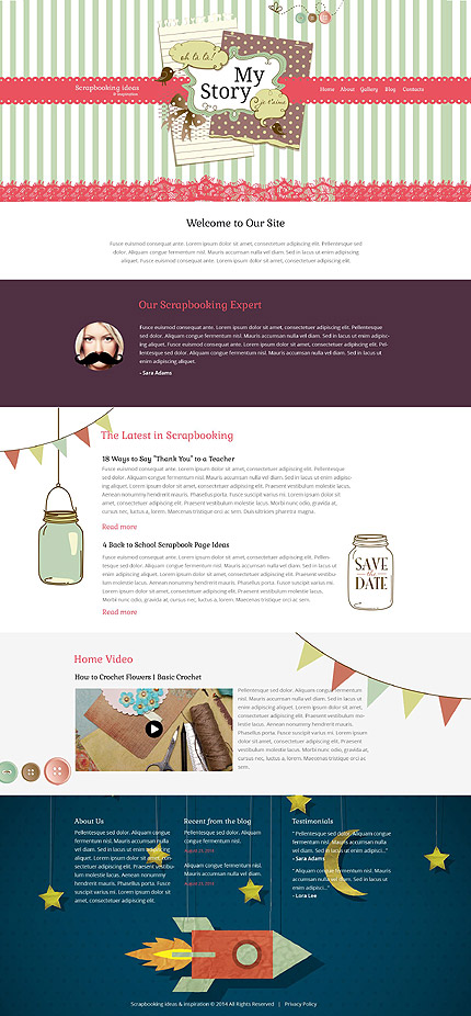
Online stores use grid image menus that fill the page and lead to more information on the product.
Template 47837 – Food Online Responsive PrestaShop Theme with Slider, Carousel, Product Slideshows with Zoom
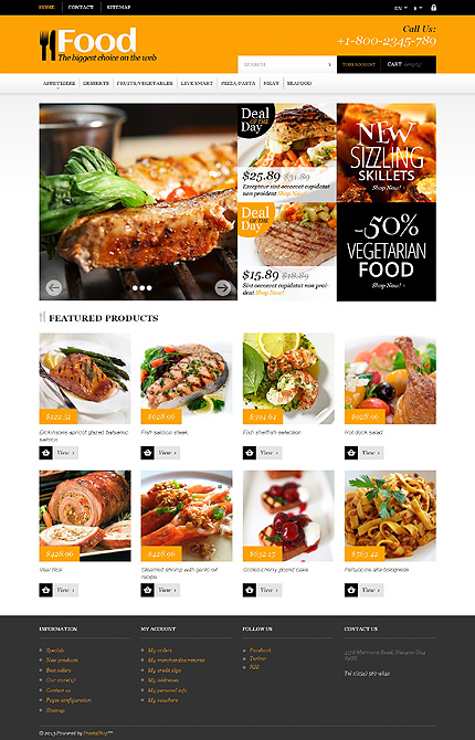
Food is displayed to advantage against a white background with a mustard header and logo in bold fonts with graphics. The homepage slider with blinds-style animation has appetizing images of food. Banners by the side of the slider highlight the Deal of the Day and special discounts. Featured products lead into product pages with descriptions, slideshows with zoom, stock availability, sales, reviews and shopping cart. Below, a carousel shows other products in the same category. Shoppers in a hurry can use the sitemap to quickly navigate the site. Buying is easy with login on top along with five language options and two currency options. The footer has useful links to aid navigation.
This is especially important for content-heavy websites where the viewer finds his eyes travelling all over the place unless there is a coherent theme. The eyes travel first to the most important content. If you’re using bright, high-energy colors, it may be a good idea to play down the background image and use black-and-white or a single color. Color blocks add emphasis to content or tone it down, depending on the transparency or opacity of the colors.
Template 52101 – Translation Agency Responsive Joomla Template with Slider, Gallery and Blog
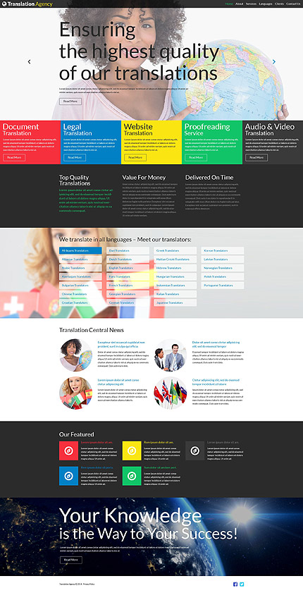
Black contrasts with content blocks of high-energy colors – red, blue, yellow, green offset with grey, to project the agency’s translation services upfront to the visitor. The slider has international images relevant to the content. Services are displayed in a sortable gallery that can be viewed by category. The blog with zoom effects on the images has a search bar and login form so users can access content and post comments with site security. More content is presented a black background. Translators in all languages can be accessed with the click of a button. Circular images with text on white provide a welcome break in the design. Black with square icons in the theme colors provides contrast. Text on the background video of a globe projects this company as a truly global company.
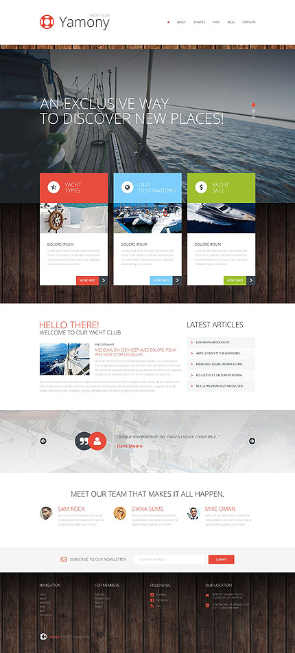
Rectangular and circular elements are used effectively in this site design. A range of yachts are presented on a parallax slider in black and white and color, on which content blocks with color headings in red, blue and green stand out strongly, along with relevant images and content leading to more information on the site. Lazy load effects present content only when required on scroll – notice the content boxes sliding in on scroll from right, bottom and left. Testimonials are presented in a carousel on a black and white parallax banner which gives the feeling of depth. Services are presented in a gallery with zoom effects on hover, with media in image, gallery, slideshow, video and audio formats displaying a range of yachts. The blog with zoom effects on the images, engages the user with content about upcoming events and tips about yachting.
Template 51838 – Coffee House Responsive OpenCart Template with Product Slideshows with Image Zoom
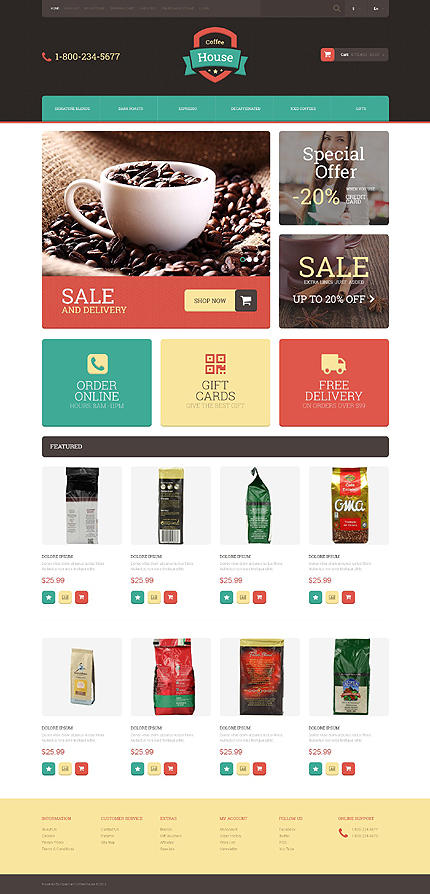
Brown with green,yellow and red makes a beautiful website for a coffee house – from the logo in a red and green shield on top to textured panels with rotating banners below. Icons and colored banners or images highlight special offers. Featured products lead to product pages with slideshows and image zoom, price, shopping cart, stock availability, social icons, product reviews and product descriptions. The buttons below the featured products are also in green, yellow and red. Buying is made easy with login, checkout, shopping cart, currency and language options on top. The footer has useful links and a sitemap for ease of navigation.
Template 52062 – Restaurant Cafe Responsive WordPress Theme with Blog and Gallery, Lazy Load Effects
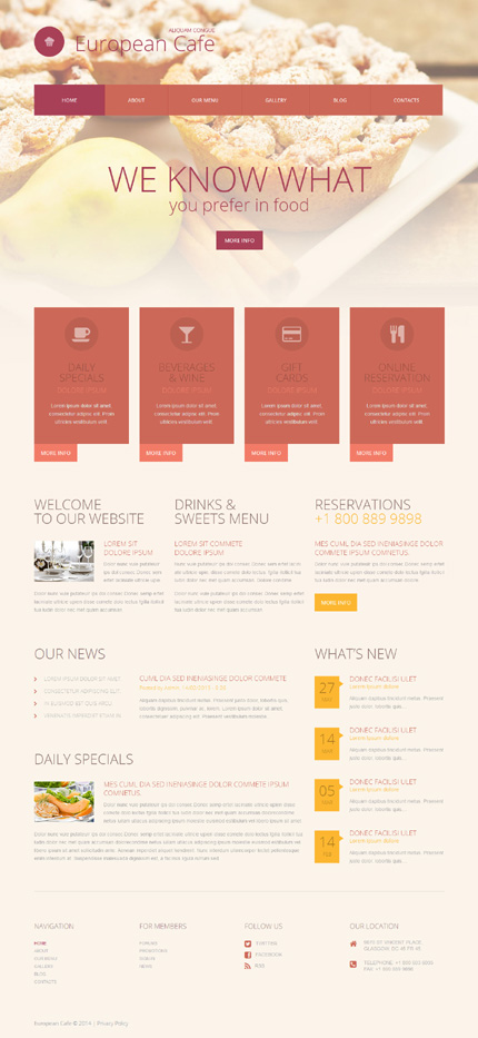
For a contrast in color blocks, take a look at a template with a softer appeal. This
template derives its colors from the background image. Maroon and muted orange
on a peach background present a pleasant and inviting appearance with hover effects
on the menu. As the user scrolls down the page, the headline slides into view from the left. Four color blocks with twirling icons slide into the frame using the lazy load effect, hold the user’s attention and invite action through a click of the buttons below. The
gallery with media in image, gallery, slideshow, video and audio formats shows an appetizing spread of dishes, and can be viewed by category. The blog engages the
user with content about upcoming events and chef’s special dishes to look forward to.
Template 52171 – Communications Company Responsive WordPress Theme with Gallery and Blog

This template is designed with transparent overlays in yellow and shades of blue
on the background of a black and white image. Banners and graphics with hover
effects focus the viewer’s attention on the content that is being read. The gallery
has media in image, slideshow, gallery, video and audio formats, and can be viewed
by category. The blog gives technical information about the latest in communication technology and invites customer responses with comment forms.
Template 52325 – School Supplies Responsive OpenCart Template with Slider, Product Slideshows with Image Zoom

Color immediately draws the eye in this School Supplies Responsive OpenCart
Template with Slider .The slider with grid and block wipes reveals school children busily
at work using their art supplies to create creative works of art. The menu uses the colors of the rainbow in underlining and coloring the word on hover while drop-down menus are black in contrast to the white of the site. Color blocks in mustard, green and blue in the grid layout highlight free shipping, 20% off and Super Sale. Smaller blocks highlight Top, Sale and New within the product boxes. Blue, green and mustard are used for the buttons and pink for prices. On hover, the magnifier opens up quick information on the product while the arrow leads to a product page with detailed information, product slideshows with image zoom, stock availability, pricing, shopping cart, reviews and other bestselling products. The colorful bar on top draws attention to the account, login, shopping cart, checkout area that makes buying easy. The footer has useful links and a sitemap for ease of navigation.
Shapes are a vital web design component. Shapes are also an important way to distinguish different kinds of content on a website. Color blocks give a solid weight to a shape. Let’s look at some of the the different kinds of shapes used today in web design.
Rectangles and squares are the most commonly used shapes – for the simple reason that web pages are rectangles made up of smaller rectangles and squares. Squares and rectangles are familiar and trusted shapes which represent order and formality; honesty, stability and rationality; conformity, security and solidity, evenness, equality and peacefulness.
Squares and rectangles can become somewhat boring – but tilting them or tilting the text, using a checkerboard design, or using solid or outlined boxes can break the uniformity of the design while keeping the content coherent and easy to read. Remember that most backgrounds, bullets and menus are designed in rectangles as they are easy to lay out and save space.
Template 51710 – Travel Agency Moto CMS HTML Template with Slider, Mobile Layout Included

This picture-postcard site with the pictures in the slider slightly tilted against a blue perfectly horizontal frame makes an adventurous statement along with the suitcase covered with stickers of places visited, a map and a compass also slightly tilted against a similarly textured background in a lighter shade of blue. Beside each picture on the slider is a statement of the starting price of the tour. The fonts in the logo and menu are elegant. Four banners below with appropriate images lead the reader into more details on the services of the travel company. Inner pages have detailed information neatly laid out in section-wise content. A contact form helps a user get in touch with the travel agency for more details.
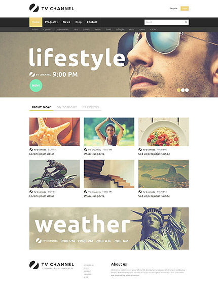
This TV Channel Responsive Joomla Template shows what’s new in the homepage slider. A broad drop-down menu draws attention to the main content of the channel
and is designed in black and yellow along with zooming images on lazy load which
attract the viewer into the site. More banners in grid format are treated the same way. Each image takes you into a page with more information. A second menu in black
makes it possible to integrate and organize a great deal of information on this site.
Bold fonts catch the eye on a banner with zoom and lazy load, giving a feeling of
depth. The blog engages the user with useful content.
Template 52314 – Singer Responsive Joomla Template with Blog, Forum and Gallery
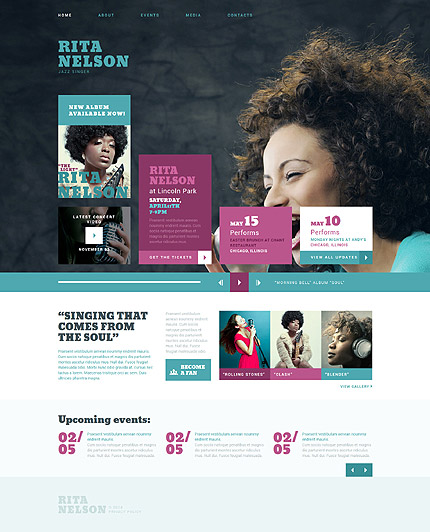
This template for a personal page for a singer is designed in pink and blue on black with hover effects on the banners. Important dates and album releases of the singer are highlighted so that fans can book tickets in advance. A sample audio track from an upcoming release is given for the audience’s listening pleasure. “Upcoming events” on the homepage (displayed in a carousel) lead into the blog which features more such events. Photographs of the singer lead to the gallery. The invitation to “become a fan” leads into the Forum with a user name and password where fans can gather online and exchange their views and comments.
Circles are complete, protect what’s within, and are associated with movement, energy, power, harmony, life and infinity (the sun, the moon, the universe). They attract attention, they protect, they provide emphasis and contrast to other shapes.
Template 51707 – Camping Moto CMS HTML Template with Circle Design, Gallery and Hover Effects

Circles take centerstage along with bright yellow against a muted image of a
storytelling session at a camp, in this Camping Moto CMS HTML Template.
Large fonts emphasize the message beneath the brand logo in yellow. Circles
with hover effects and icons showcase the activities at the camp. More circles
with images focus on different camp audiences by age-groups and interests. Text
laid out in circles on a white background talks about adventure and learning programs
with video icons. A yellow banner with a happy camper in a circle highlights a
testimonial. The familiar rectangular shapes hold the design together with the yellow
and white backgrounds and black banner, the drop-down menu, and the footer menu where camp activities are highlighted. The gallery is presented in circles with images.
Triangles represent action, energy and power and are used in familiar shapes like pyramids, arrows and pennants and as a part of other more complex geometrical
figures (rhombuses, squares and polygons.) On their base they are stable, while
pointing forward they direct movement and can suggest conflict. Triangles are
dynamic and strong and can convey progression, direction, and purpose.
Template 52133 – Martial Arts Responsive Website Template with Slider, Gallery
and Animations

Template 52283 – Bikes Store Responsive PrestaShop Theme, Triangle Design,
Lazy Load, Slider, Animated Custom Blocks and Blog
Slicing through the mountain air, over the jagged slopes, a mountain biker climbs
at a furious pace. What drives him are the thrill of adventure and conquest –
symbolized by the triangles and polygons in the design – both light and dark and
color. This Bikes Store Responsive PrestaShop Theme promotes bikes and
mountain-biking gear. The homepage slider stands out with its polygon and triangle design at the base. Downward pointing arrows that look like flags point towards the attractive products on sale shown in the homepage banners. Icons in twirling circles draw attention to more products. Testimonials in a banner with large quote marks and triangles continue the theme design. News snippets in images lead into the blog. Animated flips reveal on scroll in custom blocks. The megamenu product dropdown menu with transparent overlay neatly reveals further product navigation when required. New products feature a quick view with a product slideshow and image zoom, product description, price and review. Categories can be accessed from the main menu. The footer has useful links for ease of navigation. Buying is easy as account, login and checkout links are placed on top.

